Paywall and subscription redesign
How I designed the paywall, payment and offers for Dainik Bhaskar's news app.
Case study 01 • Dainik Bhaskar • Jun 2022 – Sep 2026 • Android · iOS · mWeb
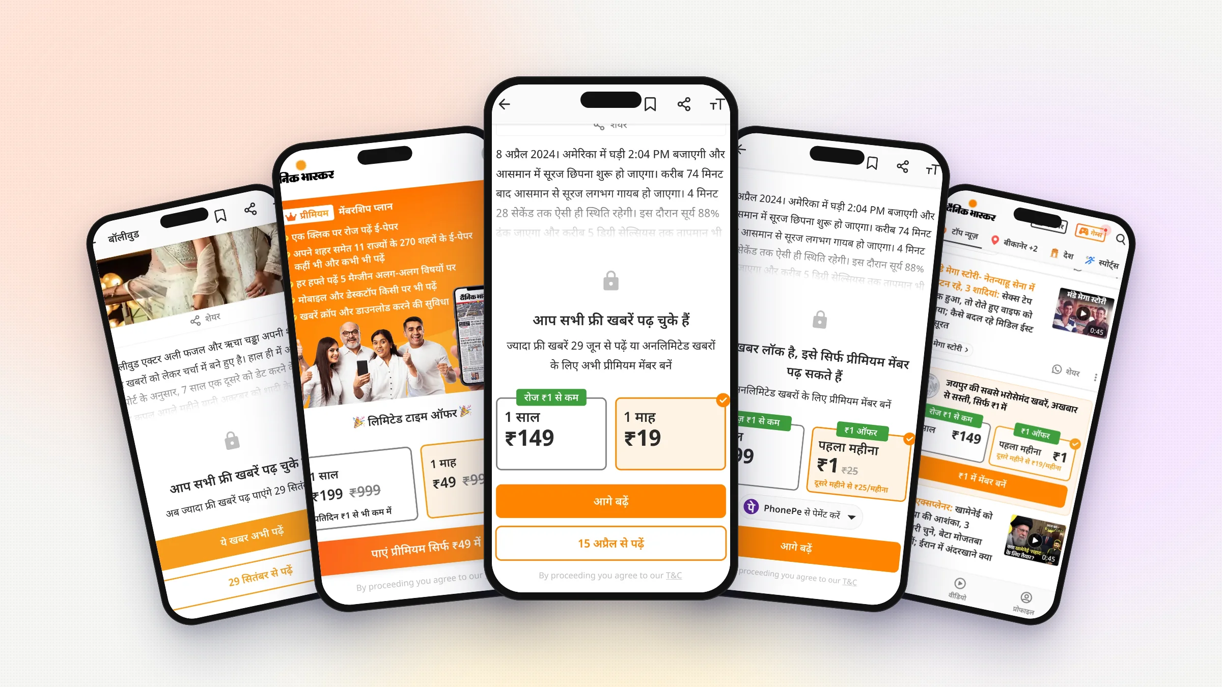
Overview Paywall and subscriptions
In 2022, Dainik Bhaskar started charging for some of its news online. I designed what paying readers see. The paywall, the plan page, payment, autopay, offers and the plan card in the home feed.
Details
- Product designer, subscriptions and growth
- role
- Paywall · Purchase & autopay · Field research · Offers · Feed placement
- scope
- Jun 2022 – Sep 2026
- timeline
- Android · iOS · mWeb
- platform
My role Every paid screen
I designed every screen a paying reader sees. The PM owned the funnel and I worked closely with them. I was also part of the field study in Bhopal.
Problem Nobody saw the plans
Nine months after launch, fewer people were paying than the company expected. Everyone thought the offer was not good enough. Then we visited readers in Bhopal and found that most of them didn't even know paid plans existed.
Solution Make plans easy to see
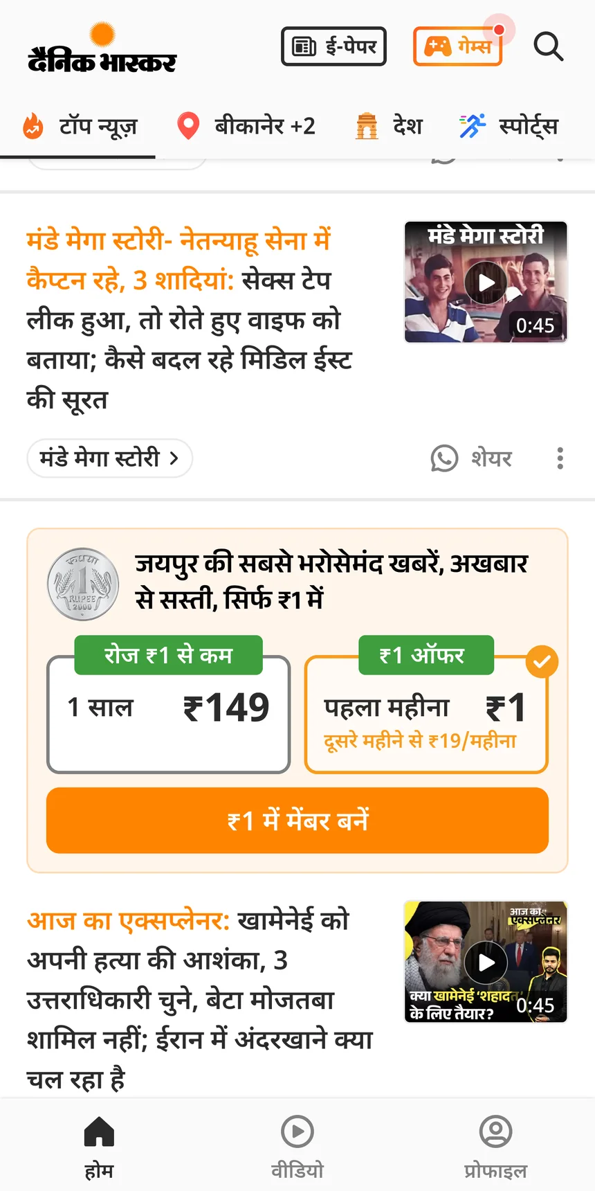
We stopped trying to convince readers and made the plans easy to see. A simple paywall, a ₹1 first month, a faster checkout and a plan card in the home feed. Editorial did not want a sales card in their news feed, so I made its spot movable. The desk moves it around the news every day.
Result More readers saw the plans
With the plans right on the paywall, 24.7% more readers reached checkout. Checkout kept converting at about 4.2%, so more readers at checkout meant more paying members. The ₹1 offer converted 19.5% better than normal plans.
Impact
The first paywall
Read this part
I joined Dainik Bhaskar in June 2022. The company was about to start charging for news, and my first job was the paywall. We had two questions. How do we warn readers before they hit the paywall? And should a paywall on a video work like one on an article?
Warning readers early
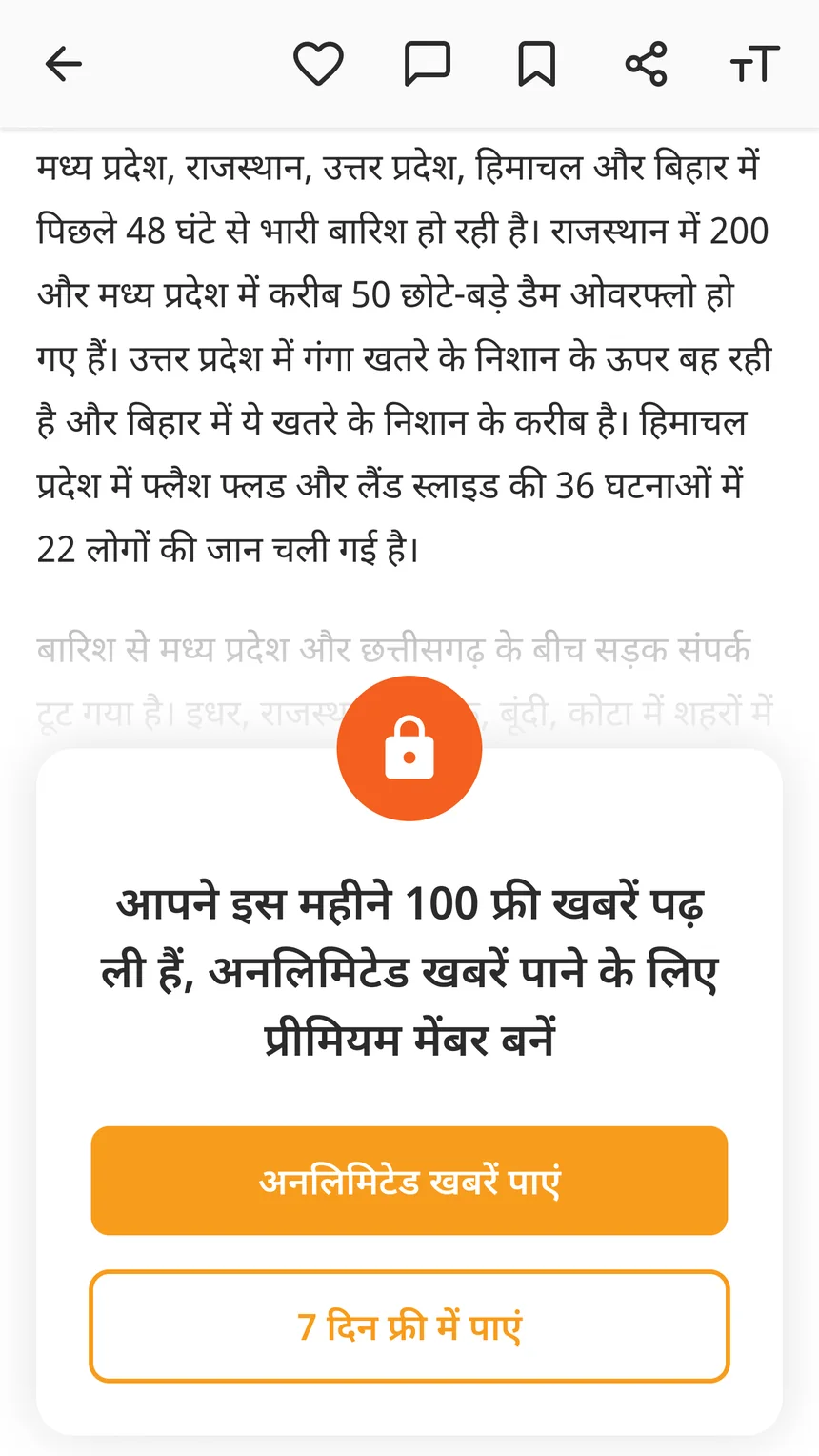
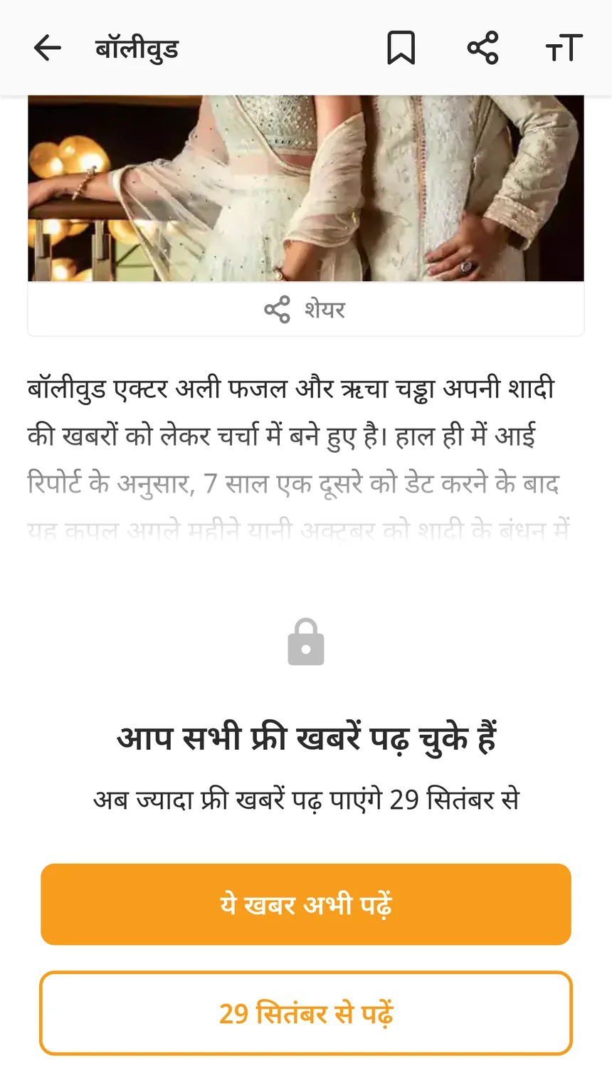
If the paywall is a surprise, readers feel tricked. If they see it coming, it feels fair. So I designed three ways to show how many free stories are left.
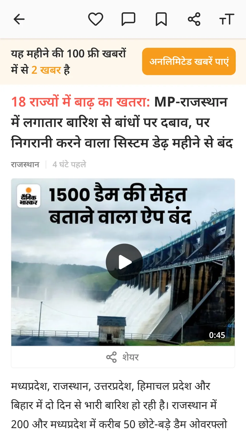
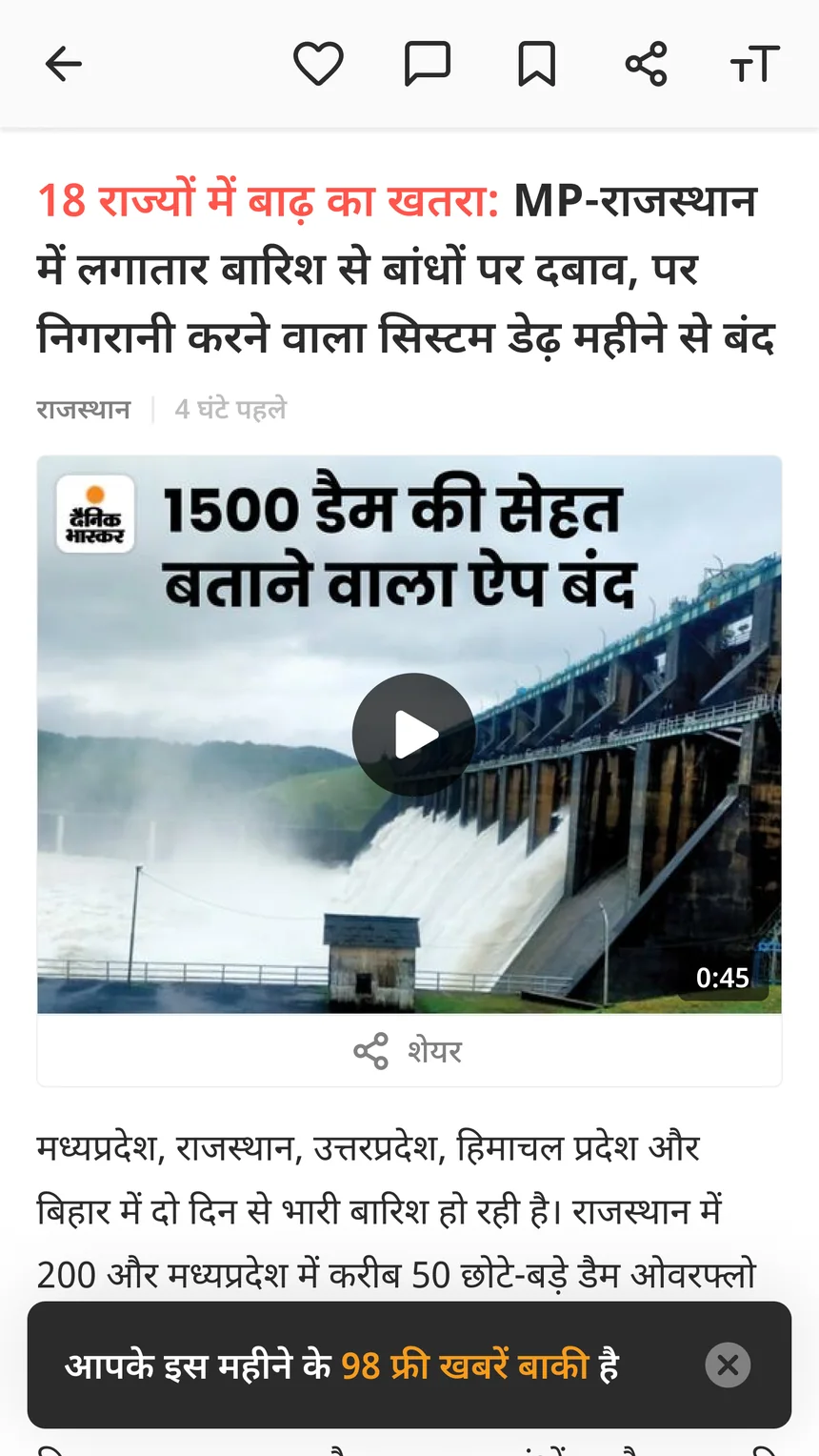
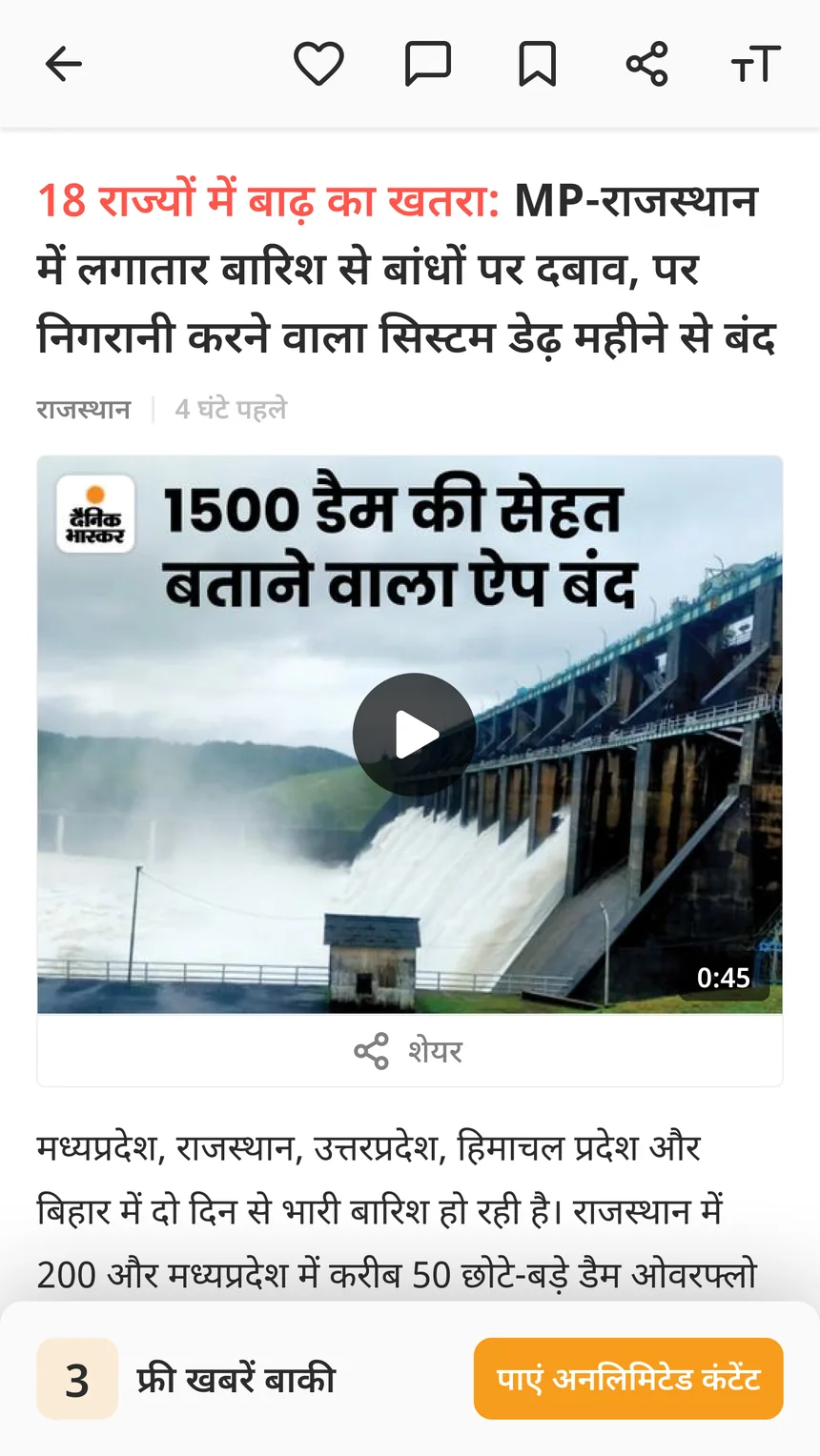
A paywall for each case
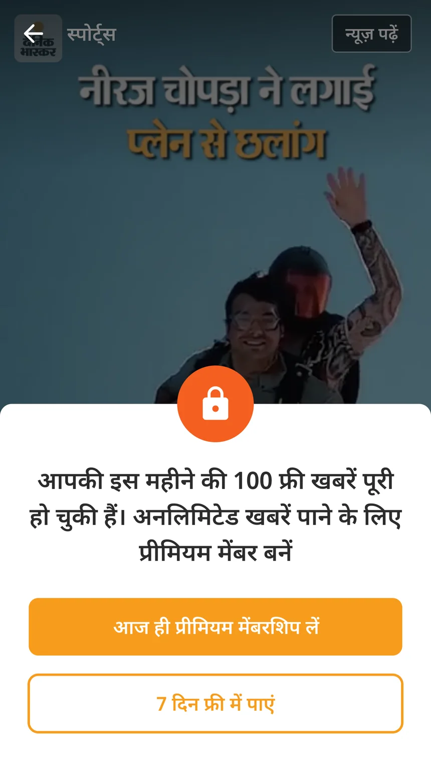
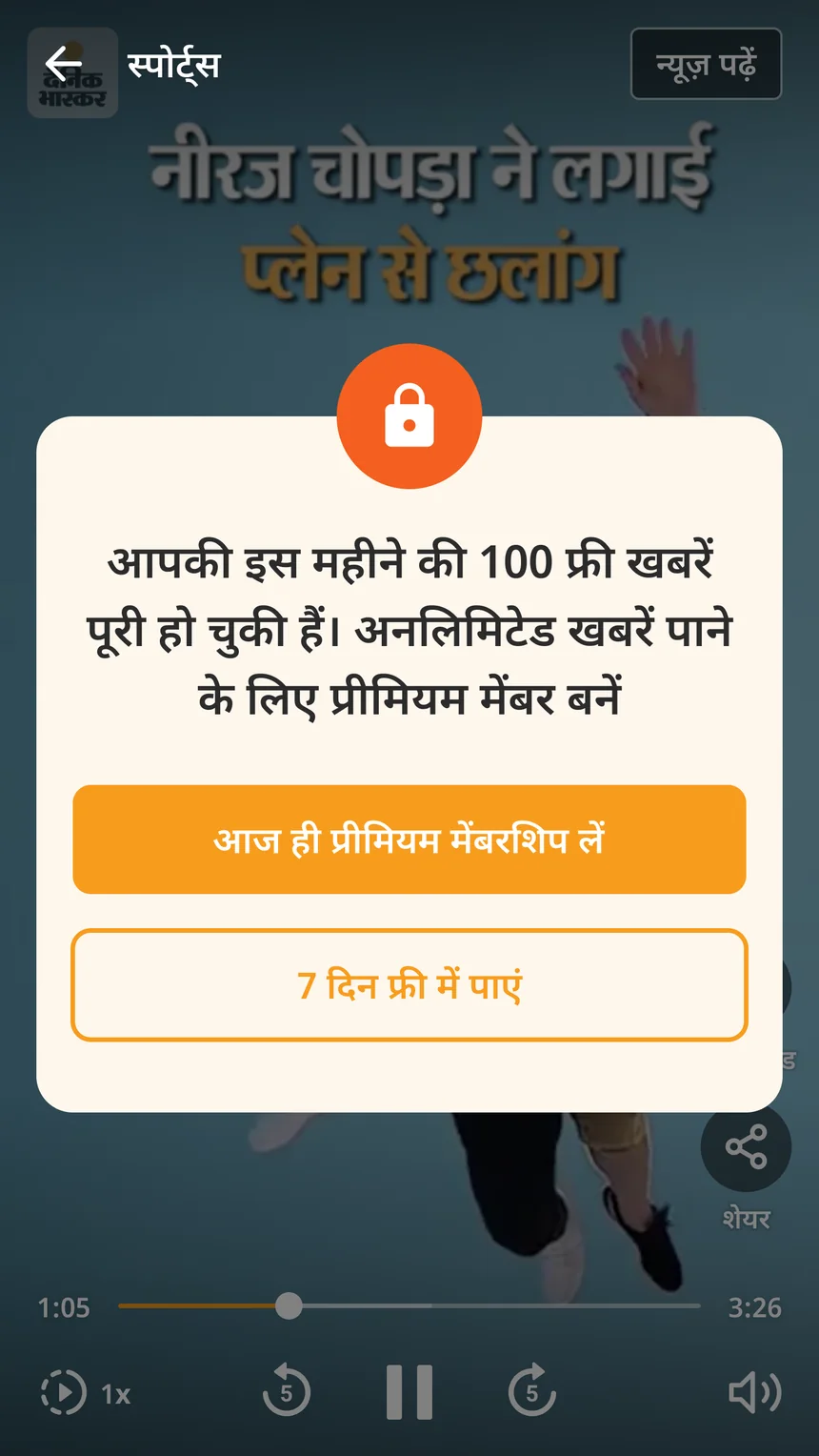
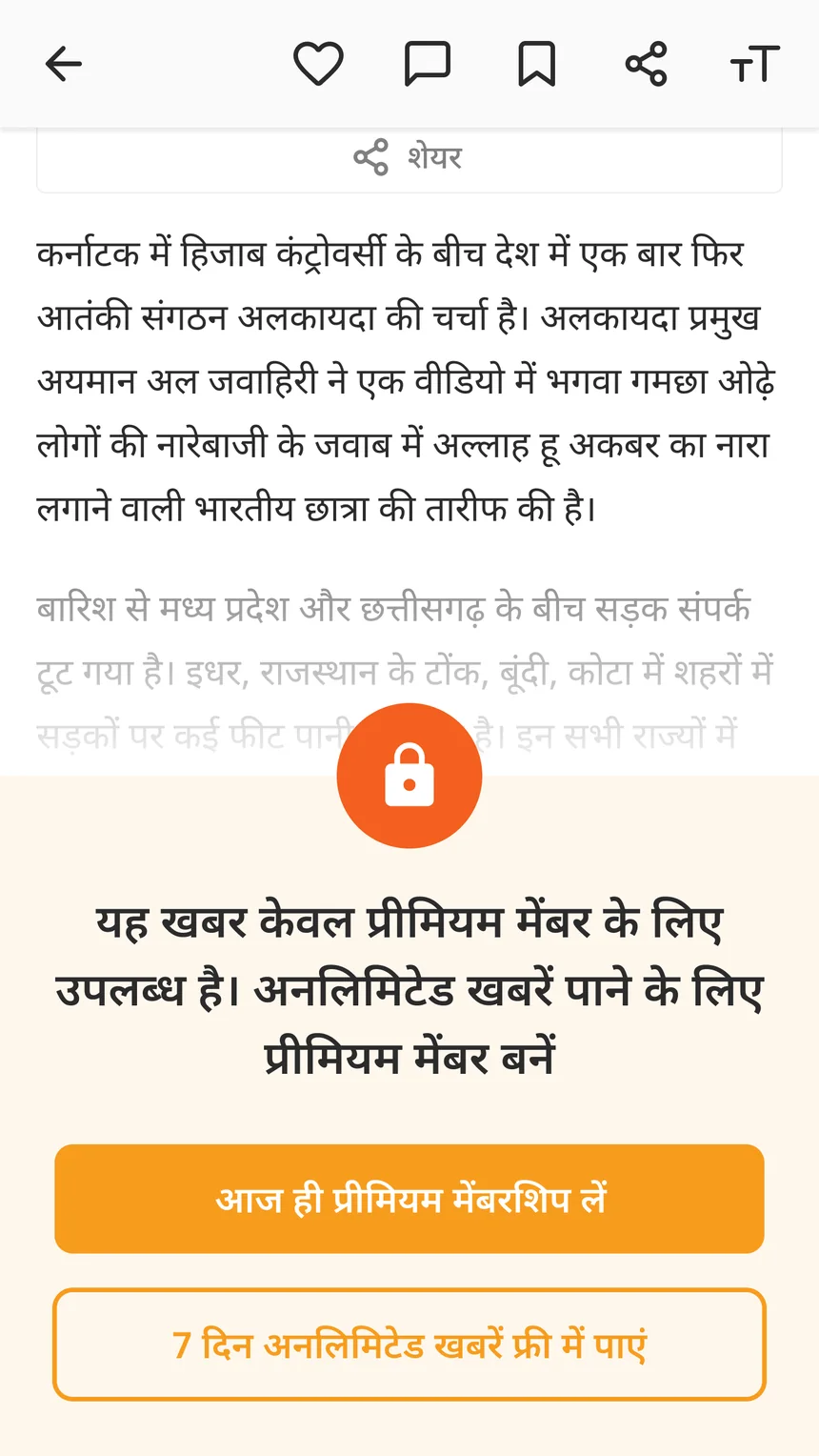
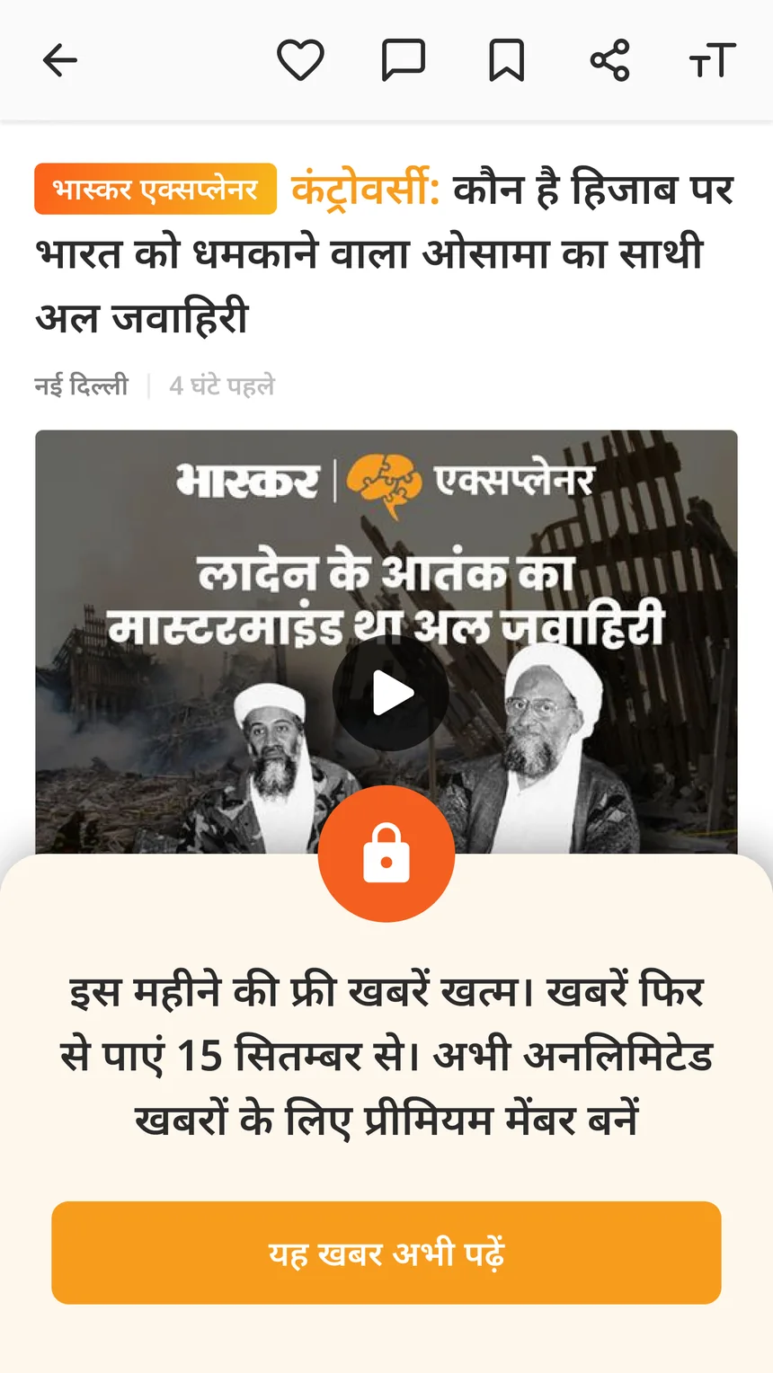
A story that is always paid is different from running out of free stories. A video is different from an article. So each case got its own paywall.
What we tested
Just one thing. Do readers understand that they now need to pay to keep reading? I had just joined, so I was not part of this test. But the result guided all my later work. The clearest version won, not the pushiest one. This paywall worked at launch. Nine months later, the Bhopal study in April 2023 showed its problem and I redesigned it.
Purchase and autopay
Read this part
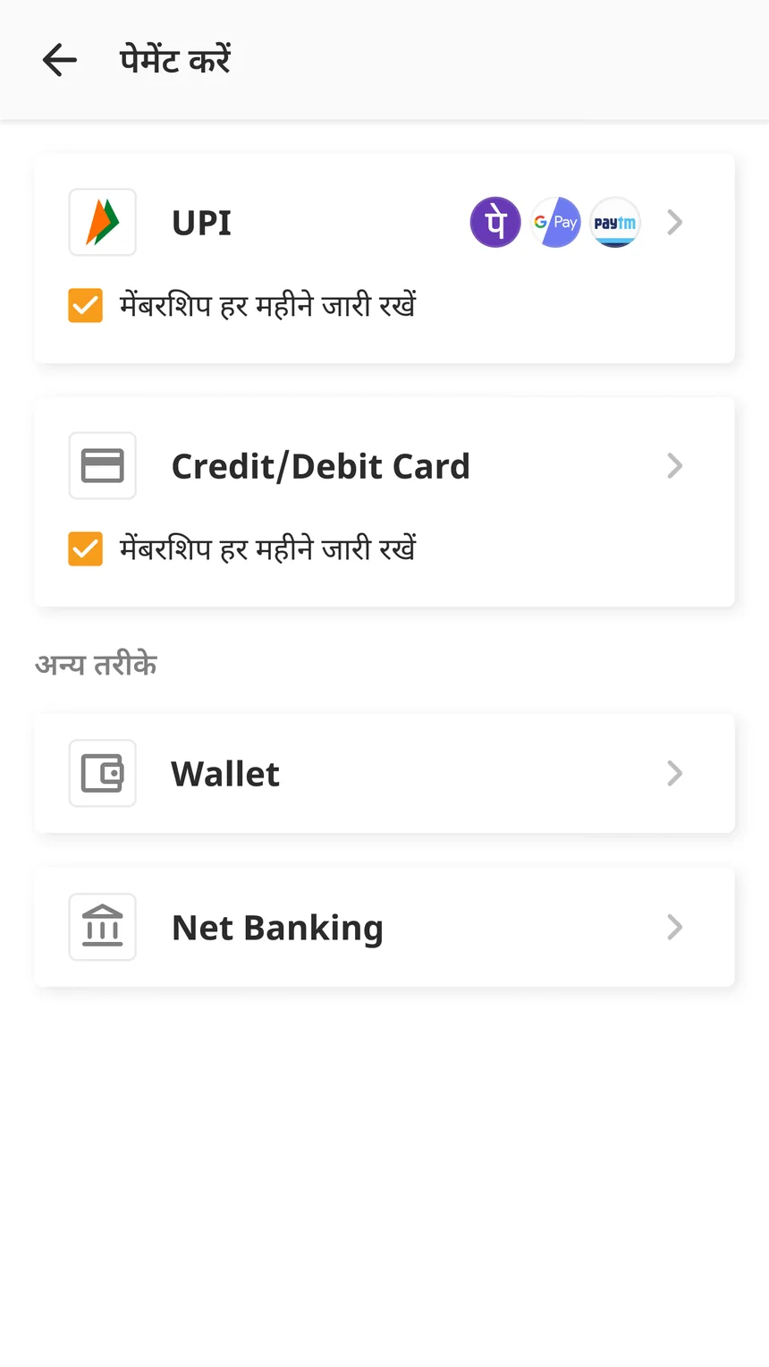
A paywall only stops people. Next I designed how they pay, and how they keep paying without deciding again every month. First I studied how UPI apps and other subscription apps handle payment and autopay, and the rules behind them. The research file is public
Two autopay decisions
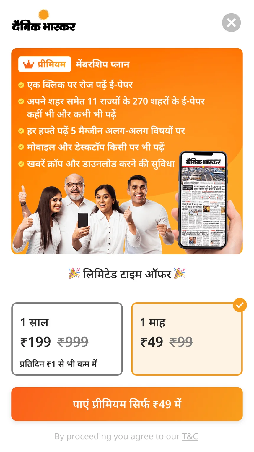
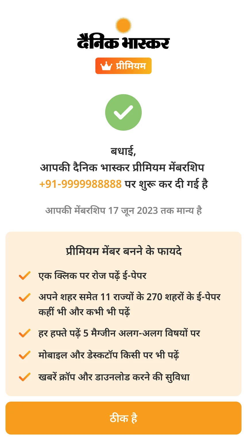
Monthly always has autopay. On a ₹49 plan, people forget to renew every month and drop off. So autopay is part of the plan, not a checkbox.
Yearly has an autopay checkbox, ticked by default. A yearly charge is rare, so readers have time to notice it and can easily turn it off.
Cancelling is easy
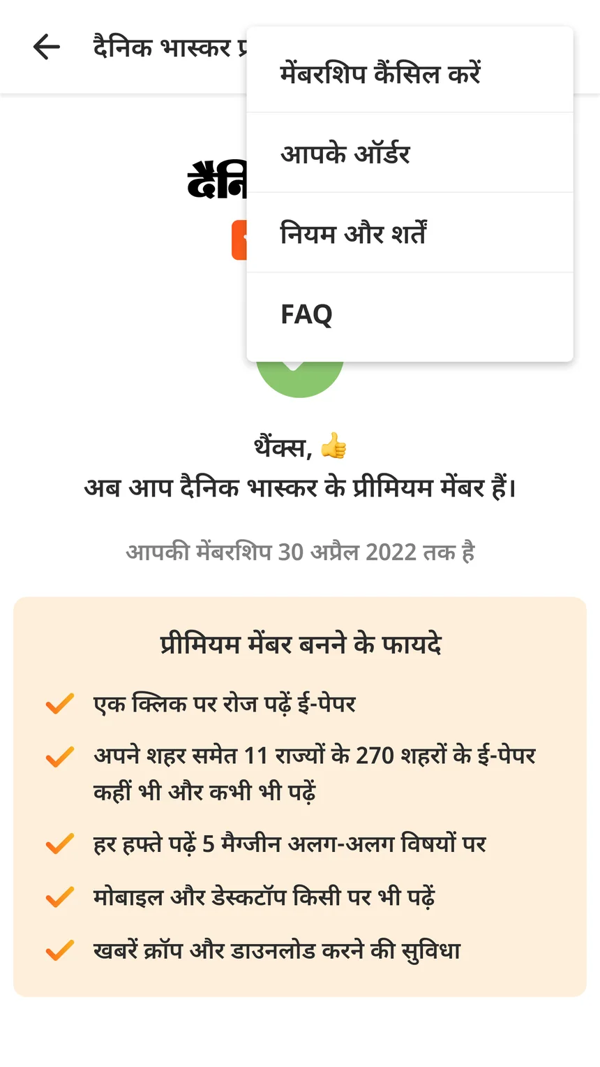
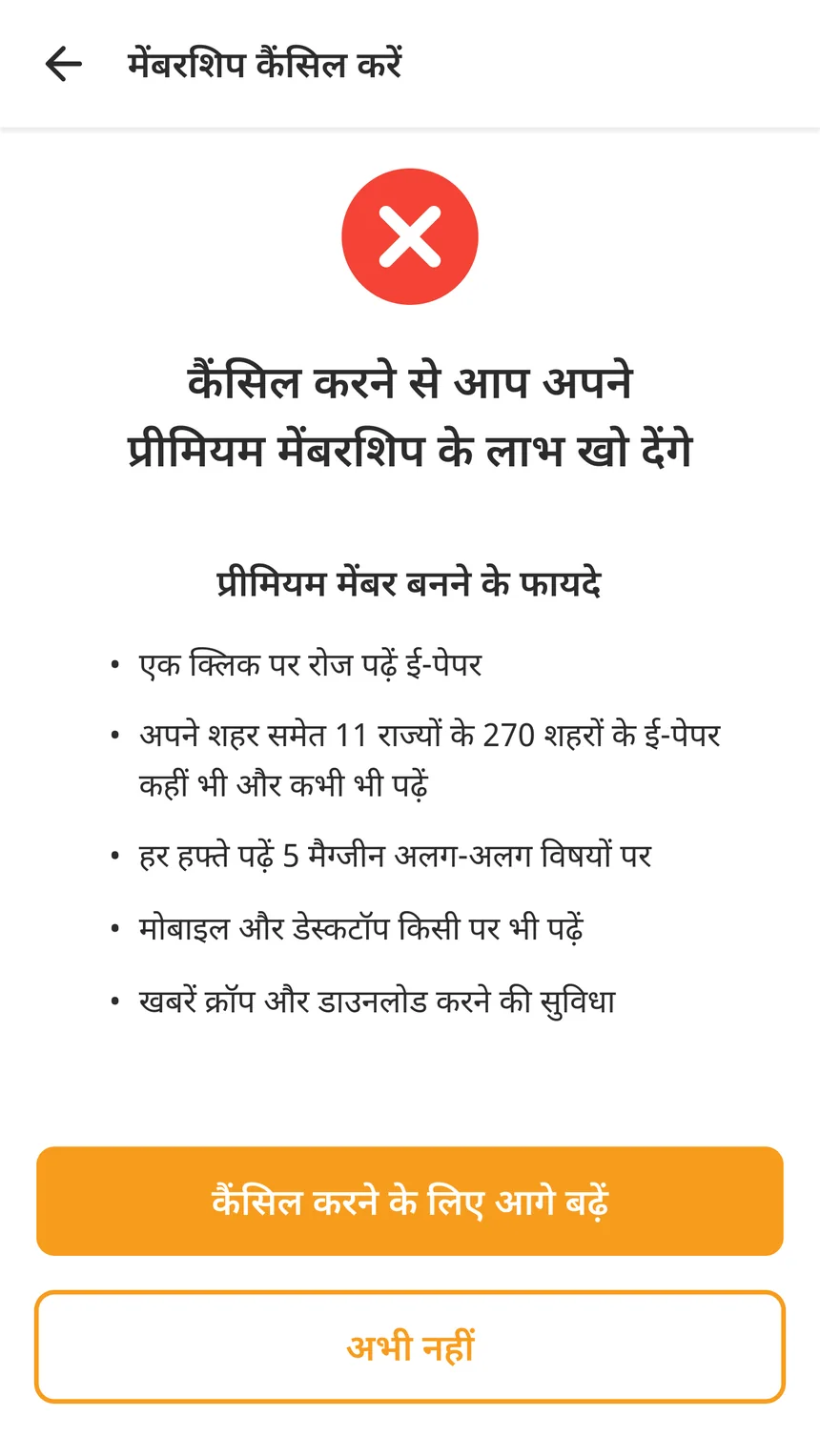
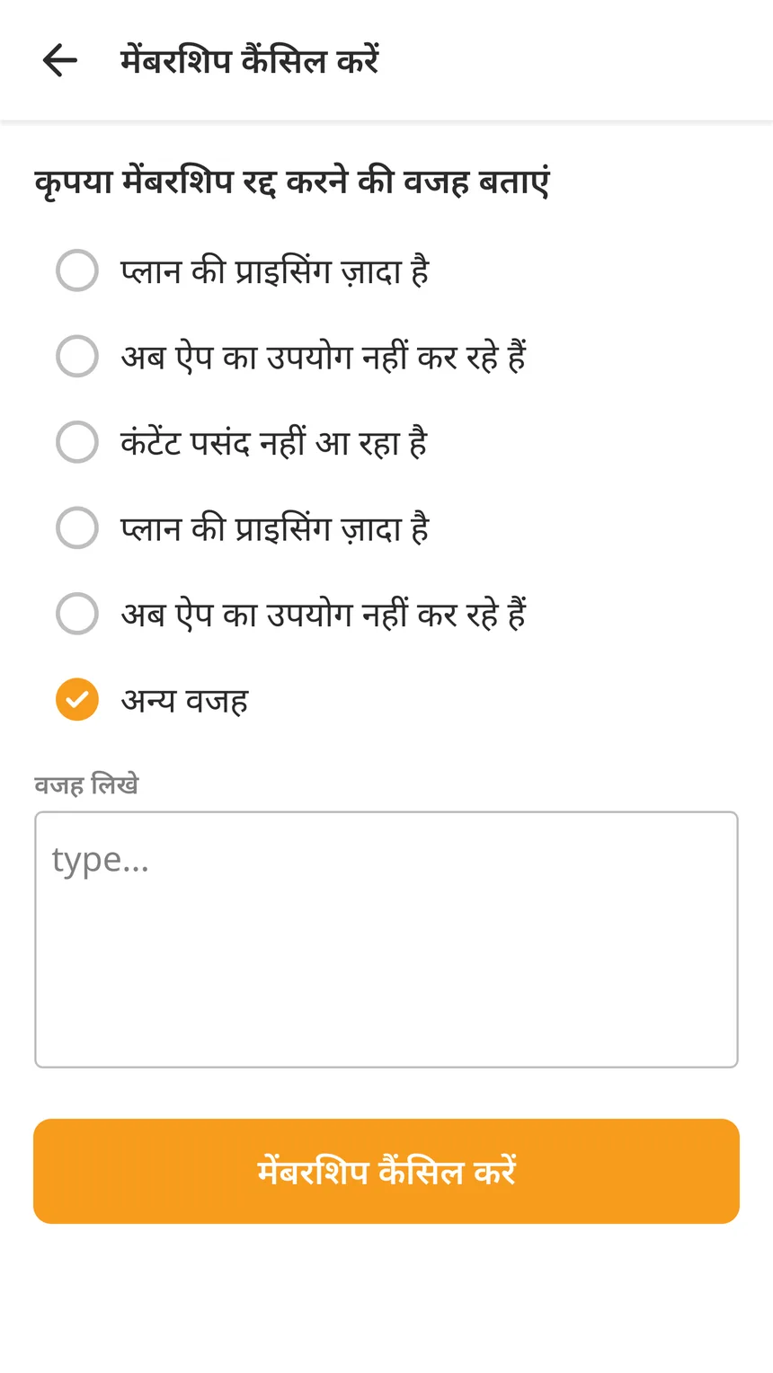
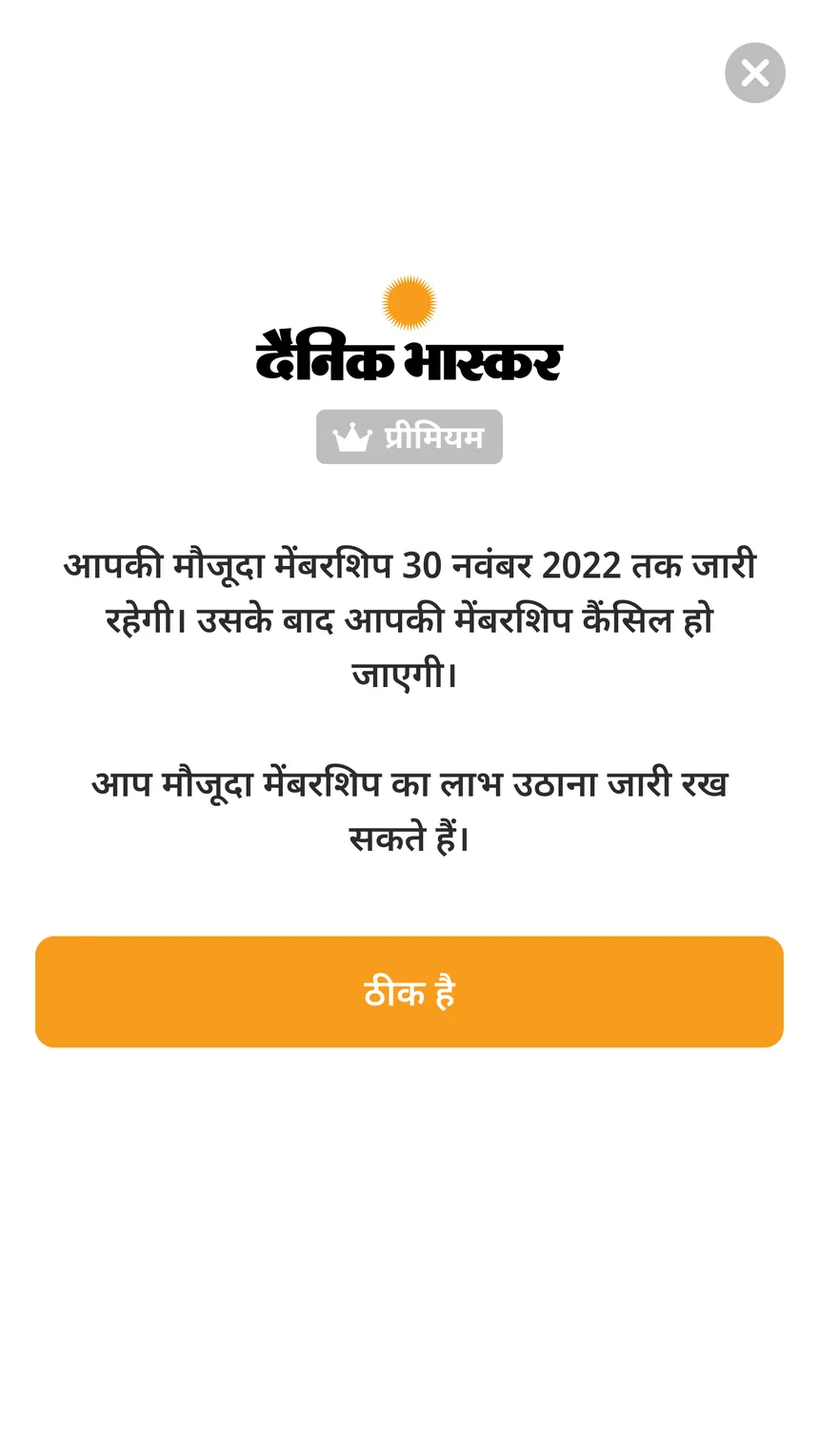
If autopay is on by default, cancelling must be easy. Cancel is in the membership menu, we ask once if they want to stay, and access continues till the date they paid for. Autopay has been live since late 2022 and has not caused many complaints.
Fewer people paid than expected
By now everything worked. Readers could hit the paywall, buy, renew and cancel. But fewer people were paying than the company expected. Everyone thought the offer was not good enough, so the plan was to add more benefits. A field study was planned in Bhopal to find out what readers wanted.
Field study in Bhopal
We went in small groups. Each group had someone from editorial and a product designer. I was part of it and visited around twenty readers in their homes.
Readers loved Bhaskar
Readers, paying or not, trusted Dainik Bhaskar a lot. So the brand and the price were not the problem.
Why we had to go there
Our data showed that few people paid, but not why. The readers we were missing never reached the screens we measured. The only way to learn about them was to meet them. About 20 homes in Bhopal, visited with editorial. Notes only, no photos. The big finding. Many readers did not know paid plans existed. It was not the price. They had just never seen the plans.
So our job was not to convince readers. It was to make the plans easy to see.
What we decided next
Read this part
After the trip we went through the findings with the CEO. This note came out of that meeting and guided the next steps.
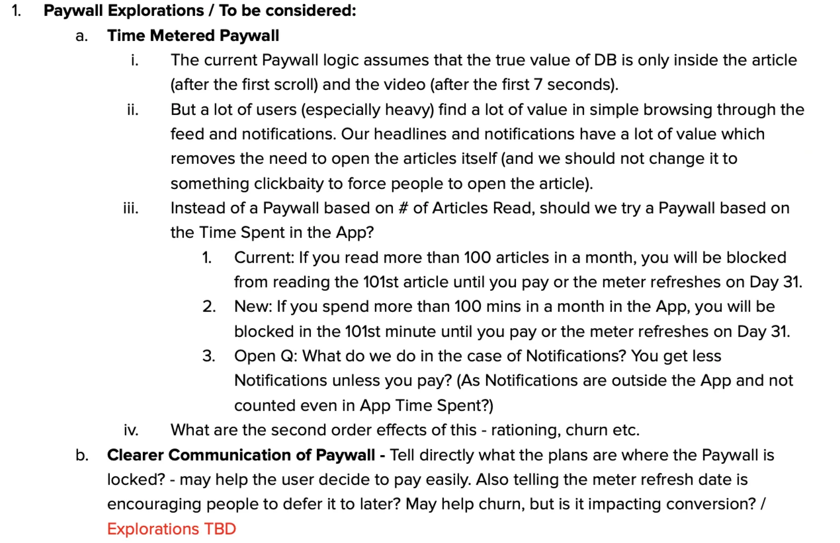
Idea A. Count time, not stories
Heavy readers get most of their news from headlines and notifications without opening stories, so they rarely hit the paywall. The idea was to count time in the app instead. But notifications are outside the app, so they still would not count. It could also cause other problems.
I explored it and we dropped it. It felt too complicated for our readers. That was a gut call, not a tested one. Looking back, I would test it first.
Idea B. Show the plans where readers hit the paywall
This is the one we built. If readers don't know plans exist, show them where readers most want to keep reading.
One doubt
The CEO asked if showing the date when free reading comes back makes people wait instead of paying. We tested this later.
Testing the new paywall
Read this part
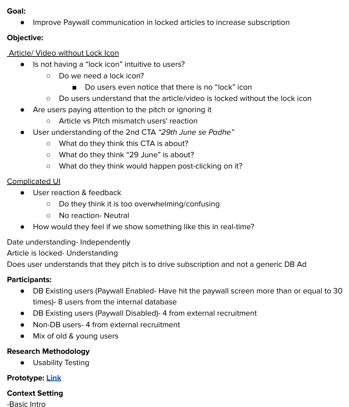
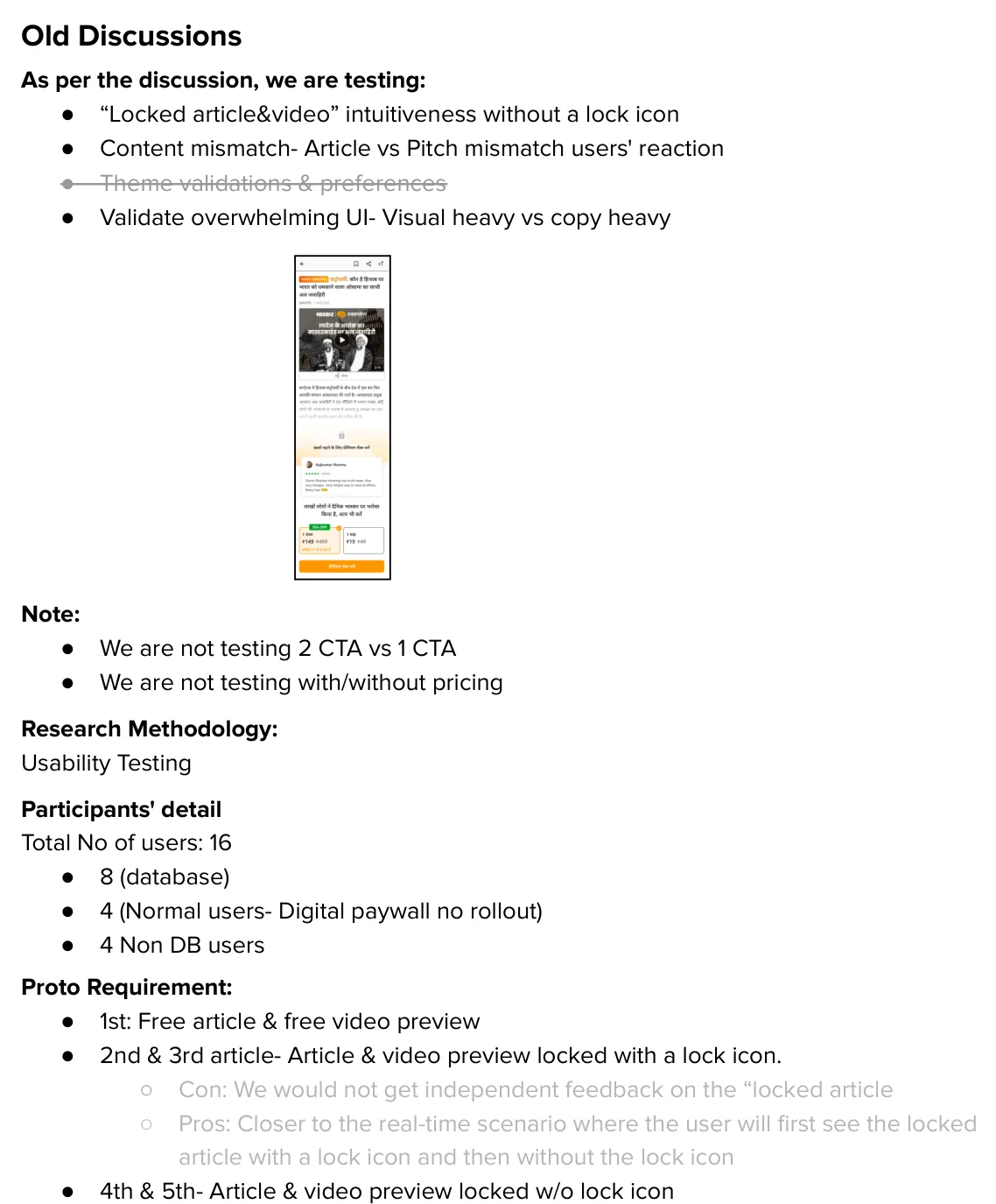
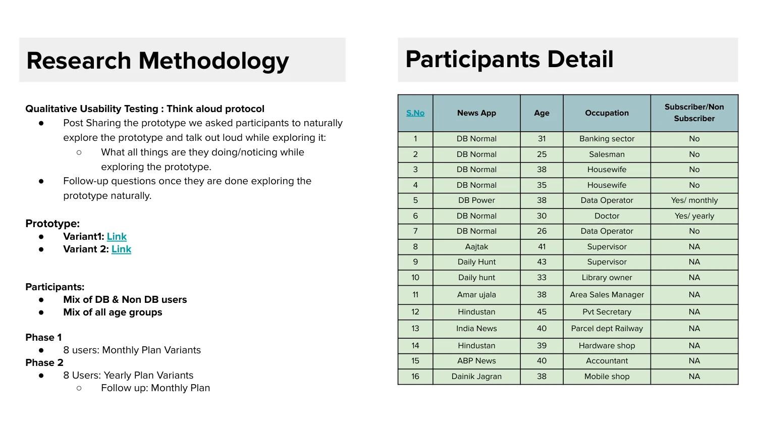
Before the redesign, we tested if readers understood the new paywall. 16 people took part. 8 readers who often hit the paywall, 4 existing users and 4 people who don't use Bhaskar. They used the prototype and said their thoughts out loud.
How the prototype worked
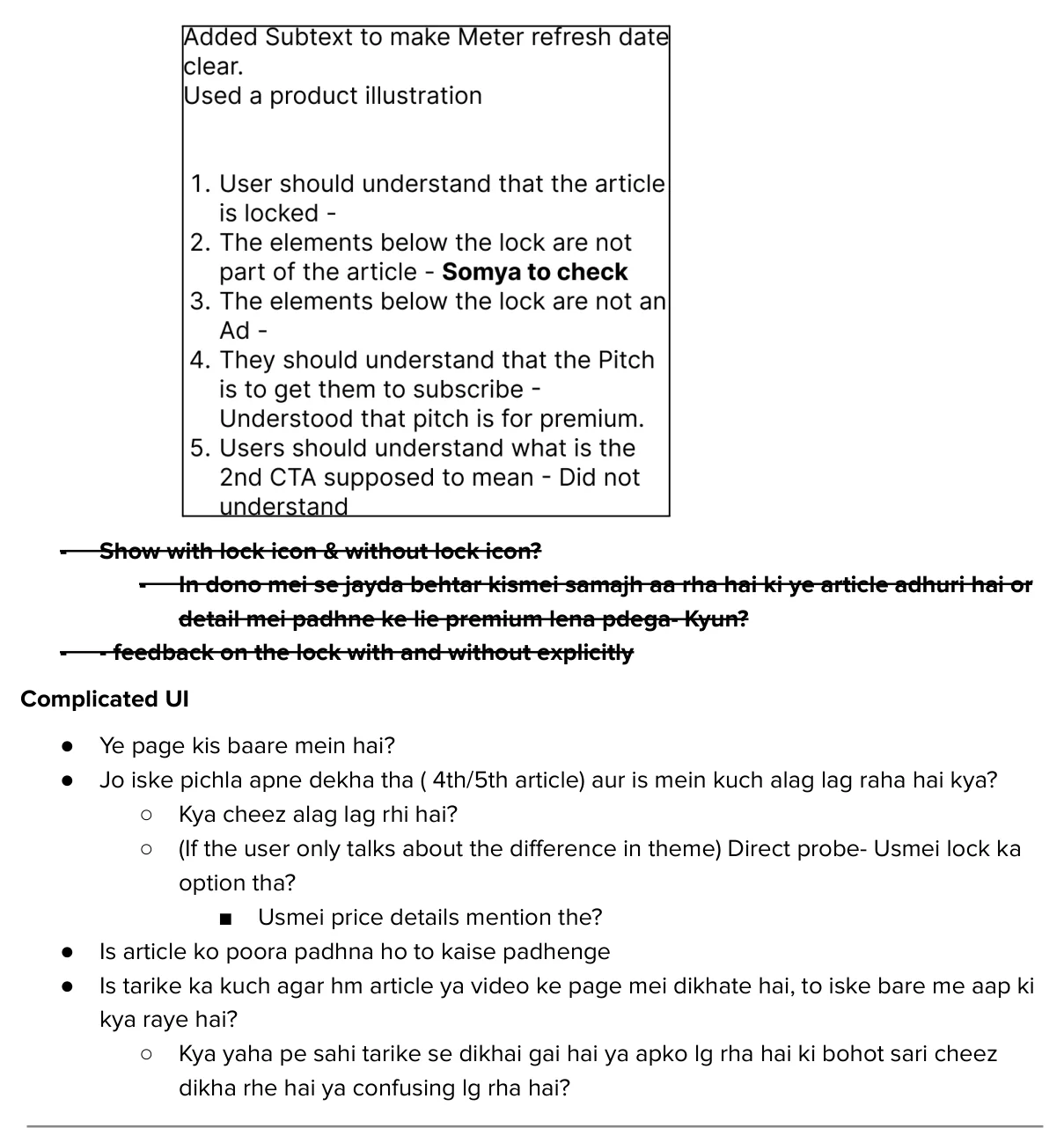
Some stories had a lock icon and some did not, to see if readers still understood. On some, the message didn't match the story, to see if anyone noticed.
What we found
Readers understood the paywall was asking them to subscribe. This mattered most, and it worked.
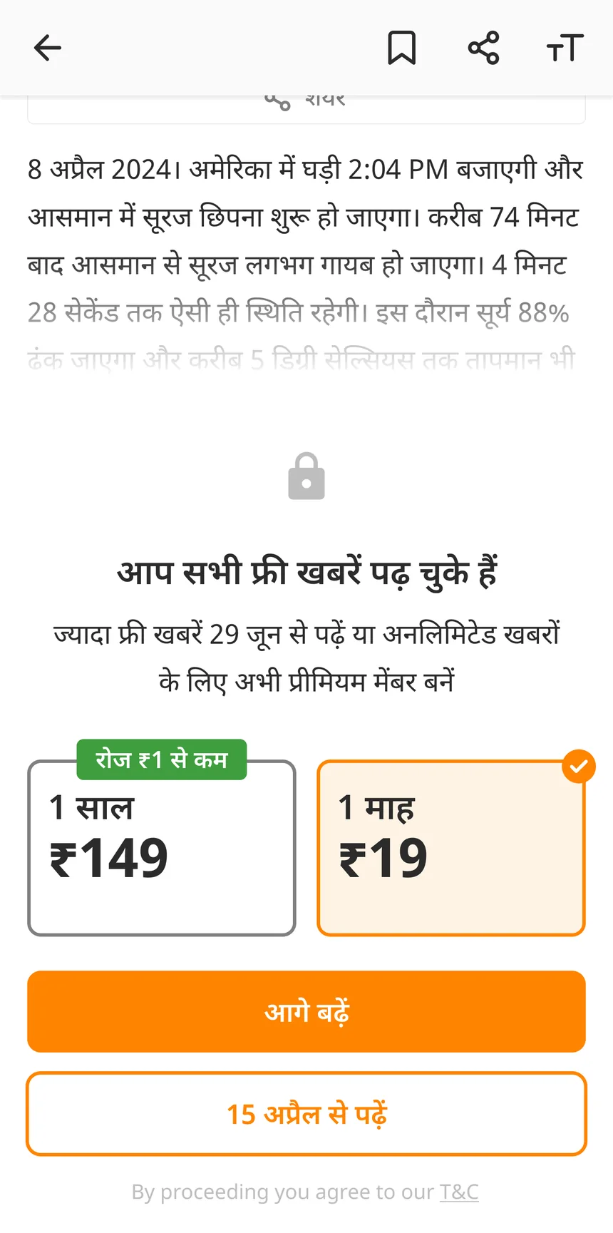
Readers didn't understand the second button, “29 June se padhein”, which shows when free reading comes back.
The CEO wanted to remove the date. The PM kept it, because readers who know the lock is temporary are less likely to leave. It was the PM's call. The date is still on the paywall today.
Picking the message
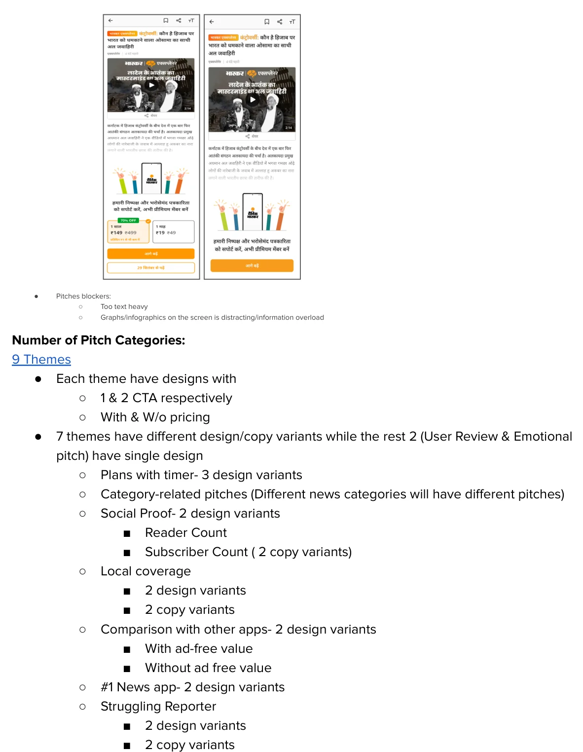
We tried nine messages and wrote down why we dropped each one, like “Too much info” or “Might seem like a fake review”.
The new paywall
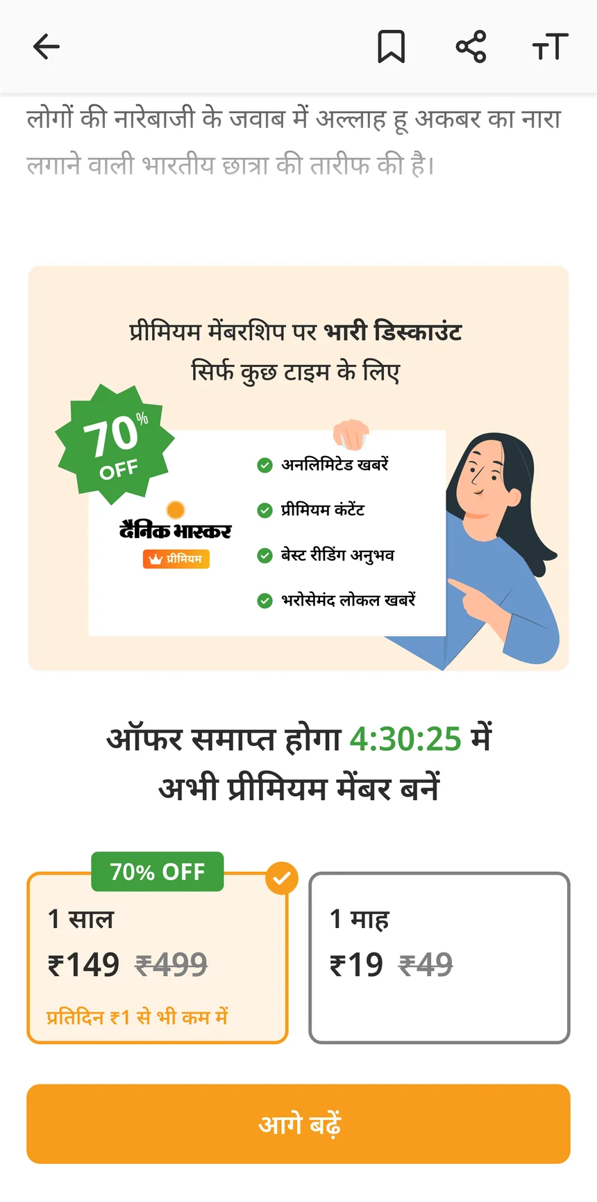
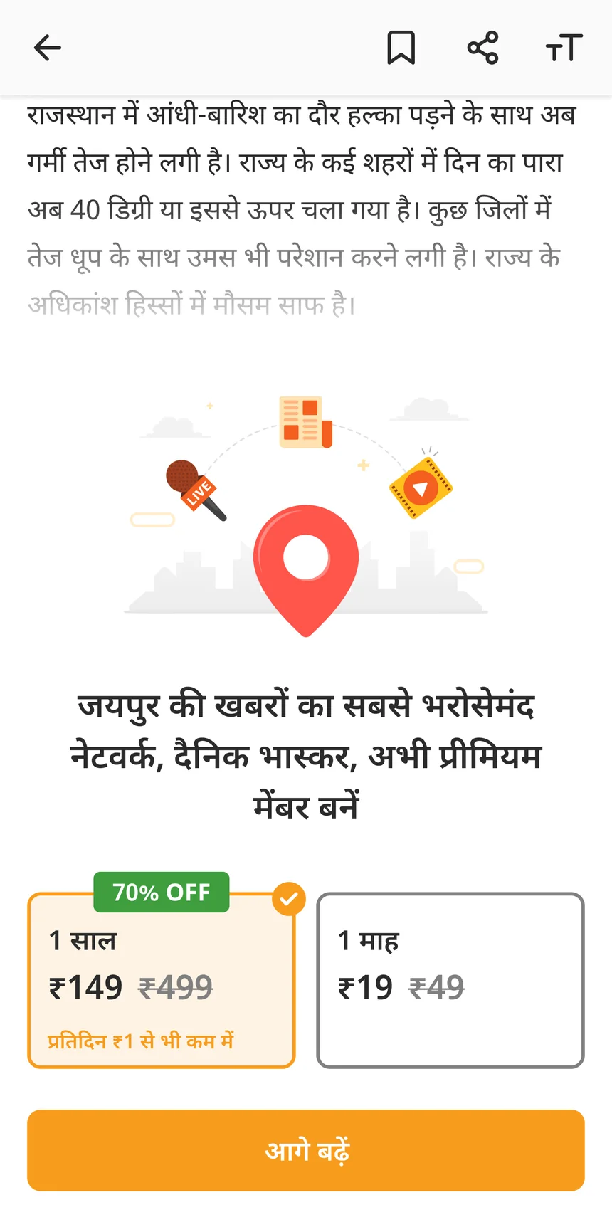
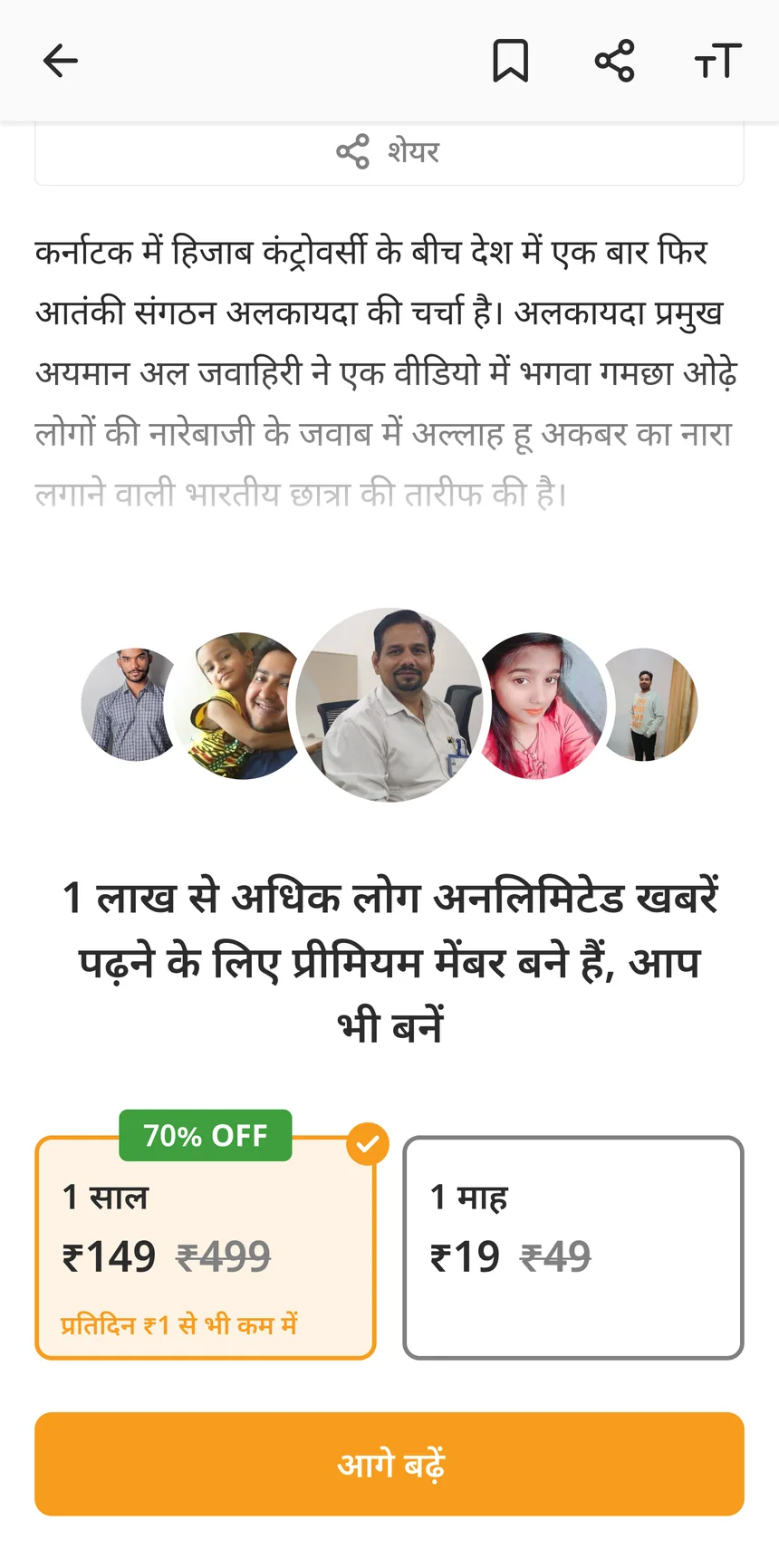
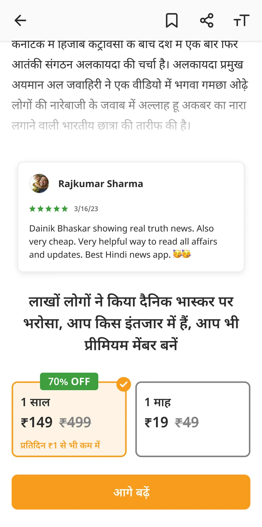
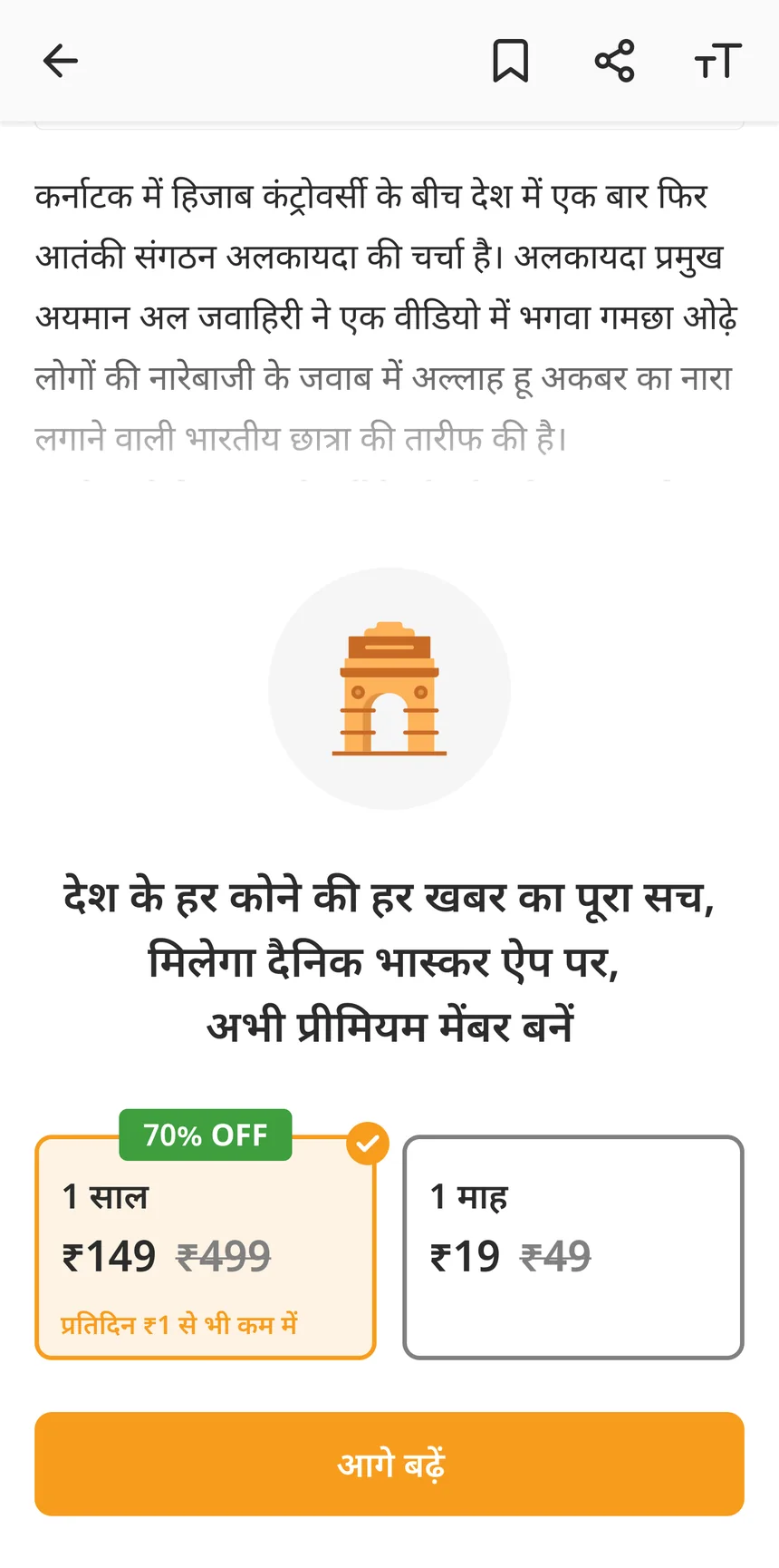
We tested five paywalls that tried to convince readers, and one plain paywall. A countdown timer. A real Play Store review. Over one lakh members. Trust in your city. Trust across India.
The plain one won
Readers already trusted Bhaskar, so they didn't need convincing. They just needed to see that plans existed. The plain paywall beat all five. It also cut a step. Before, readers went from the paywall to a plan page, then to checkout. Now the plans sit on the paywall itself, so readers pick a plan and go straight to checkout.
about six months after launch
stayed the same, so more readers at checkout meant more members
the plain one beat all five
Intro offers
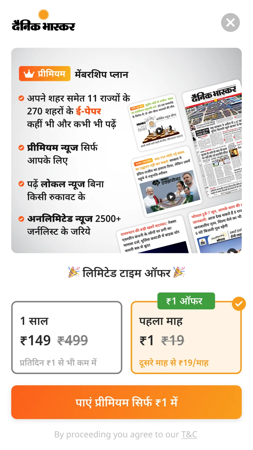
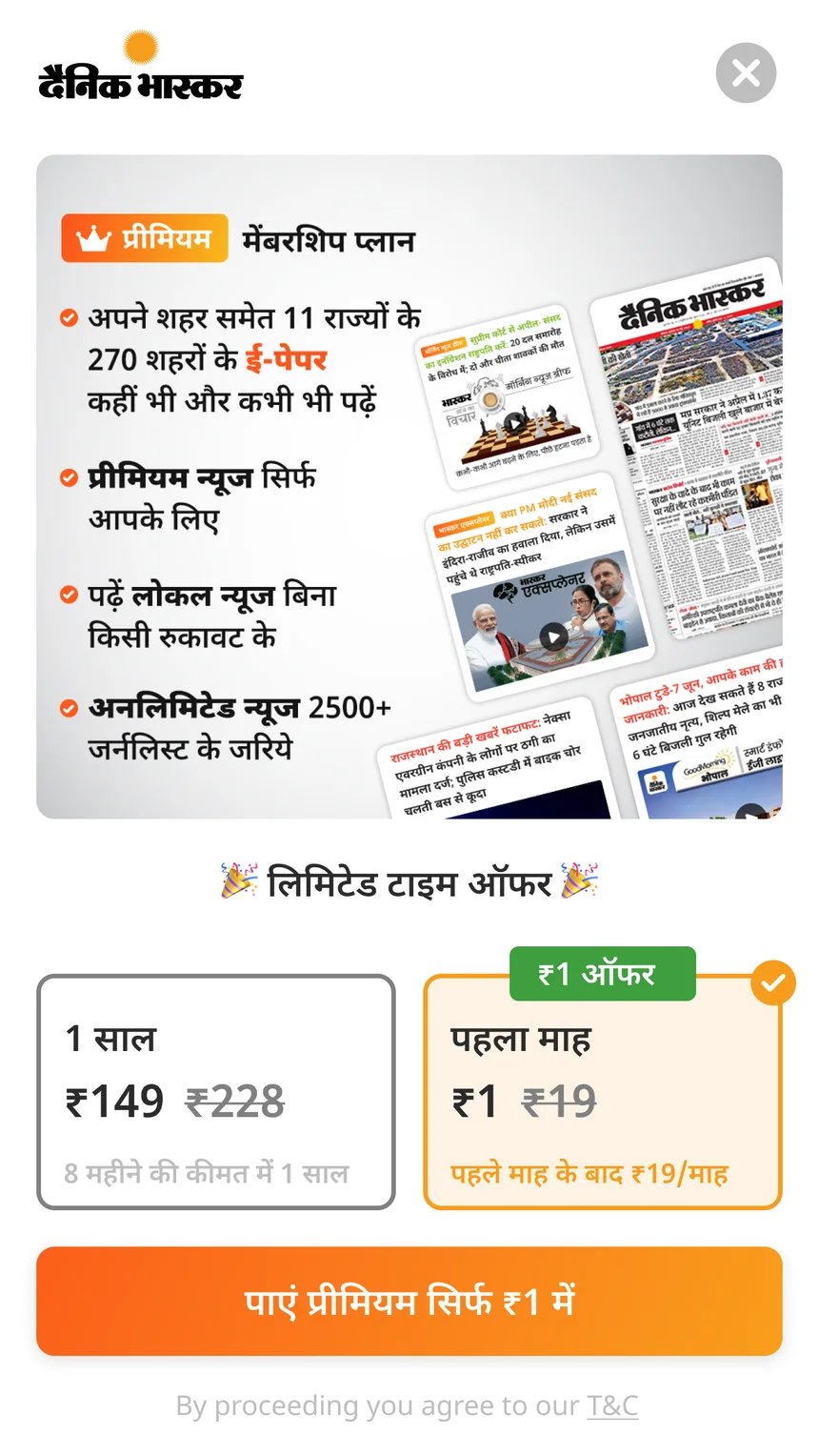
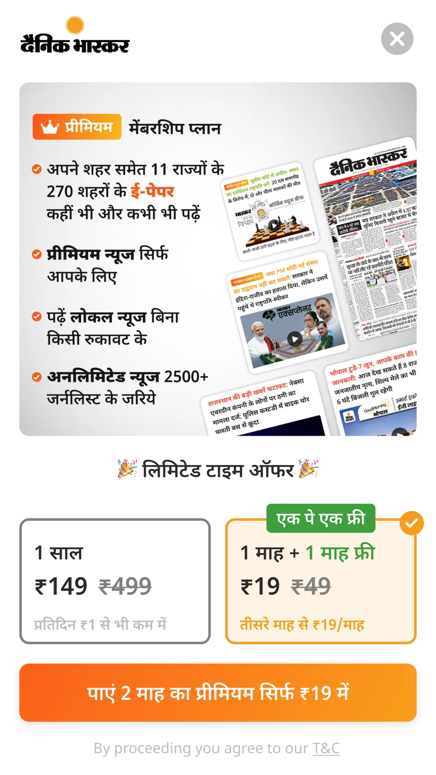
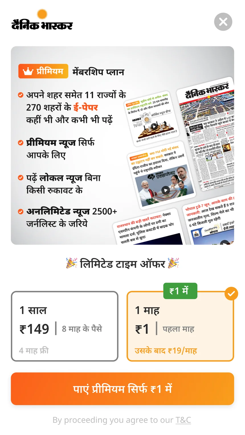
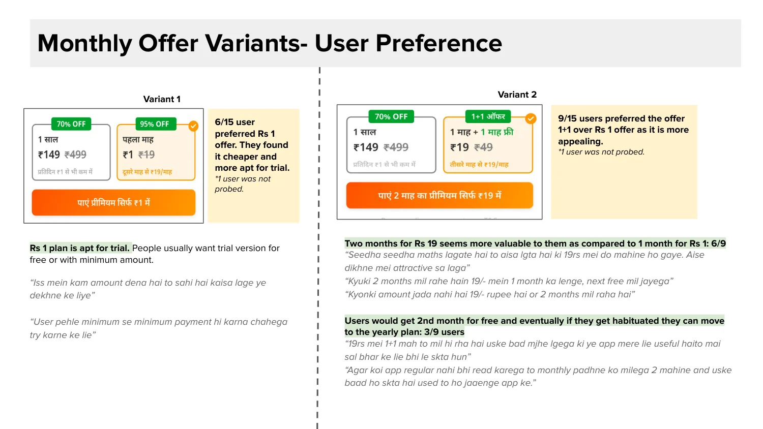
We also asked, what if the first month cost almost nothing? Then trying it is an easy decision. We tested four offers with 16 people, like bankers, housewives, a doctor and shop owners. Some read Bhaskar, some read other news apps.
Three offers we dropped
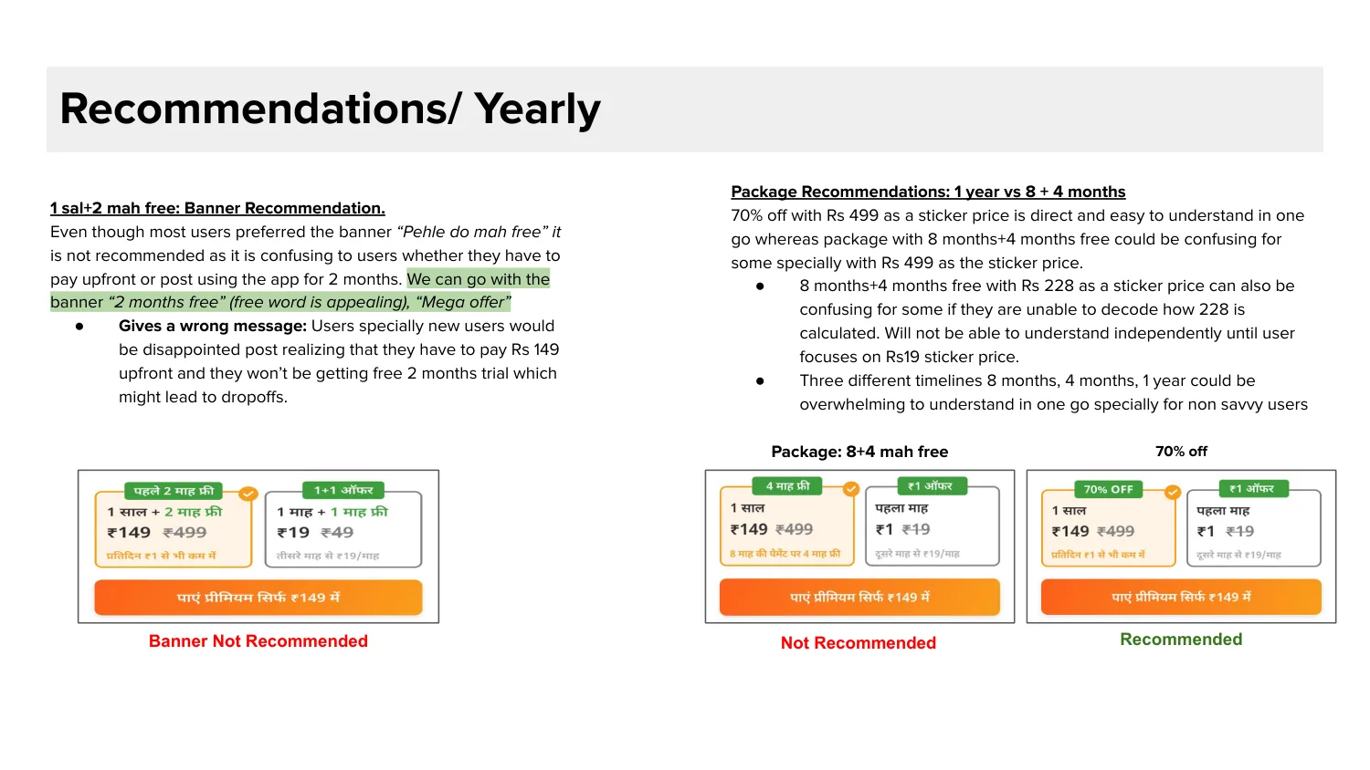
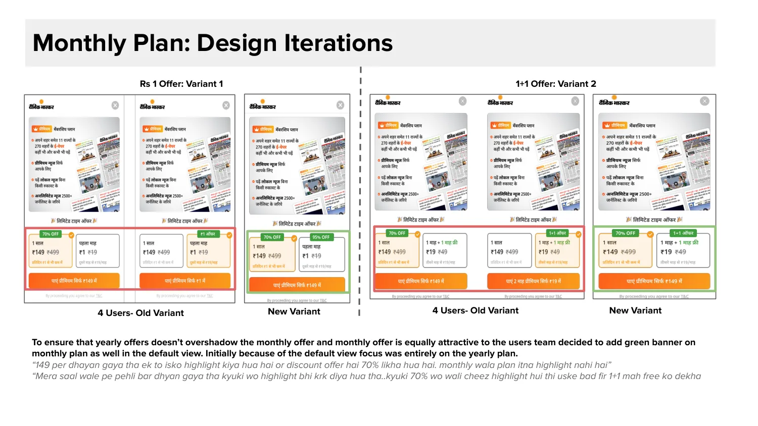
95% off. Readers liked it, but it made the yearly plan's 70% off look weak. We didn't want to hurt our best plan.
8+4 package. Too confusing, with three time periods in one card. One reader said just show a year for ₹149 instead of ₹499.
“First two months free”. Most people liked it, but they couldn't tell if they pay now or later. That would confuse them at payment.
What people like is not always what they understand.
A small layout fix
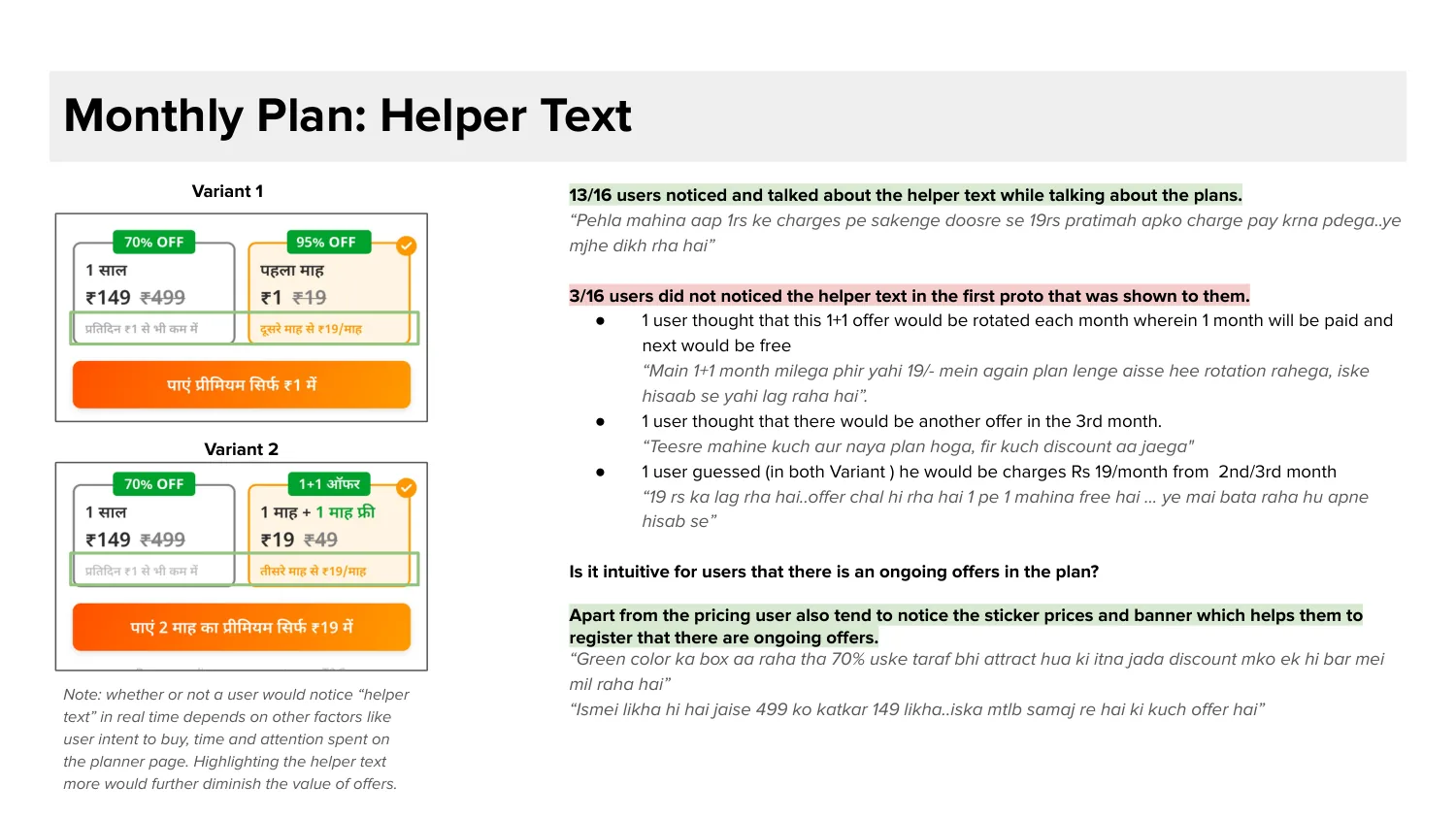
Readers only looked at the yearly plan, because only it had a green banner. One reader said, “Monthly wala plan itna highlight nahi hai.” So the monthly plan got a banner too. Now readers look at both.
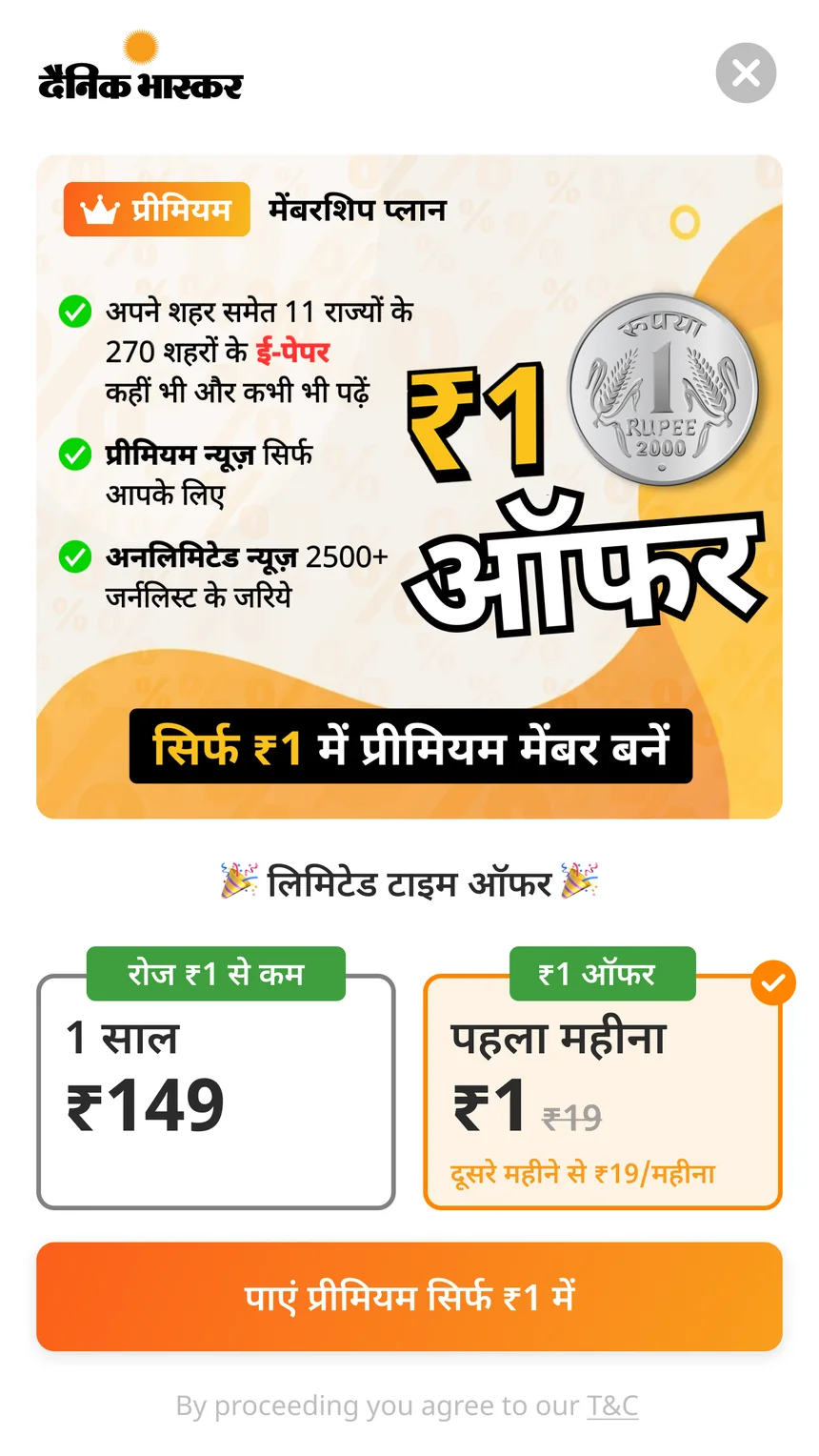
₹1 offer vs normal plans, in an A/B test
Bhaskar readers and readers of other news apps
95% off, 8+4 and “two months free”
Quick checkout and feed placement
Read this part
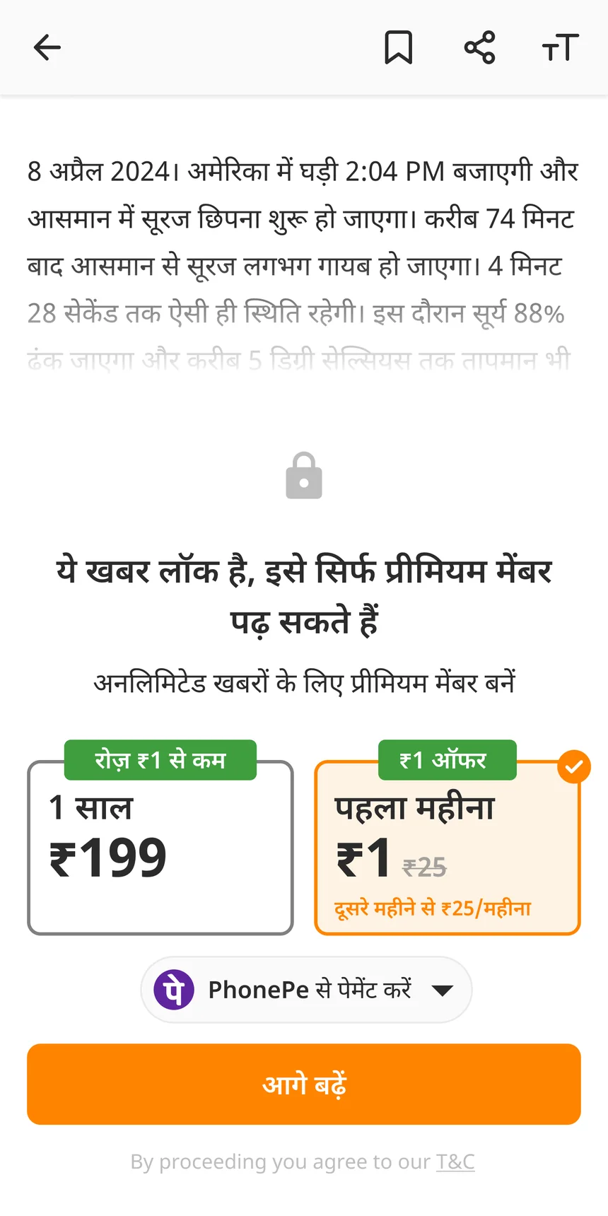
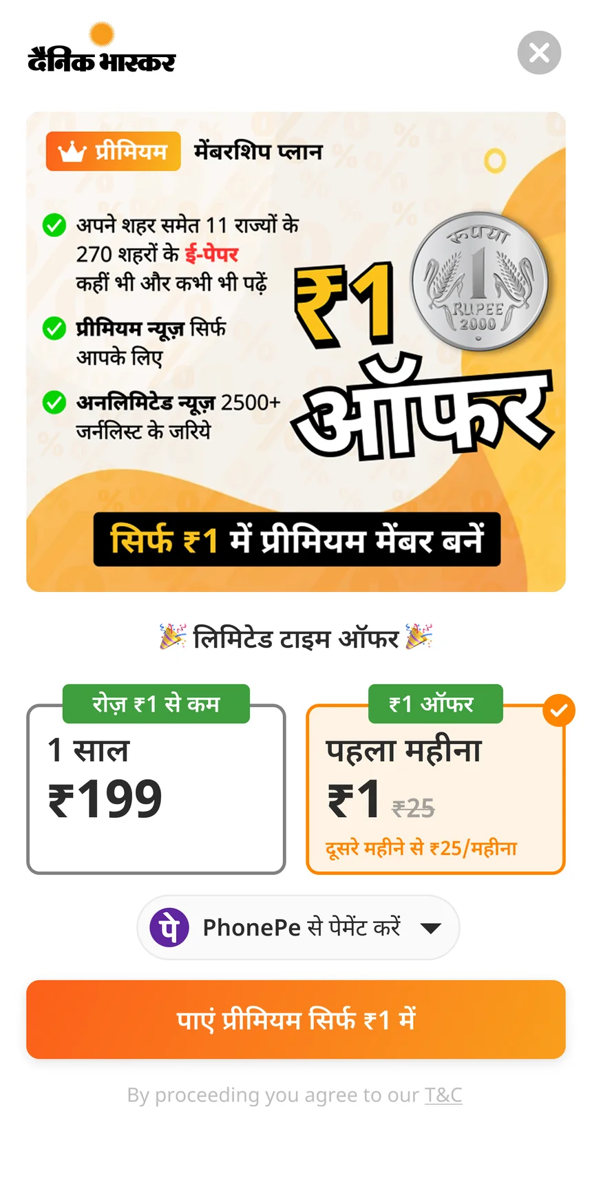
Readers could now find and understand the offer. But buying still took too many screens.
Editorial vs plans in the feed
Editorial didn't want a sales card in their news feed. So I made its position changeable. The desk can move it every day around the news. Editorial keeps control, and the plans still get seen. The desk tools for this have their own case study These shipped recently, so there are no results yet.
Outcome
The 24.7% compares checkout page views in the same funnel, before and after. It is not a controlled test, so festivals or big news may have helped too. But the rise was big and it stayed. Checkout converted at about 4.2% before and after. The redesign didn't make checkout sell better. It sent more readers to it, just like Bhopal told us.
The 19.5% is more reliable, because it came from an A/B test.
What I'd do differently
Measure before designing. Our data on the old funnel was weak, so it was hard to say exactly what caused the change.
Test the idea we dropped. We dropped the time-based paywall on a gut feeling. I would test it first.
Show results in the desk tools. The tools show what is live, but not how it is doing. Numbers there would help the team decide faster.