Newsroom CMS and internal tools
The desk side of the results on this site. The screens that place the plan card, make and order the story rings, run the news-style widget and target experiments.
Case study 02 • Dainik Bhaskar • 2025 – Sep 2026 • Web CMS
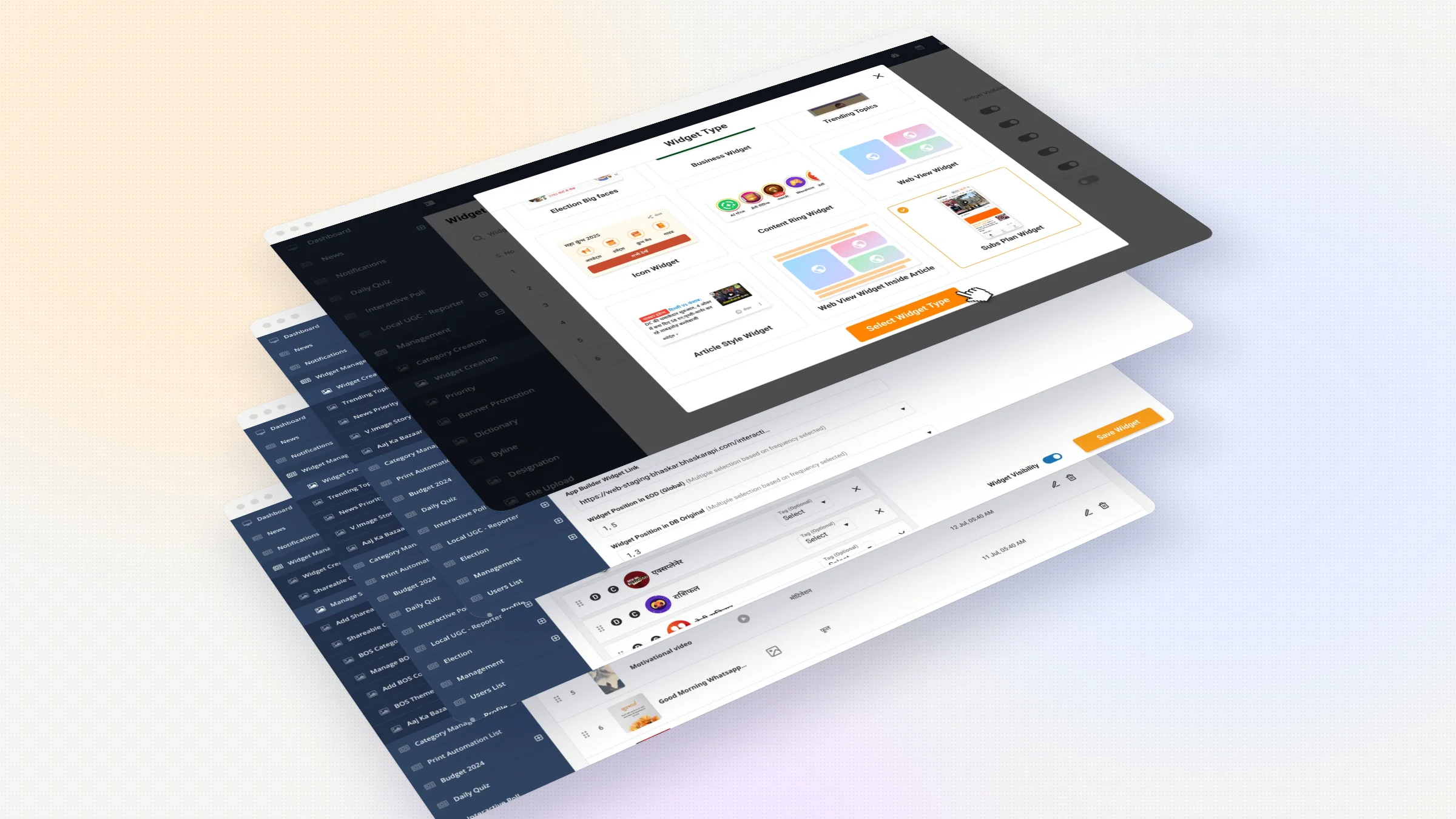
Overview The desk side
Readers see a plan card, a row of story rings, a card that looks like news. Someone at the desk has to make each one, place it and switch it on.
Details
- Product designer. Designed the CMS screens for the reader features I built.
- role
- Feed widgets · Plan card · Story rings · Experiments · Shareables
- scope
- 2025 – Sep 2026
- timeline
- Web CMS
- platform
My role Both sides of a feature
I designed the desk side of every reader feature I built, alongside the reader side.
Problem Features need running
Features had to keep running after launch without a designer. And editorial pushed back on commerce in the home feed, so placement needed control, not a fixed slot.
Solution One form pattern
One picker for every widget type, one form pattern across all of them, placement the desk controls, experiments set once and reused, and a screen to order thousands of statuses.
Result Run from the desk
Editorial teams across states use these screens every day. Every app experiment since launch has been set up in the builder, with no engineering help. The plan card, story rings and news-style widget all run from here.
Impact
One place for every feed widget
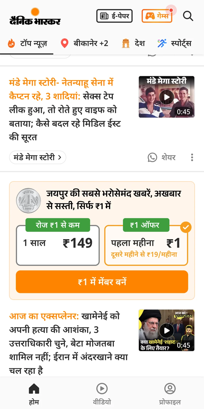
Readers see features. A plan card between stories, a row of story rings, a card that looks like news. Someone at the desk has to make each one, place it and switch it on. I designed that side too, for the features I built. This case study is the desk half of results already on this site.
One picker for every type
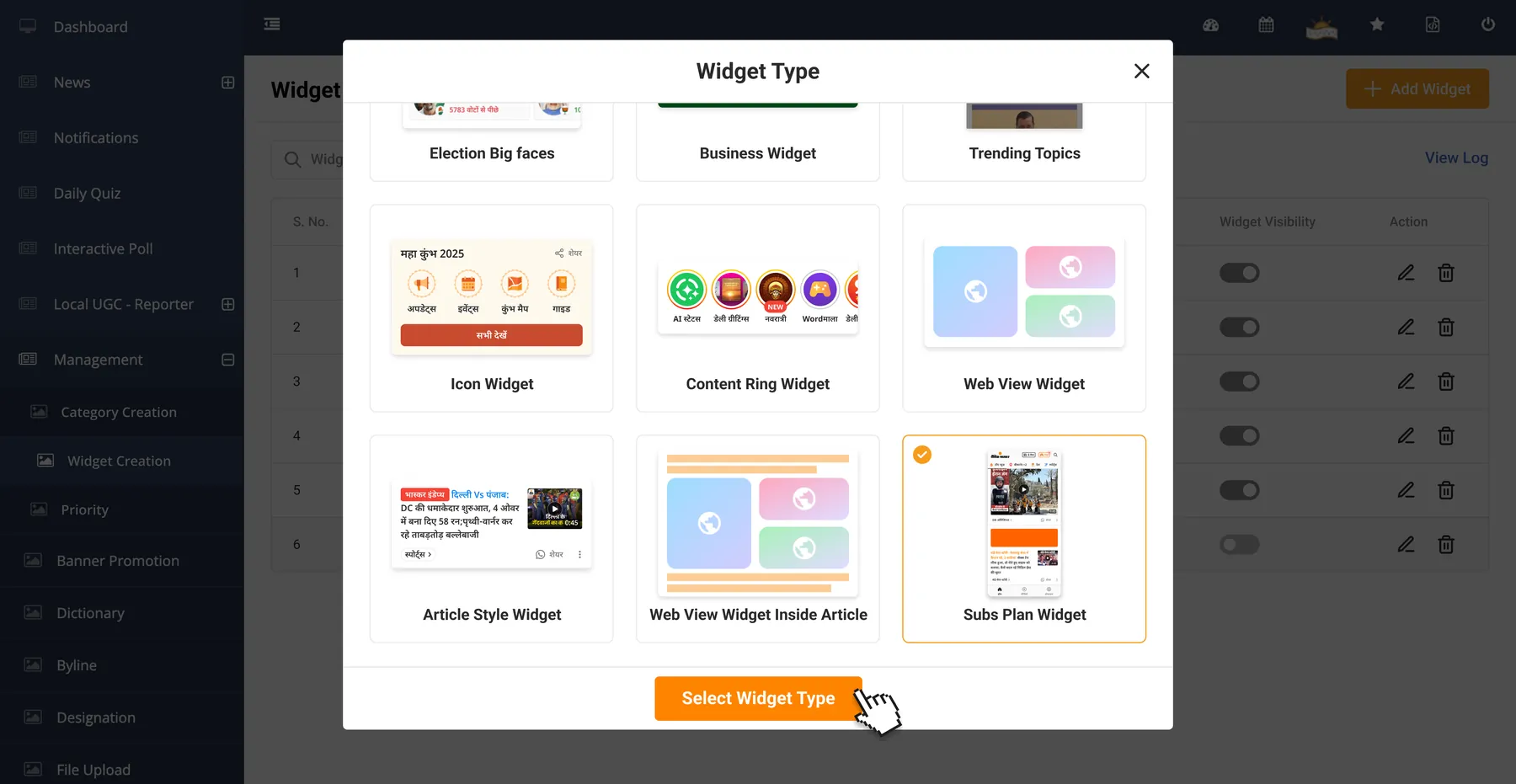
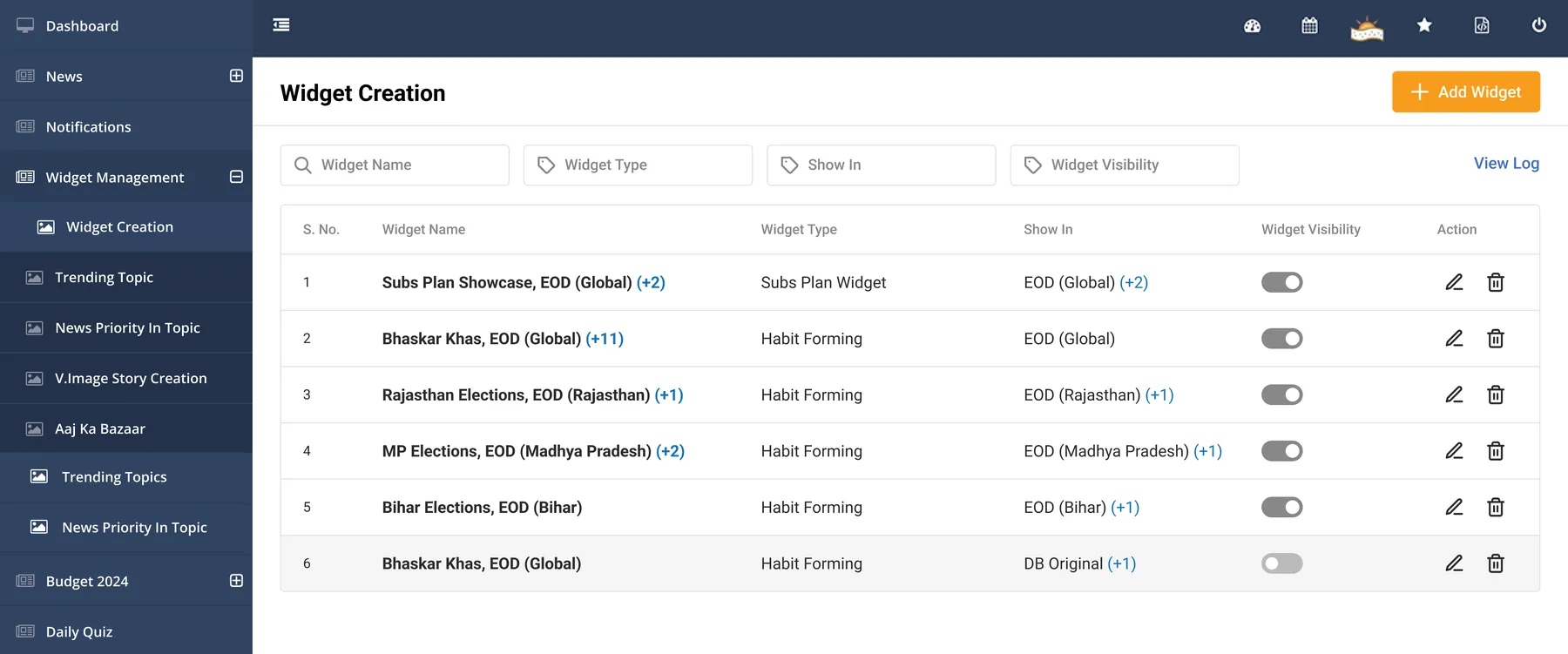
Every home feed widget starts in the same place, Widget Creation. Adding one opens a picker. Each type shows a preview of how it looks in the app. Election, business, trending, icon, content ring, web view, article style and the subscription plan widget. The listing shows every widget with its type, where it shows and a visibility switch.
Placing the plan card
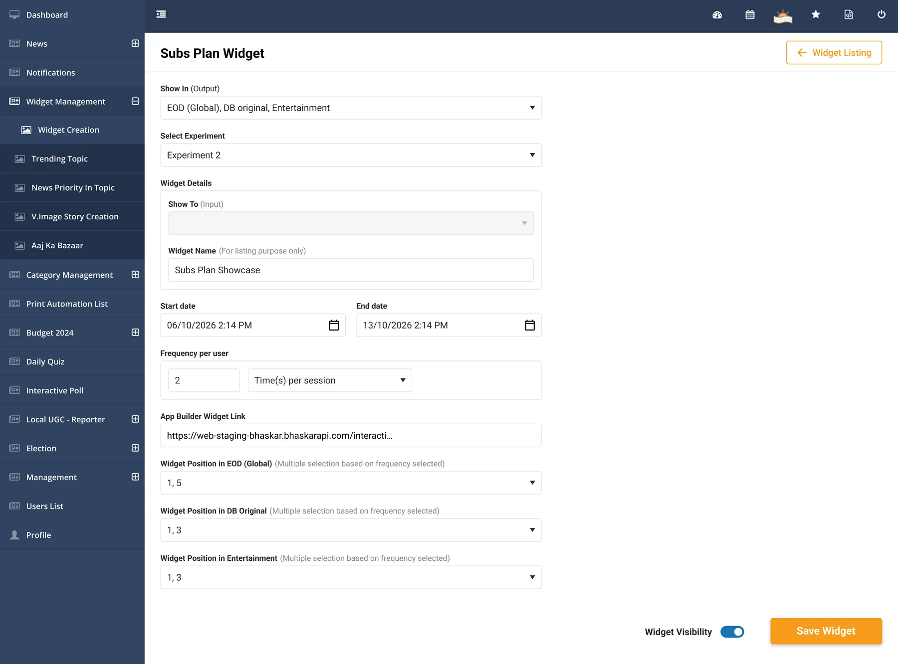
In case study 01 editorial pushed back on a plan card in the home feed. The answer was to make placement configurable, so the card could move around the news agenda. This is the form that does it.
What the desk sets
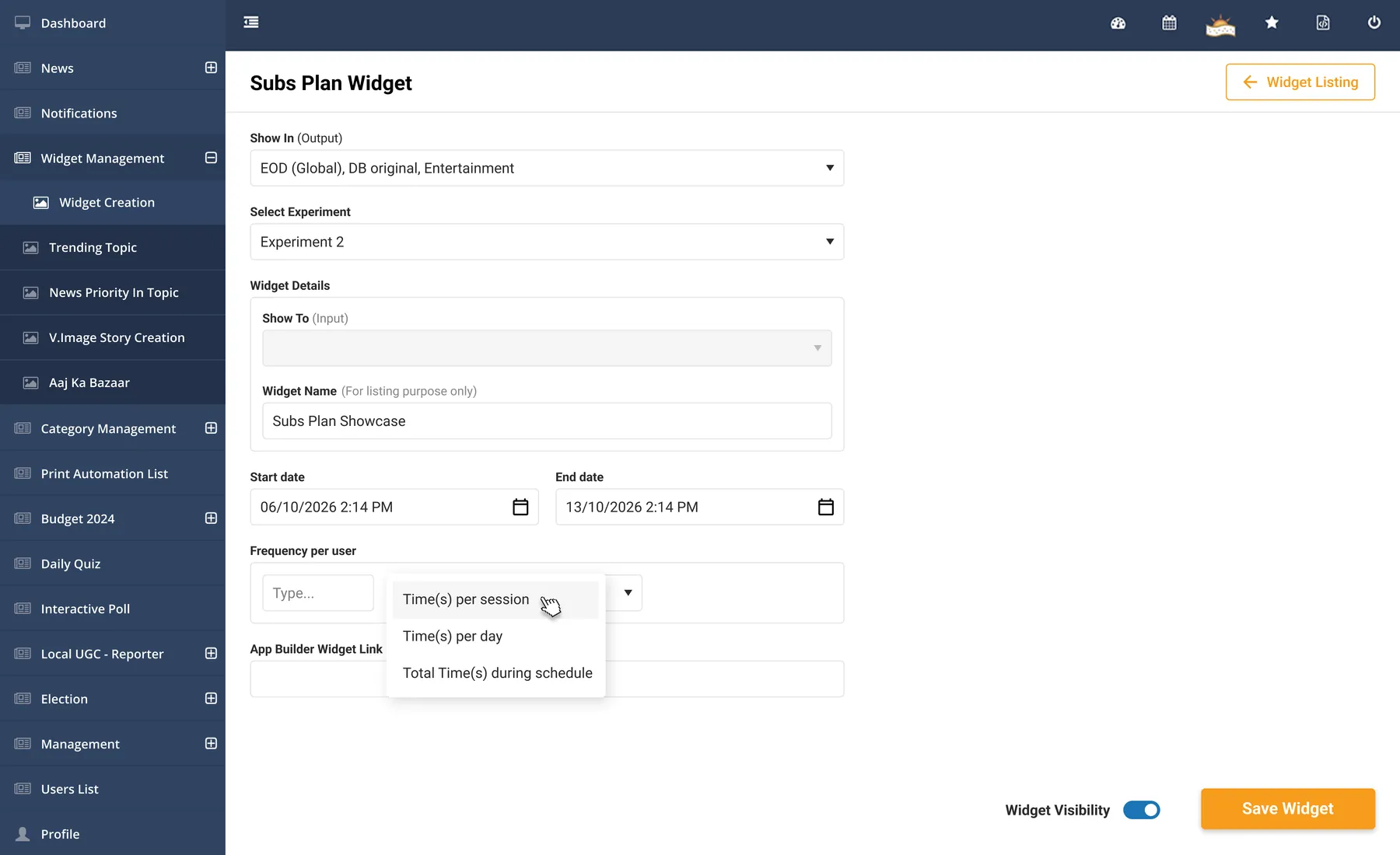
Which feeds the card shows in. A start and end date and time. How often one reader sees it, per session, per day or in total across the run. And its position in each feed it shows in.
Positions follow frequency
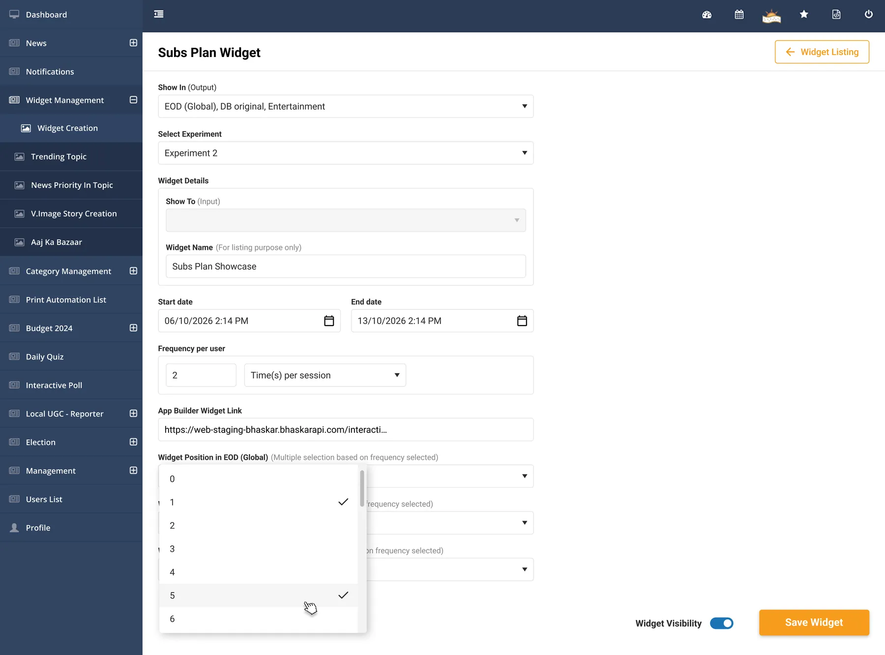
The number of positions matches the frequency. Two times per session means two positions in each feed. Here that is 1 and 5 on the main feed, and 1 and 3 in DB Original and Entertainment. So moving the card, changing its dates or switching it off all happen in this one form.
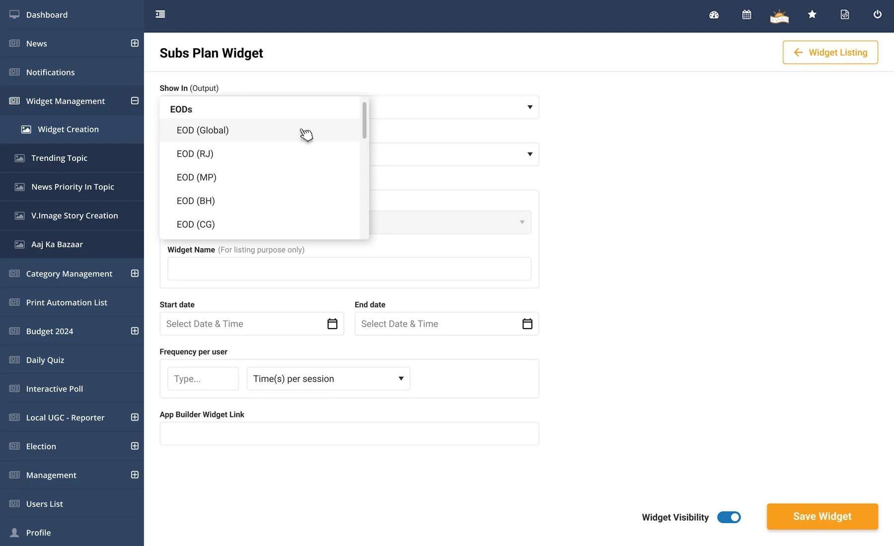
The pickers
Feeds to show in. How often, in three ways. Positions, as many as the frequency allows.
Story rings, made and ordered
Read this part
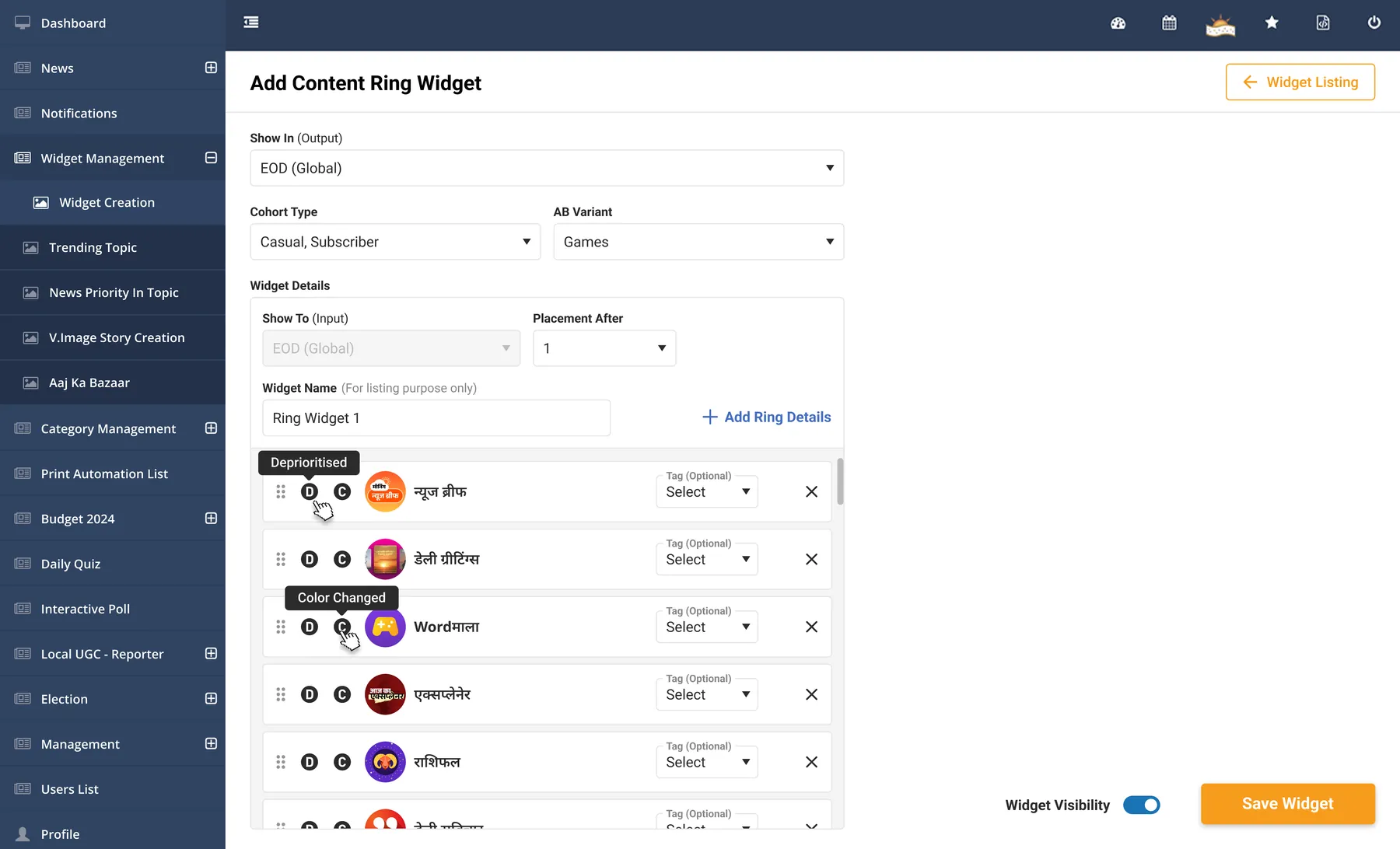
The story rings in case study 03 took click-through from one to two percent to 9%. I designed the tools that run them along with the rings. There are two. One makes a ring. The ring widget decides which rings show and in what order.
Making a ring
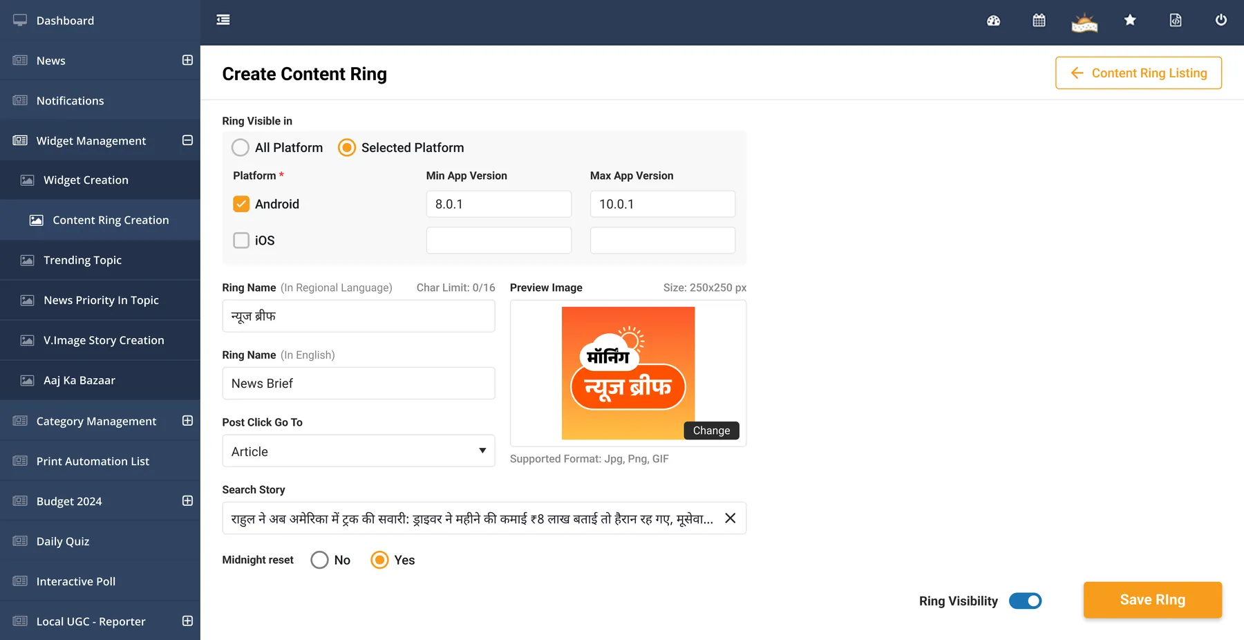
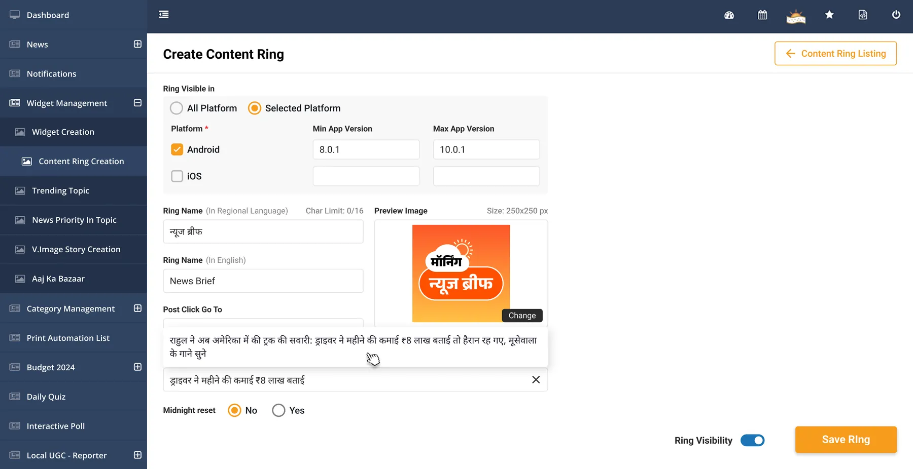
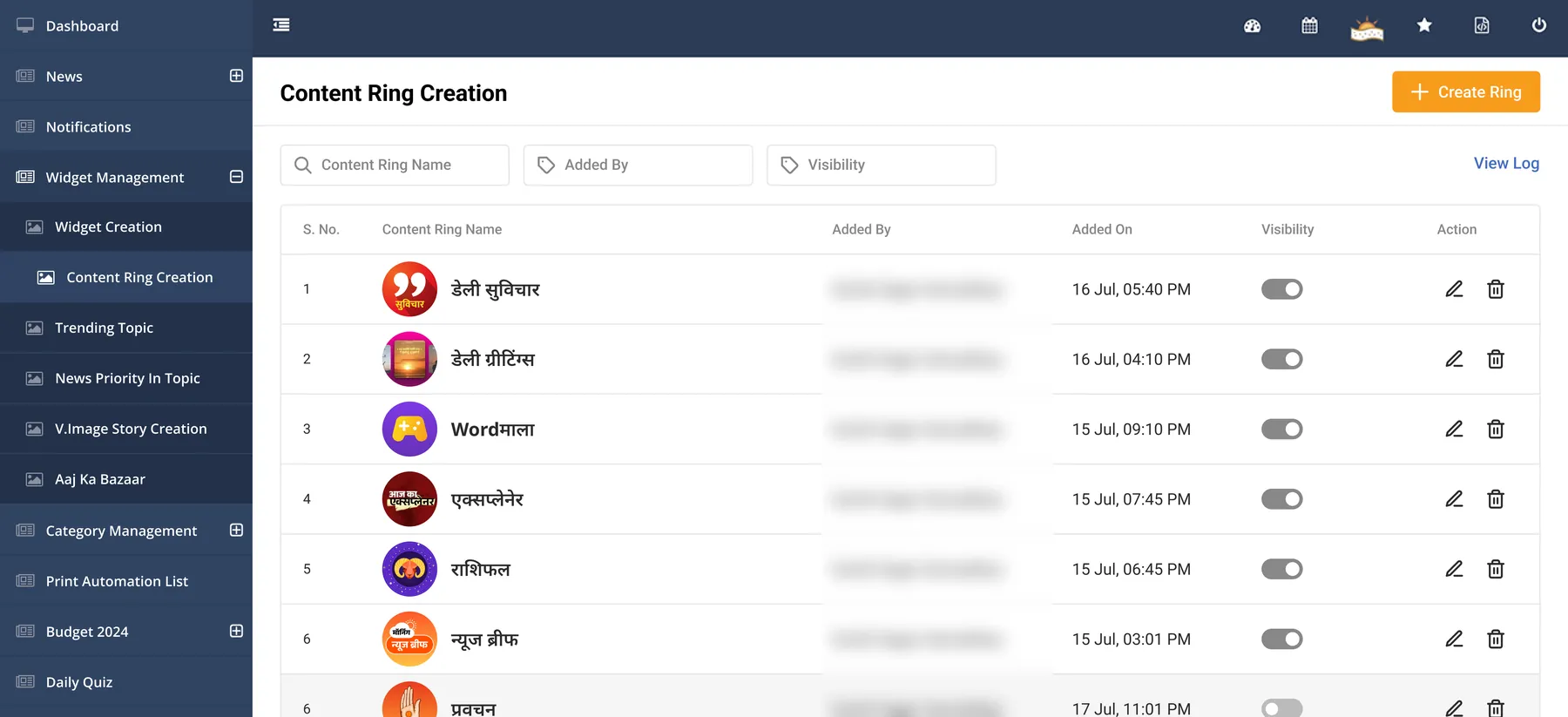
A ring gets a name in Hindi and English, a 250×250 image, and a place a tap goes. An article, a video or a URL. For an article the desk searches by headline, ID or URL. A min and max app version keeps a ring away from app versions that can't open where it goes. Visibility turns a ring off without deleting it, so a ring like a festival one can come back.
Ordering
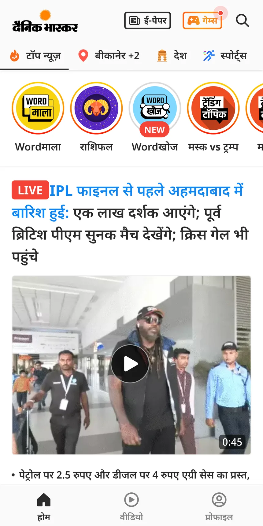
Order lives in the ring widget, not in the ring. The desk drags rings into place and can add a tag to each. When a reader taps a ring, it moves to the back of the row. Midnight reset puts the order back. The listing shows every ring, who added it, when, and whether it is on.
The widget shaped like news
Read this part
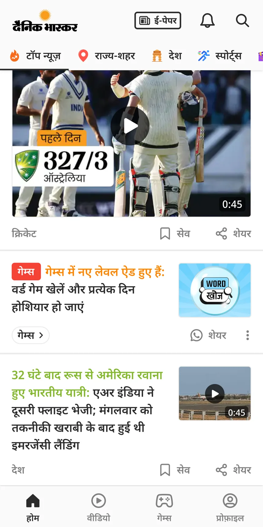
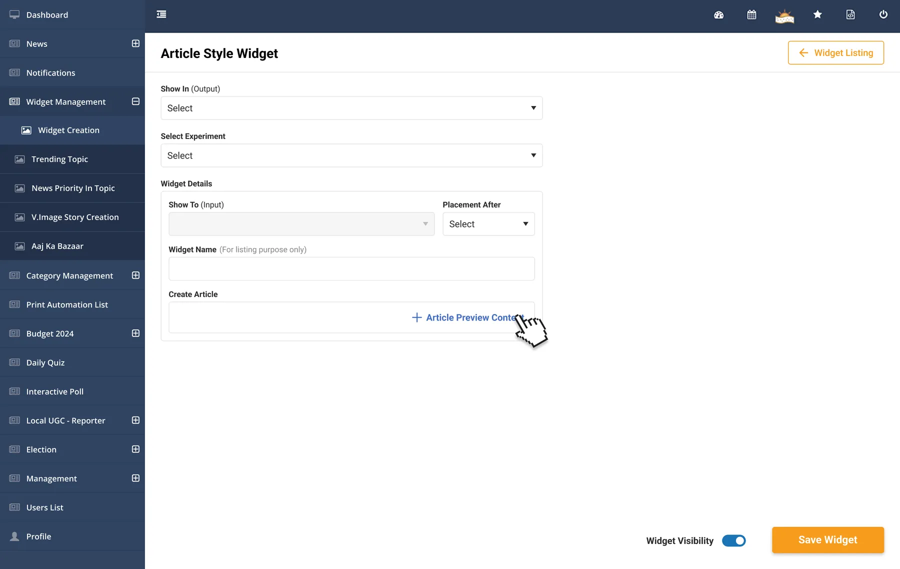
The widget in case study 03 is built exactly like a news preview. It clicks like one, around 25% at the top of the feed. This is its form. The desk picks where it shows, an experiment if it runs in one, the position it sits after, and a name for the listing. Then it adds the article preview content and switches it on. It is the same pattern as the plan card and the rings. Where, for whom, what, then visibility and save.
One experiment, many widgets
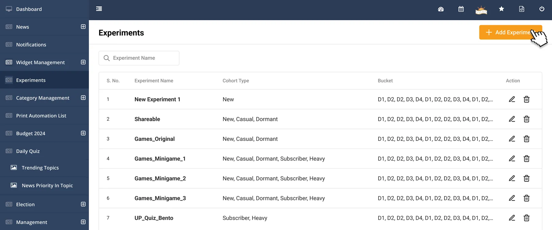
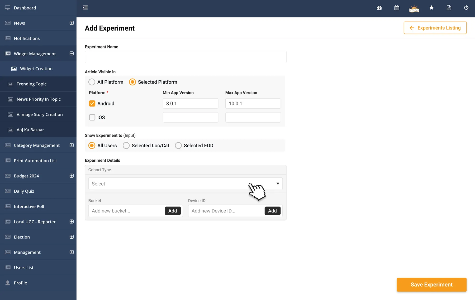
An experiment is made once, in its own screen. Then it is picked from inside any widget. The plan card and the news-style widget both have a Select Experiment field. I kept experiments apart from widgets because one experiment is often needed by many features.
What an experiment sets
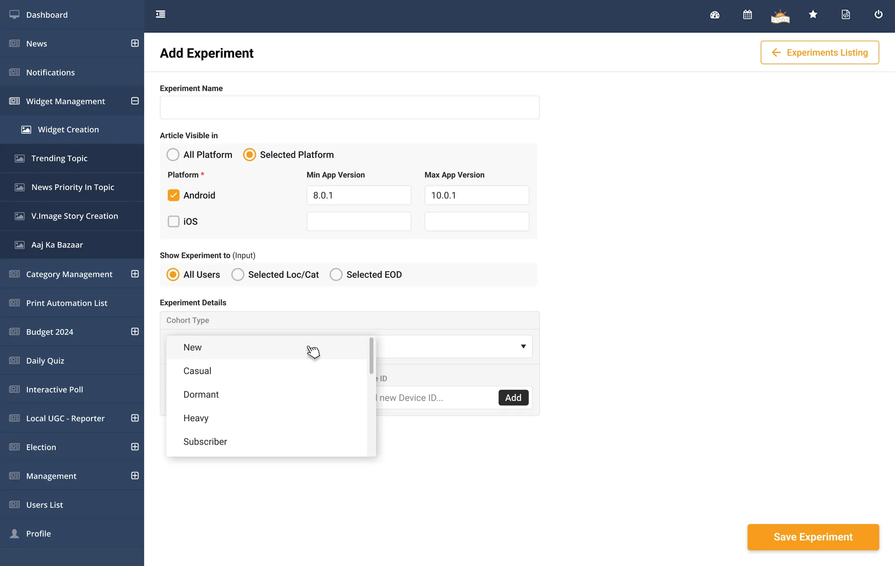
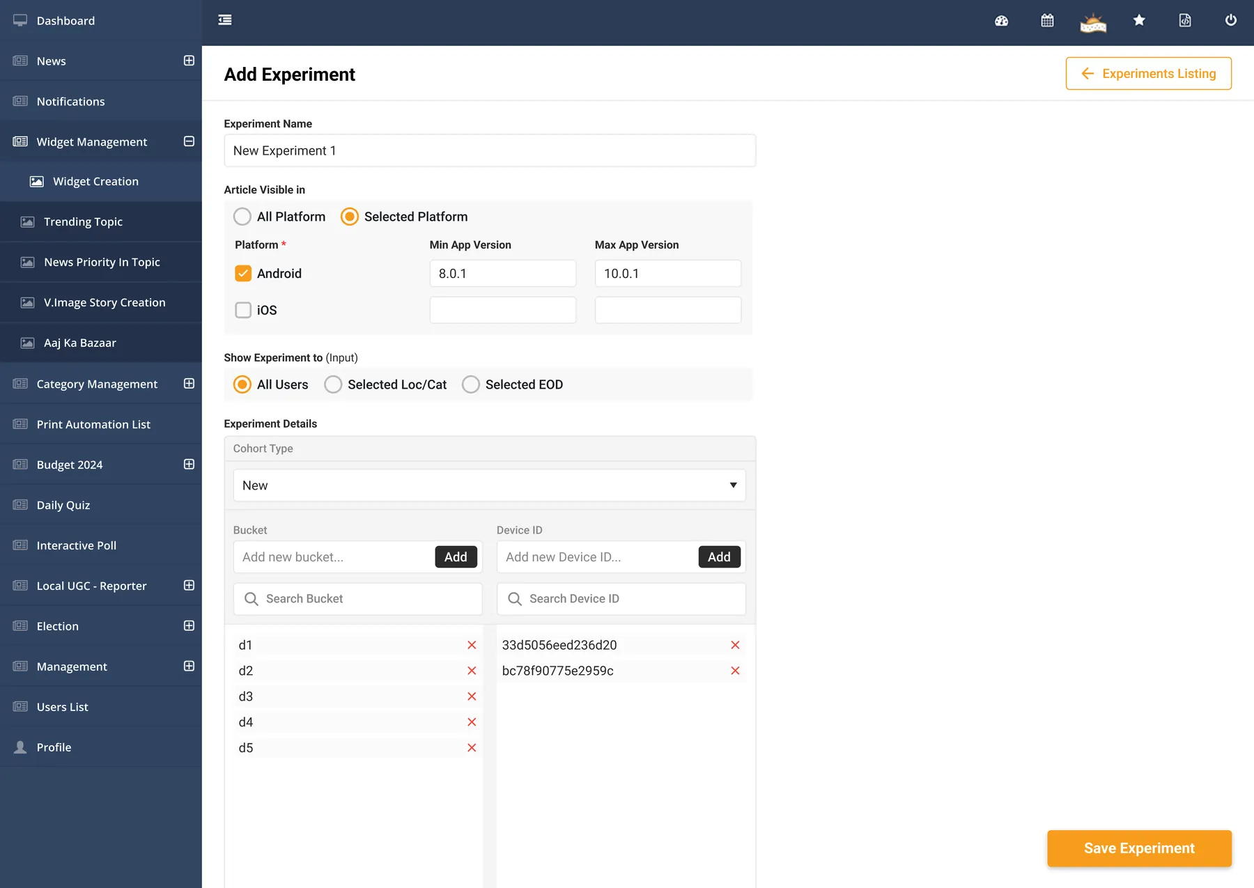
Platform and app versions. All users, or readers in a chosen location or category. A cohort type, New, Casual, Dormant, Heavy or Subscriber. Then buckets and device IDs. Buckets and IDs paste in as a comma-separated list. Each becomes a row that can be searched and removed. No result on this site ran through the builder. The intro offers in case study 01 came before it.
Lists, not one at a time
Type or paste many, add them in one go.
After it goes live
A PM or someone from the editorial team picks the experiment inside a widget and switches it on. From there the widget collects the data. The analytics team owned that data. They tracked each experiment in a tracker and shared the results with the PMs and editors, who decided what stays. My part was the setup side, so people outside tech could run an experiment without asking engineering.
Ordering thousands of statuses
Read this part
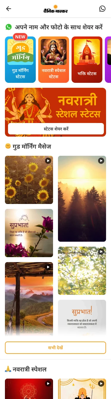
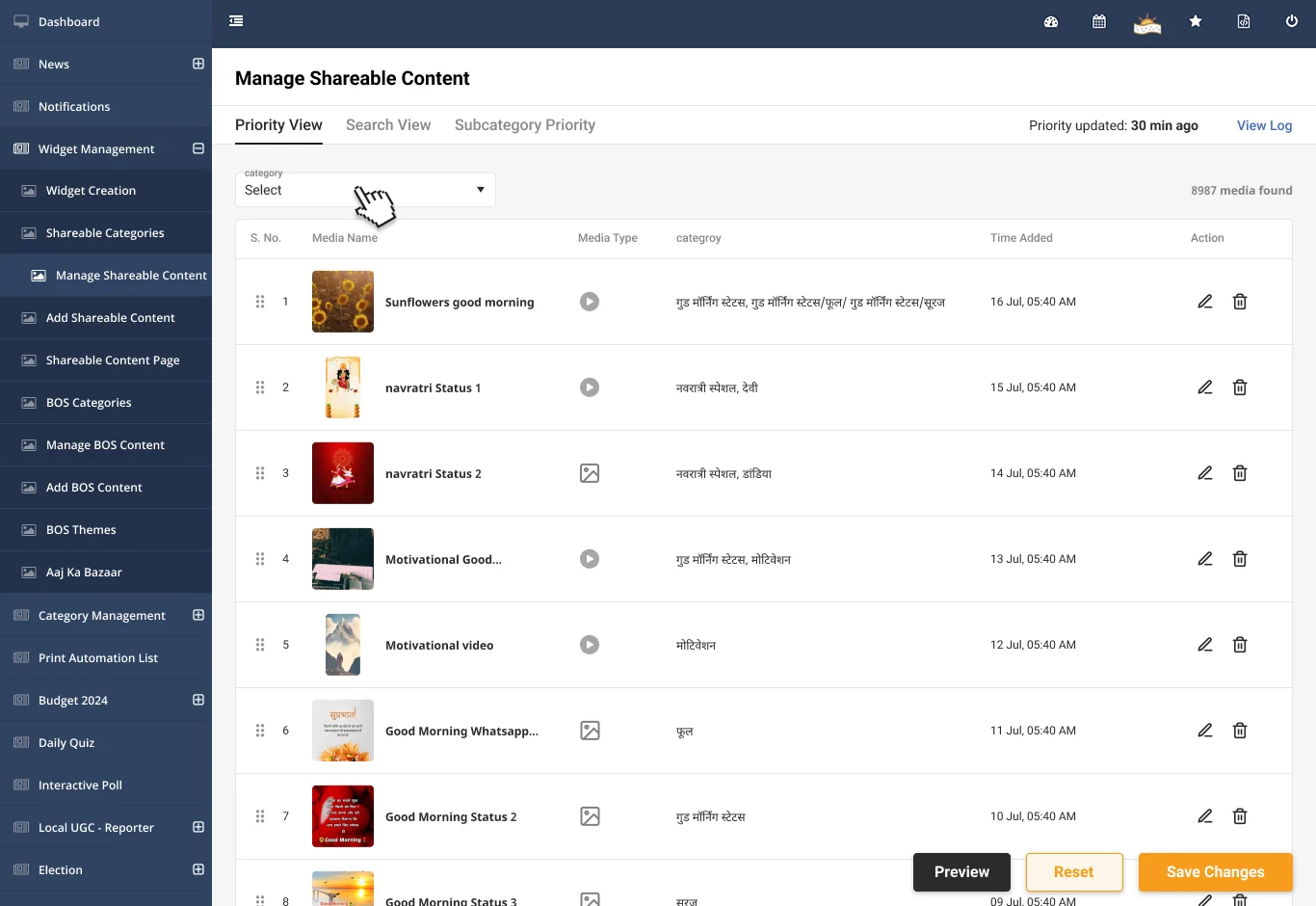
Shareables are the greetings and statuses from case study 03 . The library runs into thousands of items, and the desk sets their order. So ordering got its own screen.
How it works
Priority View starts with a category filter, so the desk orders one category at a time. Rows drag into place. A second tab orders items inside a subcategory. Search View finds a single item. Preview shows the order before it saves. Reset throws the changes away. The header says when priority last changed, and every change goes in a log.

Outcome
They belong to the reader features in case study 03 . The tools didn't make those numbers. The tools are how the desk runs the features behind them.
What I'd do differently
Show where an experiment runs. The experiment listing shows cohorts and buckets, not which widgets use each one. When one experiment serves many widgets, that is the first thing the desk needs to see.
Show results where the experiment lives. Results sat in a separate tracker kept by analytics. A simple view next to each experiment, showing how each bucket is doing, would let the person who made it see the outcome without waiting for a readout.
Make and order rings in one place. A ring is made in one screen and ordered in another. Showing the row order next to the ring form would save a trip.