Content discovery on the home feed
How I got readers to try things beyond news on Dainik Bhaskar's home feed.
Case study 03 • Dainik Bhaskar • 2023 – Sep 2026 • Dainik Bhaskar app
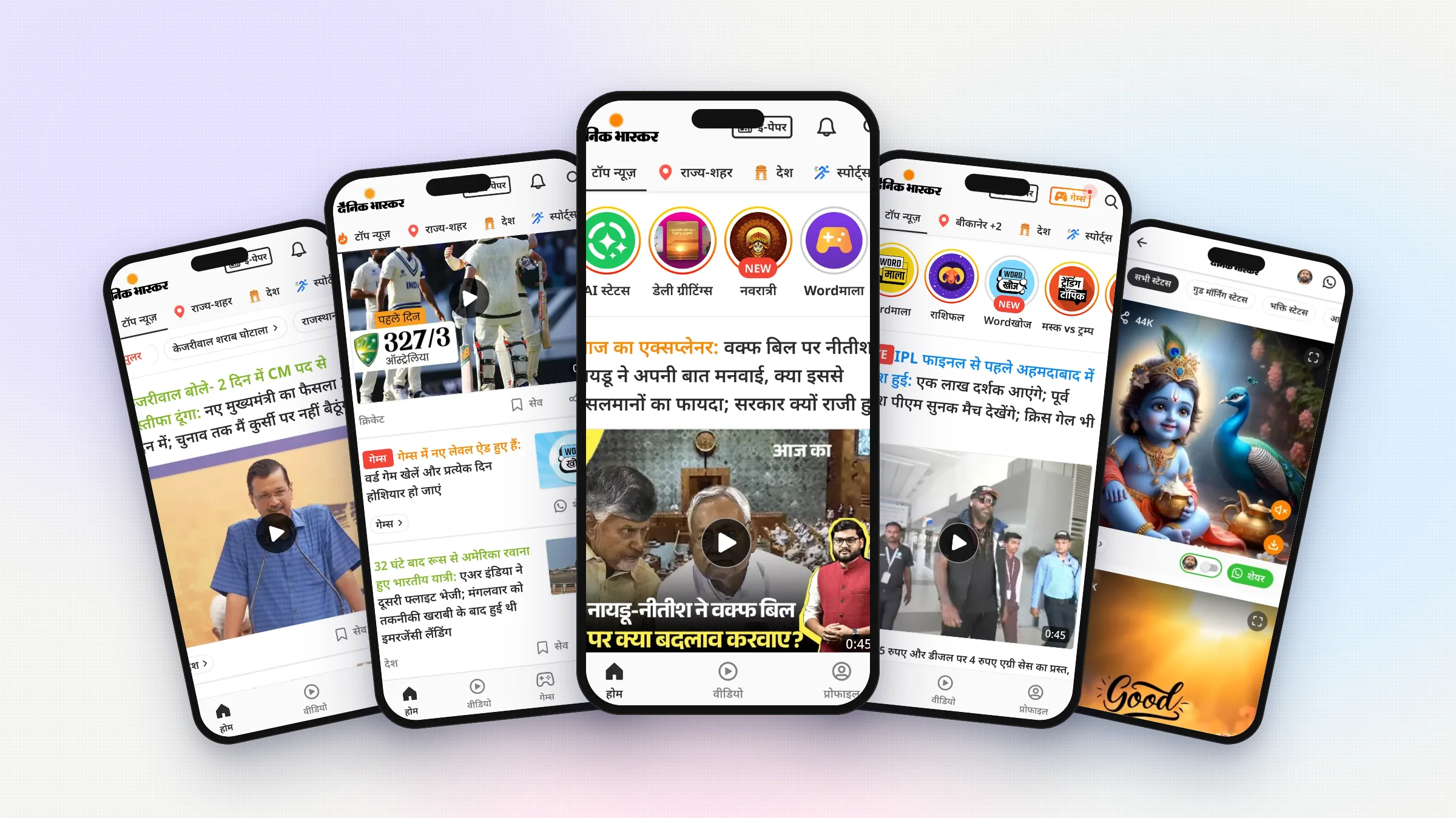
Overview Home feed discovery
Bhaskar's home feed had boxes for things other than news, like games and cricket. Every one of them got only 1 to 2% clicks, no matter what was inside or where it was placed.
Details
- Product designer. Designed both widgets and was part of the usability study.
- role
- Story rings · News-style widget · Shareables entry · Usability
- scope
- 2023 – Sep 2026
- timeline
- Dainik Bhaskar app
- platform
My role Widgets and user tests
I designed three of the old widgets. Then I designed the story rings and the news-style widget, and sat in the user tests with two PMs.
Problem Nobody clicked
Every widget asked readers to stop reading news and want something new. Moving them around didn't help. Even the best spot, above the first story, got 1 to 2%.
Solution Borrow habits
Use habits readers already have. Story rings that work like WhatsApp status, and a widget that looks exactly like a news story. Both are now how the app launches anything new.
Result From 1–2% to 9%
Story rings got 9% clicks, against 1 to 2% for every widget before them. The news-style widget gets clicked like the news around it, about 25% at the top of the feed.
Impact
Four widgets, same result
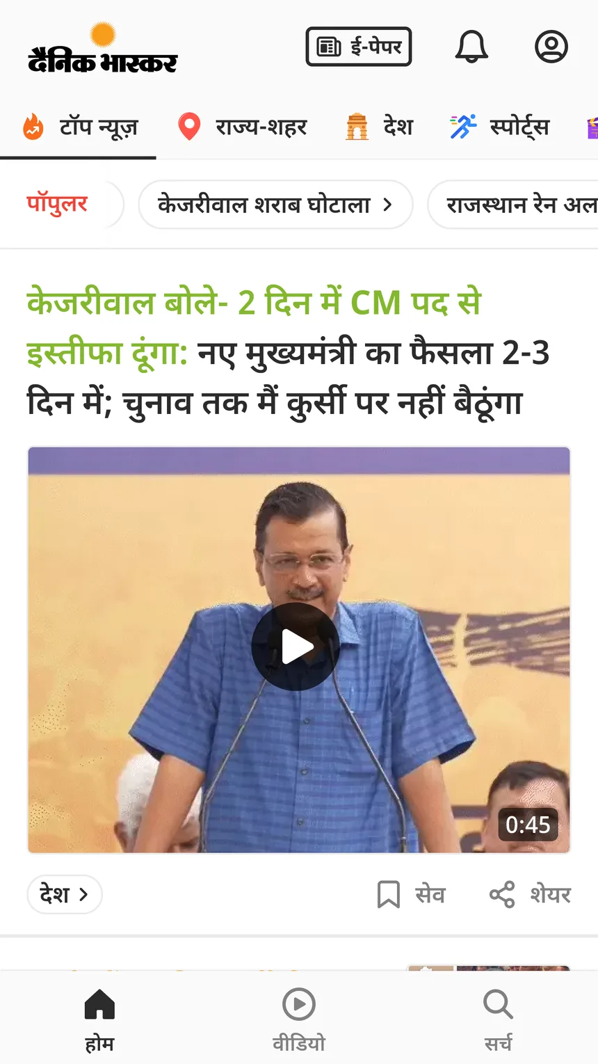
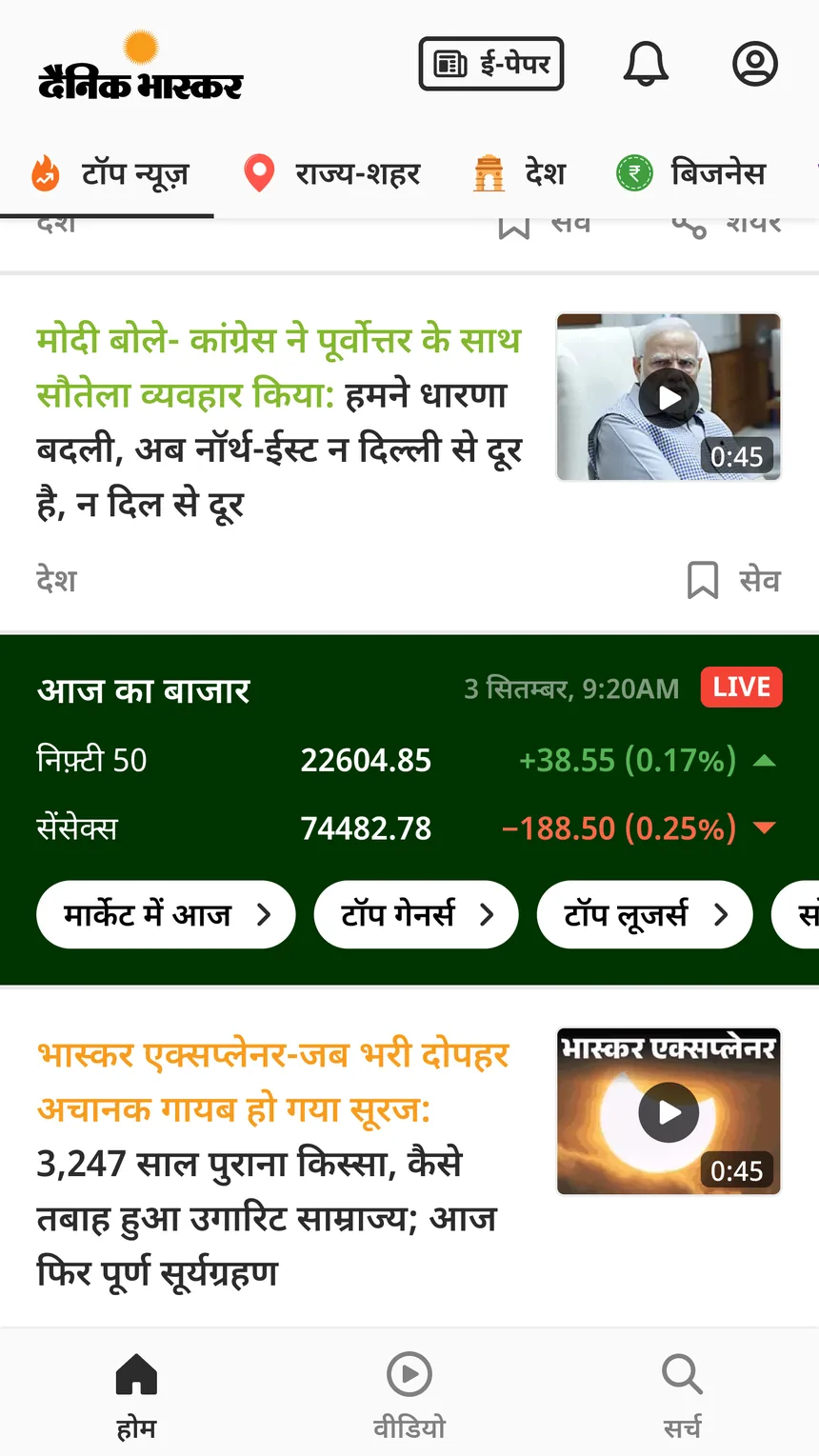
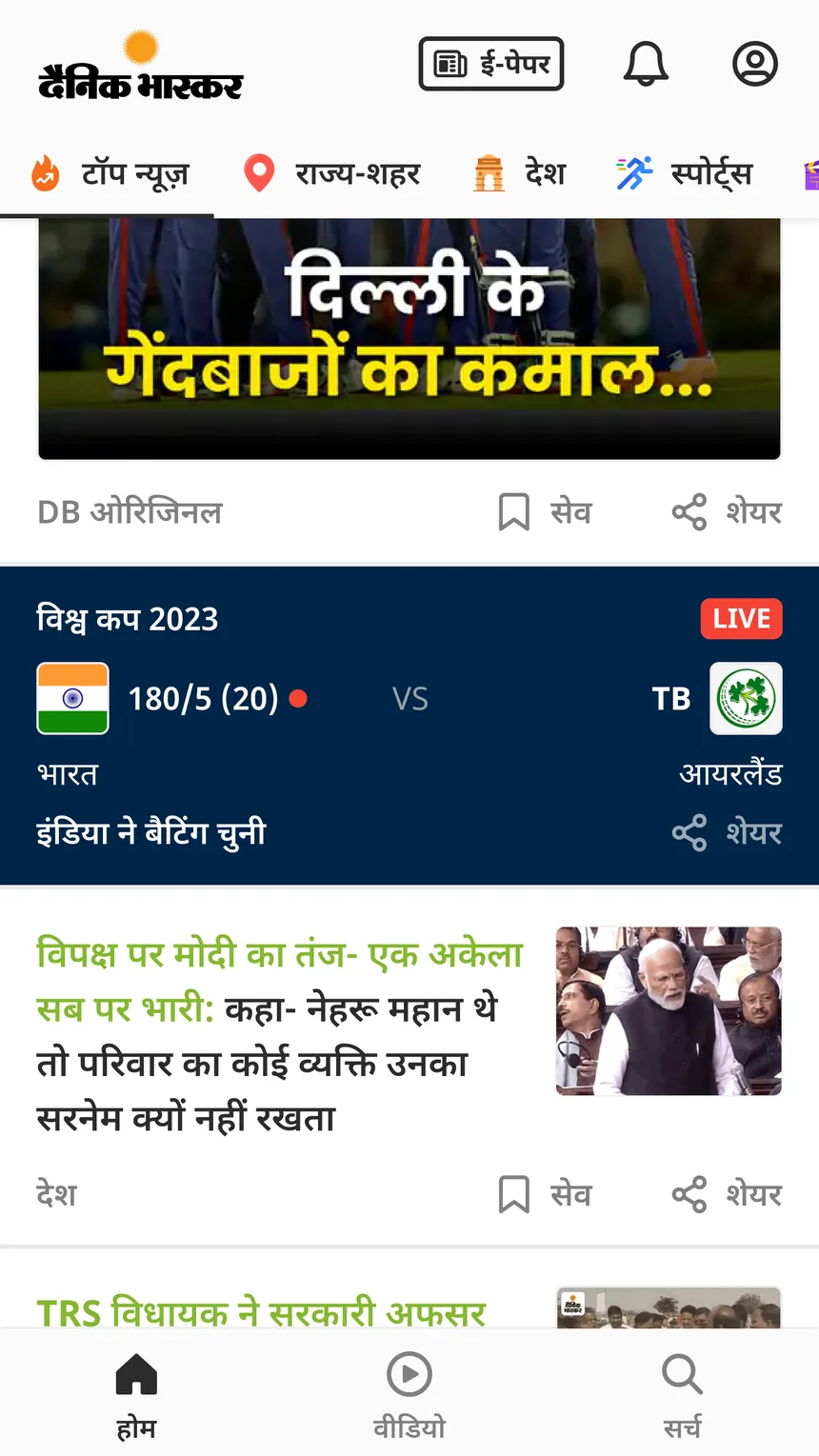
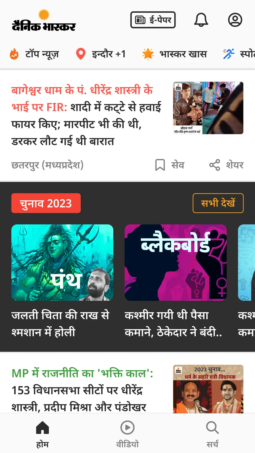
Every widget on the home feed that wasn't news got the same result. 1 to 2% clicks. It didn't matter what was inside or where it sat. I designed three of them. Trending topic chips, a live stock market band and a live cricket card. The fourth, a row of series, was made by a colleague. Four designs, four kinds of content, same result.
Why position didn't matter
Read this part
The easy answer was that readers only want news. I didn't believe it. People share good morning images, play word games and read horoscopes every day. Just not in our app. And it wasn't the position. The trending chips sat above the first story, the best spot in the feed, and still got 1 to 2%.
What they had in common
They all asked readers for the same thing. Stop reading news and want something else. But people opened the app for news, so they had no reason to. So to readers, these widgets felt like ads. And they ignored them like ads. So I changed the question. Not where to put the next widget, but which habit it could borrow. When everything gets the same number, the design is the problem, not the content.
A way in for shareables
Read this part
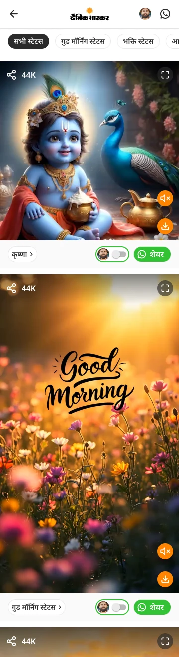
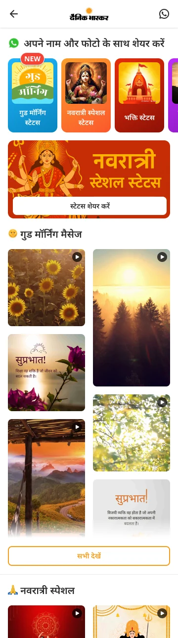
I was building a feature called shareables. Daily greetings, suvichar, motivation and AI statuses. The things people already send on WhatsApp every morning. It had the same problem. Nobody opens a news app looking for a good morning image. If it was just another box in the feed, it would get 1 to 2% like the rest. So I had to design how people find it first. This page covers the reader side. The desk tool that runs it is in case study 02
Seven designs I tried
Read this part
The obvious spot was the top of the home feed. I tried seven designs for it. Rows of links. An icon grid with a greeting. Tiles with text, outlined and filled. Tiles with video. A weekly special. Seen together, they were all the same idea. A menu. Each one asked readers to read labels and choose, which is the same old problem, just higher up the page.
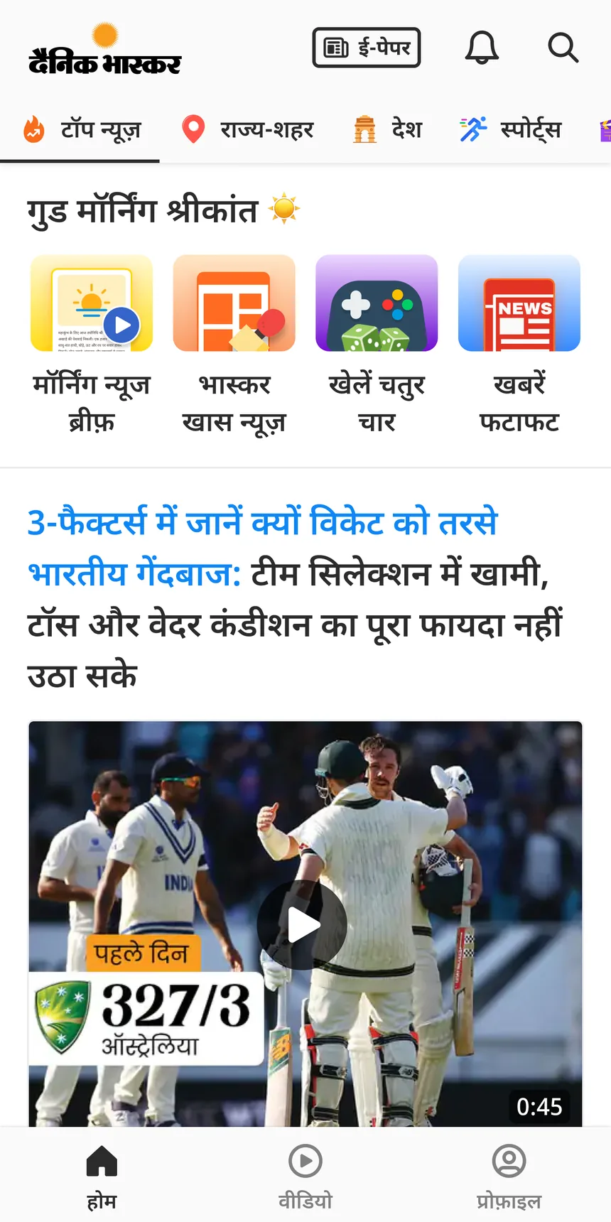
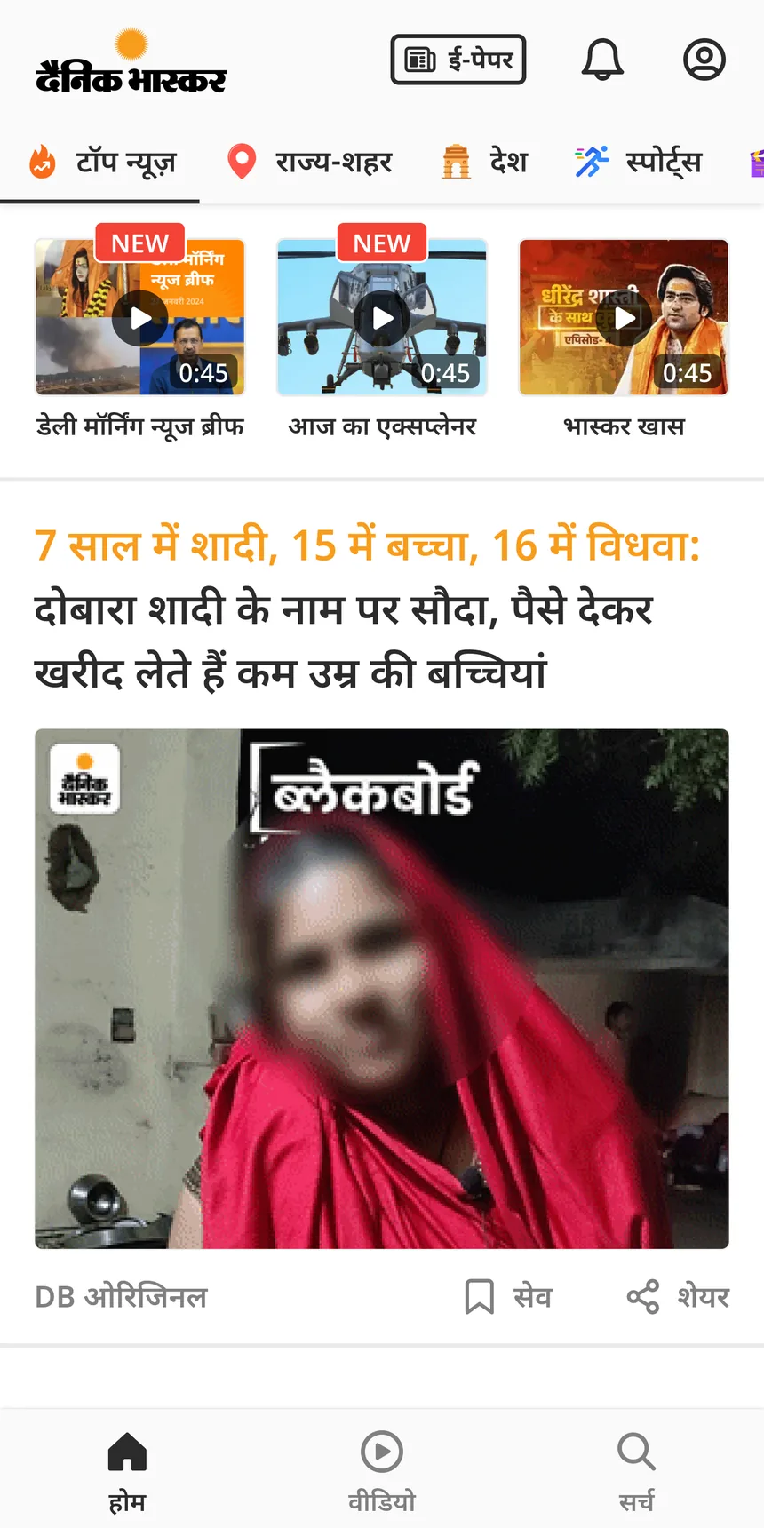
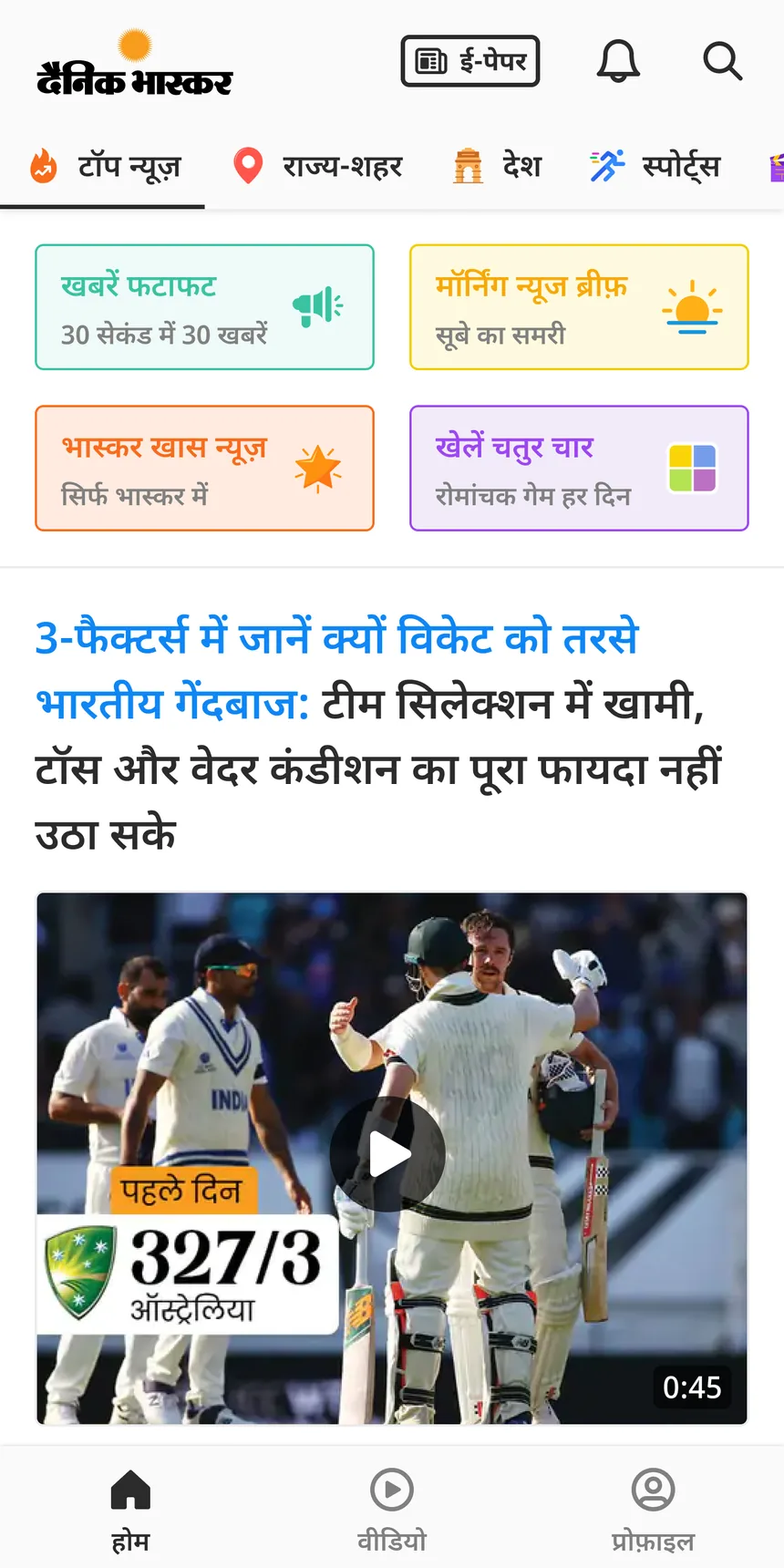
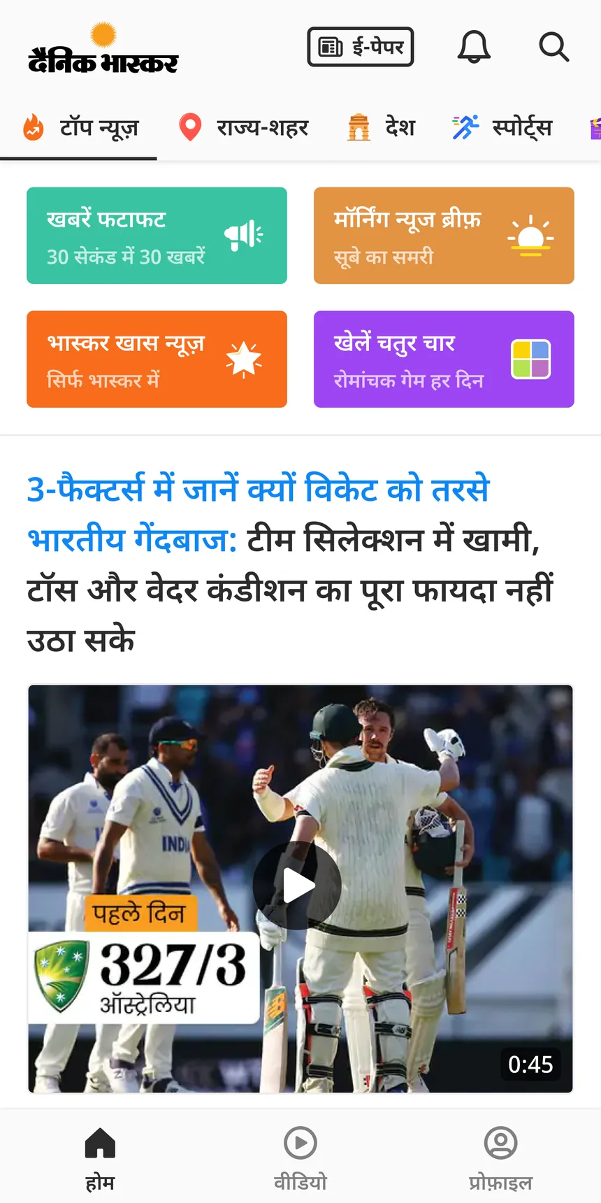
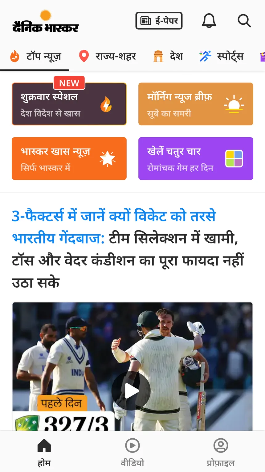
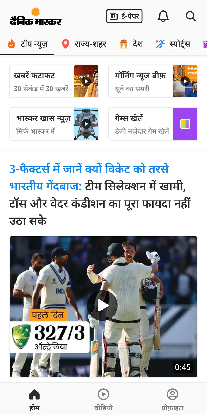
None of these launched. The rings did.
Testing the rings
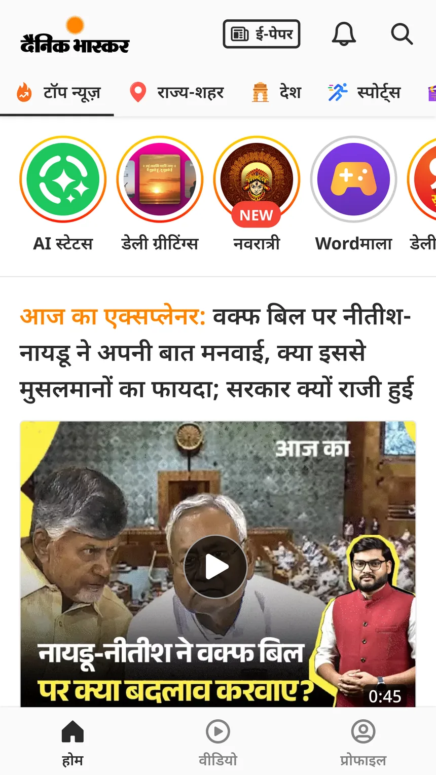
The rings don't ask for a new habit. They borrow one. Circles at the top of a feed, tapped without thinking, just like WhatsApp status. I designed them and sat in the user tests with the two PMs.
Found, then found less
In the first test, done in person in Bhopal, 35 of 42 readers found the rings without help. The online test found 13 of 15. Then two tests of the new app design came back at 13 and 10 out of 25. Finding the rings dropped from 70–80% to 40–50%. The likely reason was space. The earlier designs had a शुक्रवार स्पेशल heading above the rings, which gave them more room on the first screen. The new designs didn't.
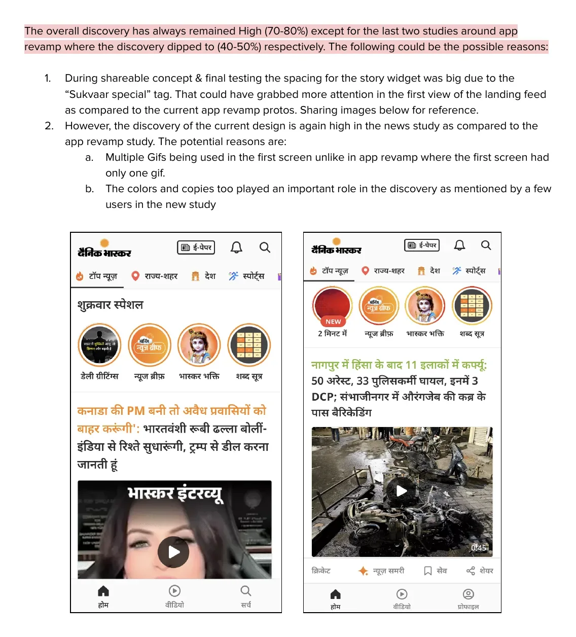
So we tested again
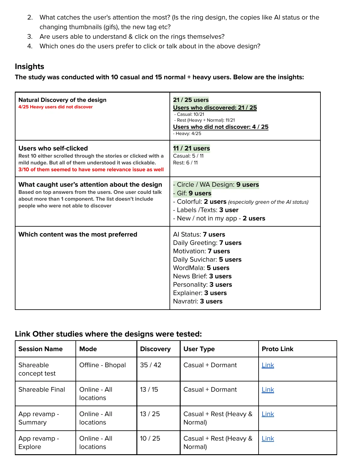
April 2025, on the version without a heading. 25 readers, 10 light readers and 15 regular or heavy readers.
21 of 25 found the rings on their own. The 4 who didn't were all heavy readers. They went straight for the news, which makes sense for a news app.
11 of those 21 tapped without any hint. The rest scrolled past or tapped after a small hint, and all of them understood the circles could be tapped.
The circle shape and the movement caught their eye. 9 readers named the circle and 9 named the GIFs. Colour, labels and the NEW badge mattered much less.
They wanted shareables inside. AI statuses, daily greetings and motivation, 7 readers each. News brief and explainer, 3 each.
Both PMs said to build it. One expected about 30% clicks, based on similar features. Remember that number. These were guided tests. Finding the rings in a test is not the same as tapping them in the real app. “jaise WA insta pe dalte hai round circle chalta”
Story rings launch
The rings launched with shareables in mid 2025, as one small row above the news. They are switched on for casual readers. Heavy readers mostly go straight to the news, which the user tests also showed, so a separate experiment is running for them. Bright icons, GIFs inside the circles, and a NEW badge when something new arrives. The same things readers said caught their eye.
They now carry more than shareables. AI statuses and greetings sit next to festival rings and Wordमाला.
How it did
Before the full launch, we ran an A/B test with casual readers. The PM wanted a big-thumbnail version, so instead of arguing we tested both. The rings got about 12% and the thumbnails about 9%, so the rings shipped. 9% clicks, against 1 to 2% for every widget before it. That's four to nine times more. It is also less than a third of the 30% the PM expected. I show both. The 30% came from other features. The 1 to 2% came from our own feed, and that was the real number to beat.
after launch, rings first won an A/B test
every older widget, wherever it sat
based on similar features
A widget that looks like news
Read this part
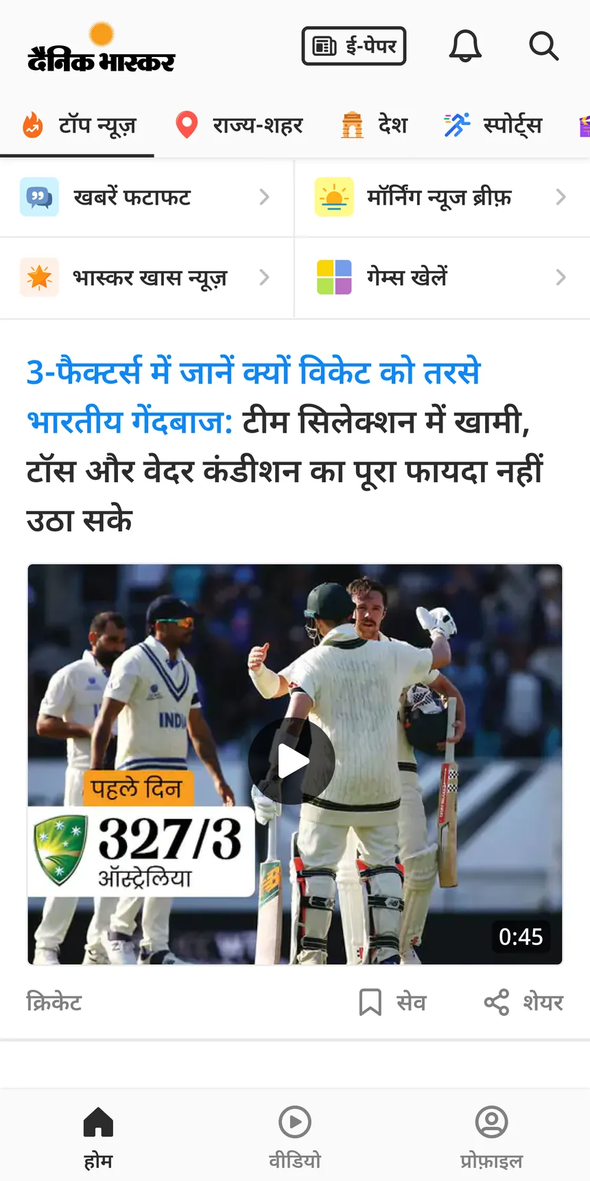
The rings solved the top of the feed. But some things need a stronger push than a small circle, like special interactive stories. So I looked for the thing in our feed that already got the most clicks. It was the news story preview. About 25% at the top of the feed, and less as you scroll. So I made a widget that looks exactly like a news preview. Same layout, same fonts, same image spot. Readers scanning headlines don't skip it, because it looks like what they came for.
And it gets clicked like one too. High near the top, lower further down, just like the news around it. But it doesn't trick anyone. A red tag sits before the headline, so readers know what it is before they read it. It looks like a story, but it doesn't pretend to be news.
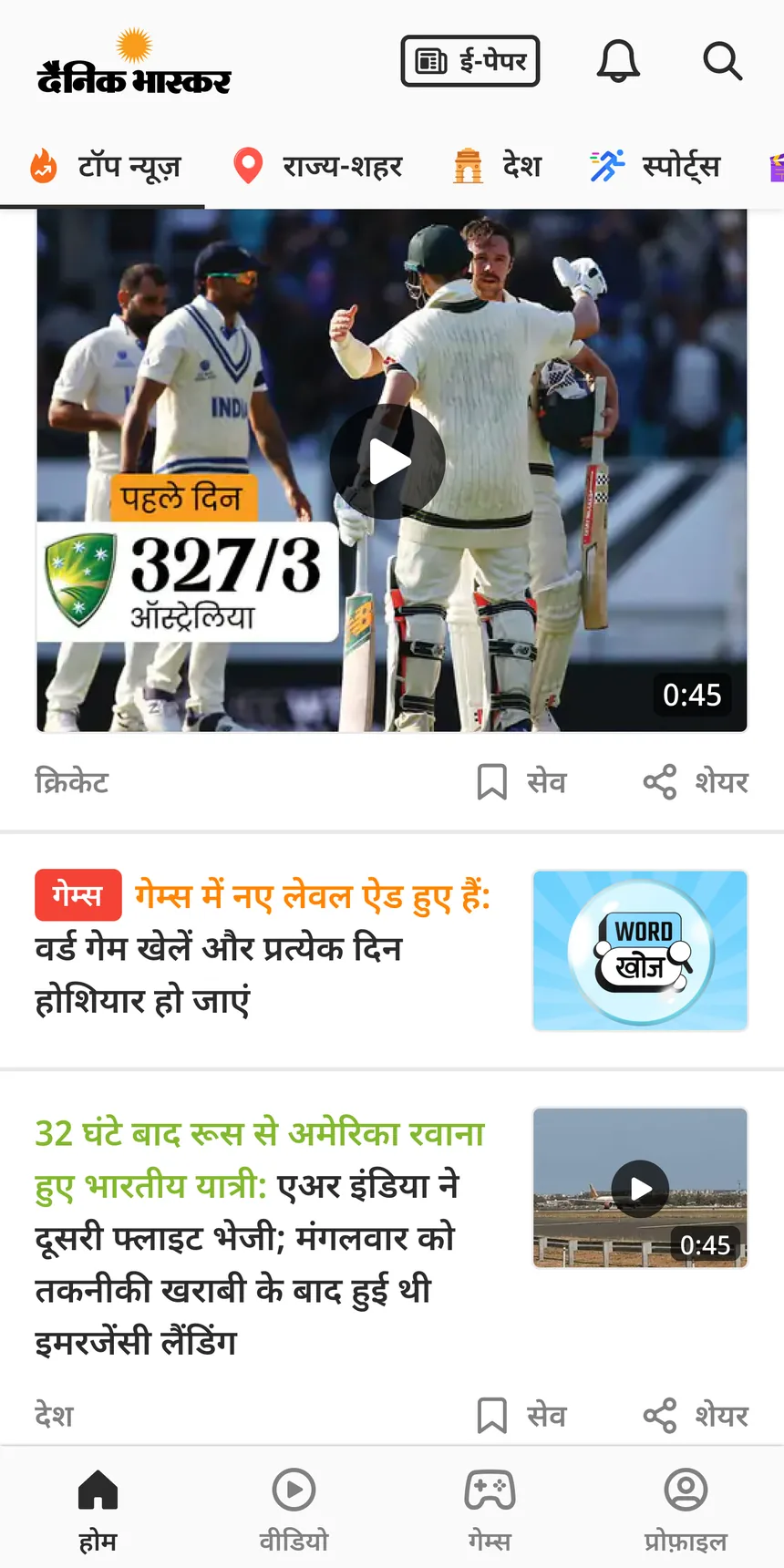
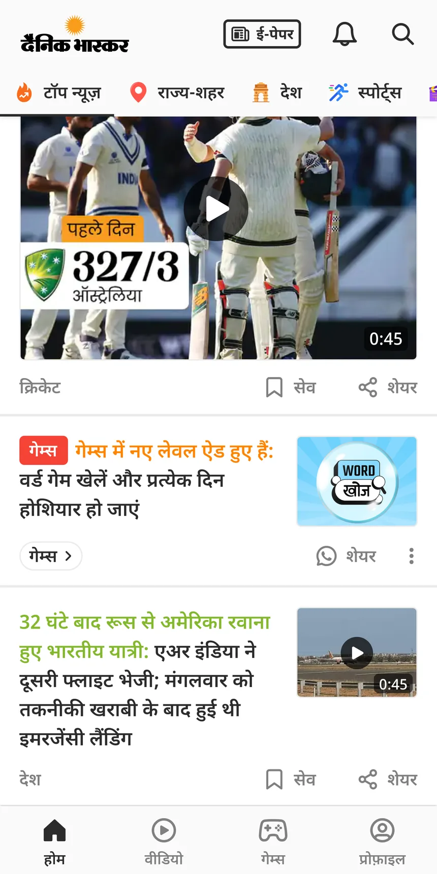
Two versions, with and without the category row. Here it is launching games.
Everything launches here
Read this part
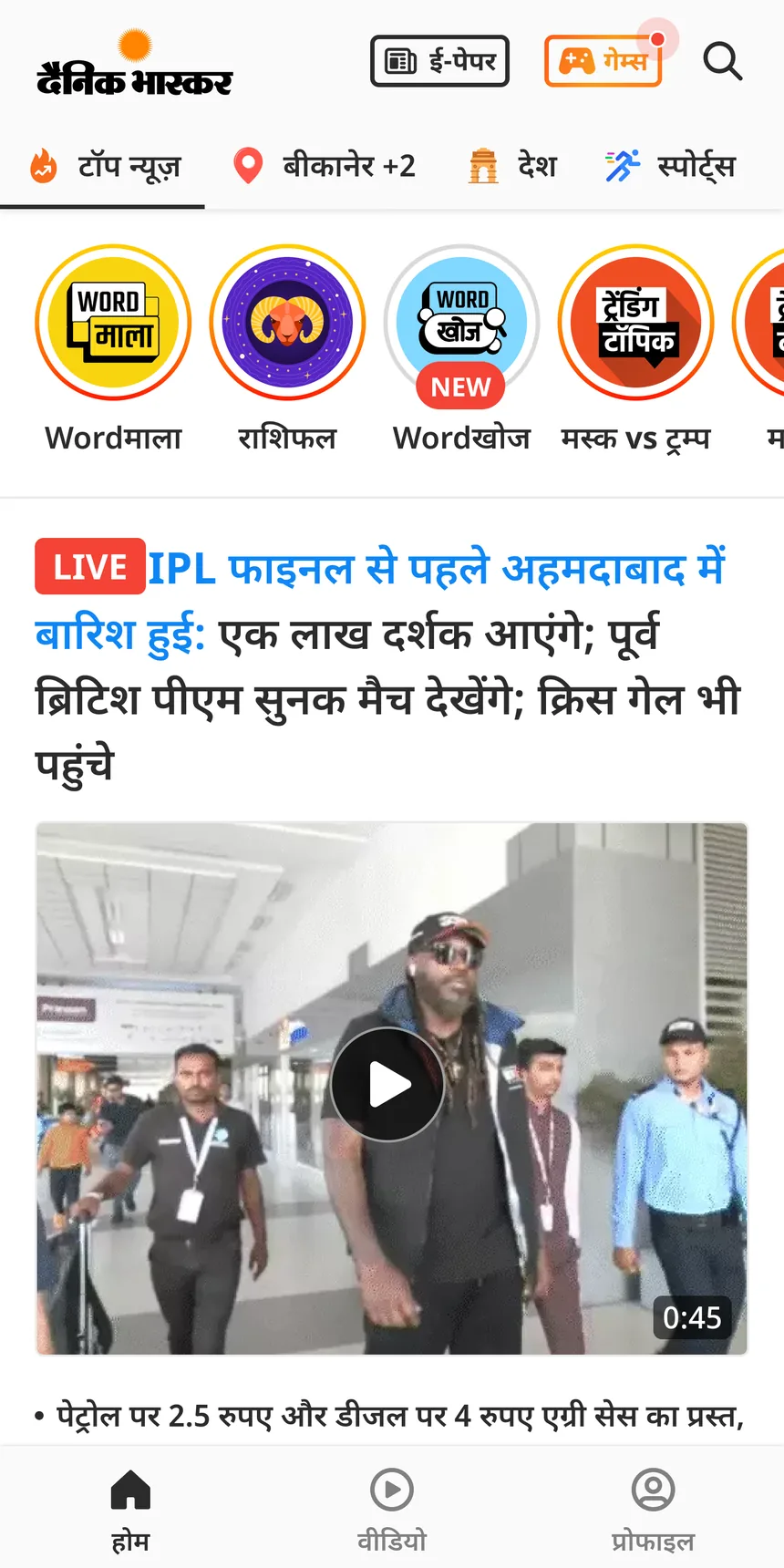
Both widgets are now how the app launches anything new. Games, features, festivals, and top news too. Wordखोज is a good example. It launched through both, a ring with a NEW badge at the top and a news-style widget in the feed.
The old chips came back as a ring
Trending topics moved into the rings. The same content that got 1 to 2% as chips now sits in a circle, like the मस्क vs ट्रम्प ring here. Same topics, same spot, different habit. That's the whole story in one screen. The desk makes rings and turns them on without a designer. That tool is in case study 02
What I would keep, and one mistake
Read this part
The rings can show a heading or not. I turned it off by default, because the test showed the rings work on their own and a heading takes up space. The desk can turn it on for special days like Diwali, when a line like "Diwali status dekhein" is actually useful.
9% vs a 30% guess
The PMs expected about 30%, based on other features. I wasn't part of that. If I was, I'd have asked one thing. Our best news stories don't reach 30%, so why would a widget? The real number to beat was our own 1 to 2%. The rings beat it by four to nine times.
Where I was wrong
Crime Files launched with a widget shaped like an old series row that got 1 to 2%. I told the PM it would get ignored for the same reason. He said the images were bigger and the content was stronger, and launched it anyway. It got a bit above 4%. He was right. The content came from months of talking to readers, so people already wanted it. The widget just had to not get in the way.
Design and content both matter. Strong content can carry an ordinary design. Now I test that before I push back.
Outcome
The rings came from an A/B test, not a guess. We turned them on only for casual readers, and tested them against a big-thumbnail version the PM wanted. The rings won, about 12% vs 9% during the test. After launch they settled at 9%. The news-style widget has no single number. It gets clicked like the news stories in the same spot, about 25% at the top and less lower down.
The user test numbers show readers can find and understand the rings. The 9% shows what they actually do with them.
What I'd do differently
Start from our own numbers. The 30% came from other features and set an expectation three times higher than what we got. Our own 1 to 2% was the honest starting point.
Measure each ring. The test said some rings would get more taps than others. Which spot and which content gets tapped is what the desk really needs to know.