Rebuilding the design system
Our old design system was basic and nobody used it. We rebuilt it from screens that had already shipped, one project at a time.
Case study 04 • Dainik Bhaskar • End of 2022 – Sep 2026 • Android · iOS
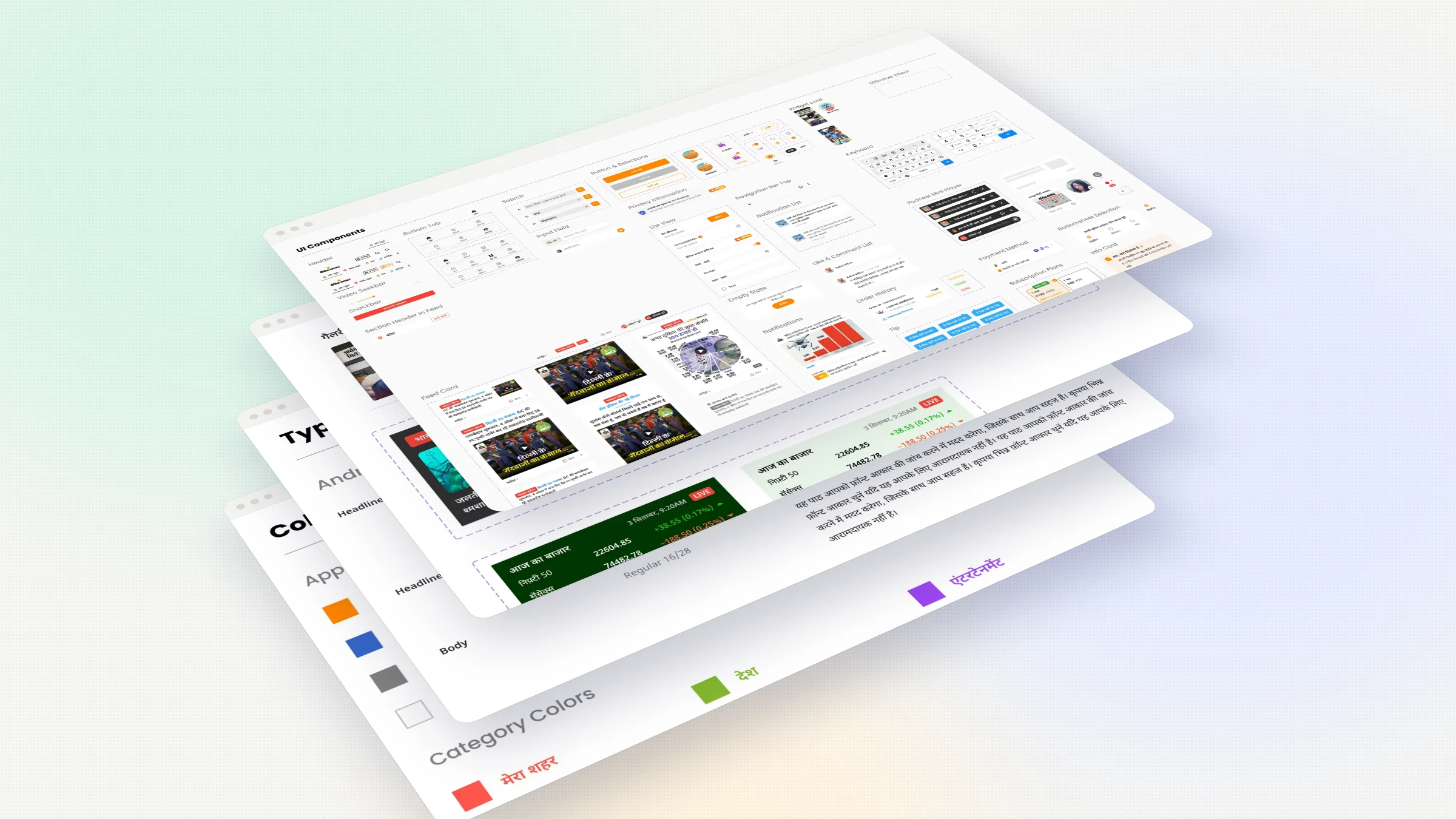
Overview Bhaskar design system
Bhaskar had a design system, but only on paper. It was made for Android, the names made sense only to Android developers, and designers were not using it.
Details
- Product designer. I built the big components and widgets. Saurabh built the basics.
- role
- Audit · Colours and type · Components · Widgets · Rules
- scope
- End of 2022 – Sep 2026
- timeline
- Android · iOS
- platform
My role Components and widgets
Two of us rebuilt it. Saurabh built the basics, like colours, type and icons. I built the big components and widgets. We did the audit and made the rules together.
Problem Made for Android, not people
Colour names said where a colour goes in Android, not what it is for. Type specs made no sense to iOS developers. And the library did not match the real app.
Solution Start from the real app
Start from what is already in the app. Name colours by their job, in light and dark. Type that works in Hindi, English and Gujarati. One news card with ten layouts. And one rule, nothing joins until it ships.
Result In every file
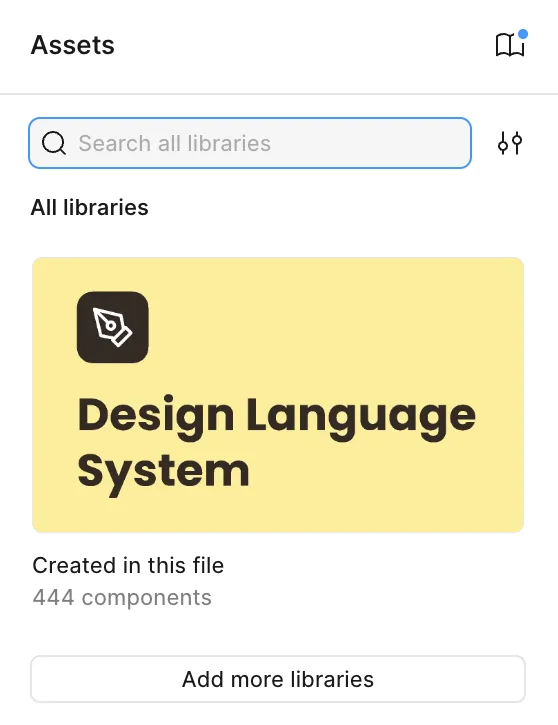
444 components, 34 colour variables and 17 type variables. Every design file uses the library, and developers use the same names as designers.
Impact
A system nobody used
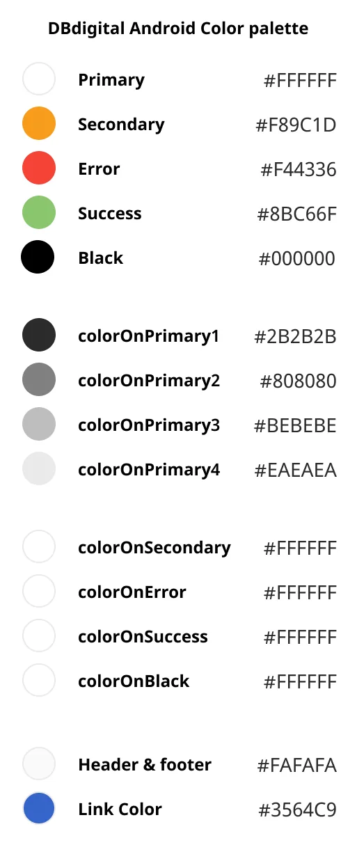
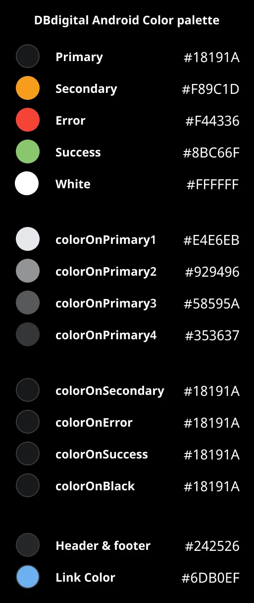
When I joined Dainik Bhaskar in June 2022, I told my manager I wanted to work on design systems. Bhaskar already had one, with a library, colours and type sheets. But it was basic and incomplete, and designers did not use it. It was made only for Android. Colours were named after Android settings, so the name told you where a colour goes, not what it is for. The main text colour was called colorOnPrimary1. The background was called Primary. Confusing.
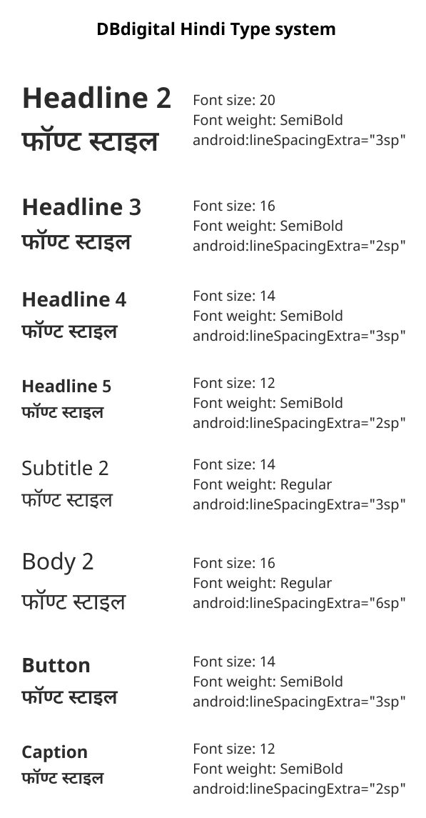
Type had the same problem. Line spacing was written in an Android-only format, which means nothing to an iOS developer. So at the end of 2022, we started again.
Start from what is already in the app
Two of us rebuilt it. Saurabh, another product designer, built the basics. Colours, type, icons, illustrations and brand assets. I built the big components, the pieces that screens are actually made of. We did not start from a blank page. We went through the app and listed everything that had already shipped and was used a lot. That list became the first version. Everything after that was added the same way, one shipped project at a time. Start from what readers already see on their phones, not from what a design system is supposed to have.
Colours named for their job
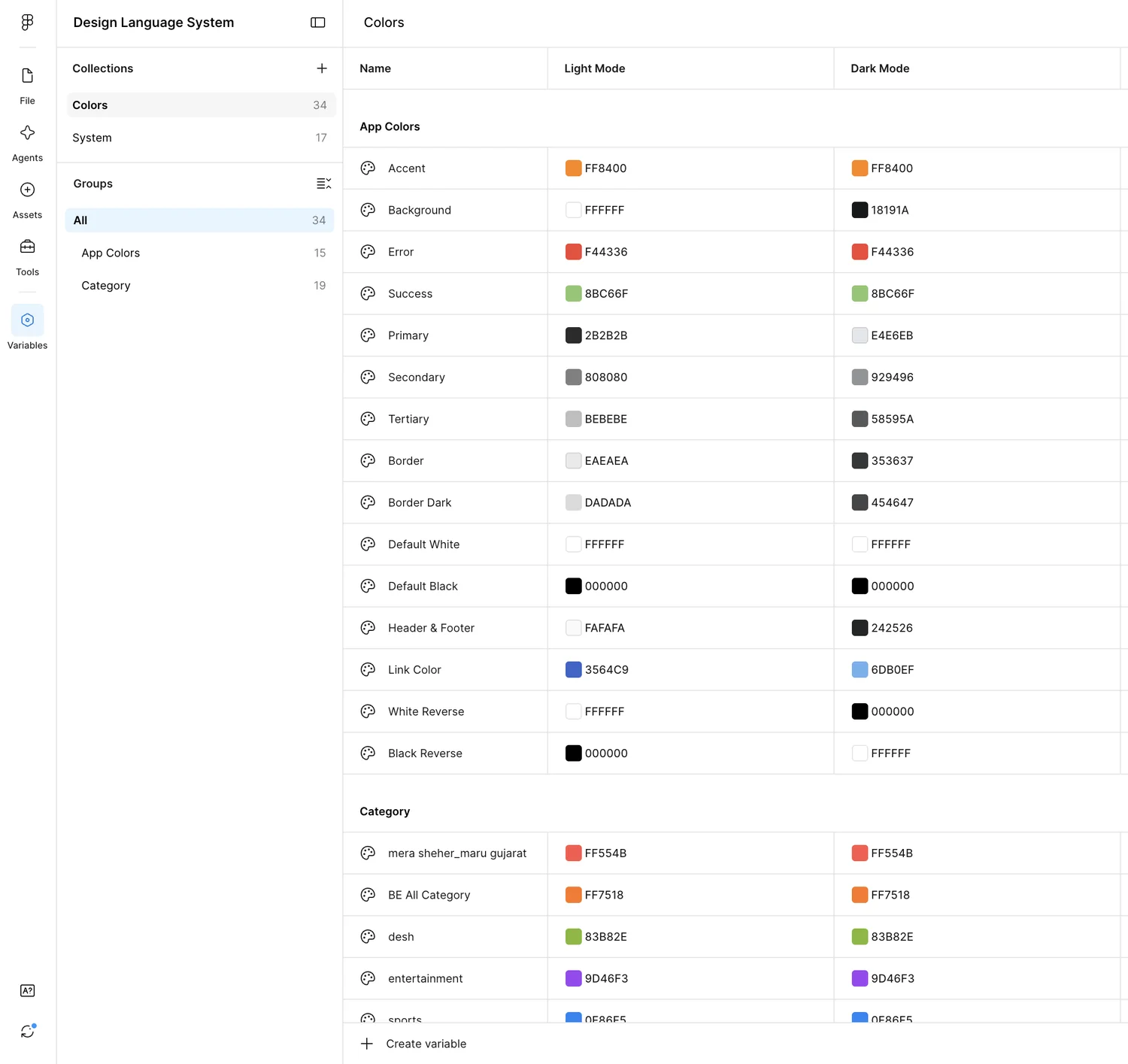
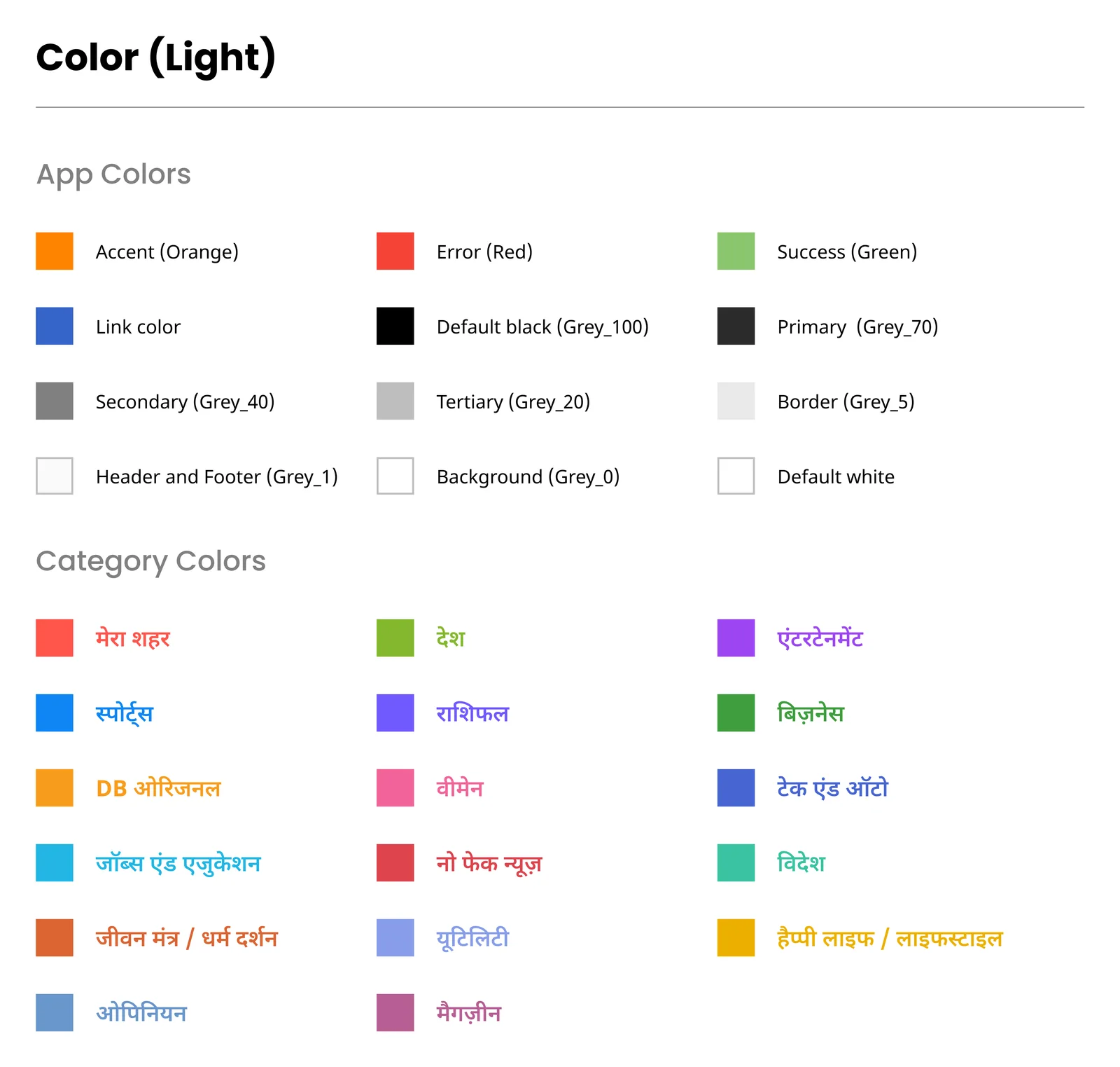
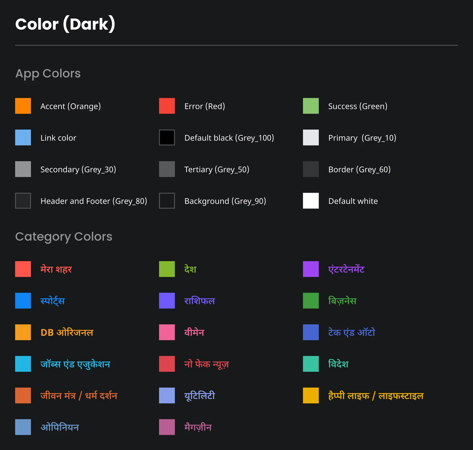
Most colours stayed the same. Only the names changed. Every colour got a name for the job it does, so designers and developers say the same word and mean the same thing.
| Old Android name | Light | Dark | New name |
|---|---|---|---|
Primary | FFFFFF | 18191A | Background |
colorOnPrimary1 | 2B2B2B | E4E6EB | Primary |
colorOnPrimary2 | 808080 | 929496 | Secondary |
colorOnPrimary3 | BEBEBE | 58595A | Tertiary |
colorOnPrimary4 | EAEAEA | 353637 | Border |
Developers use these names too. Primary, Secondary, Tertiary and Border mean the same thing in Figma and in the app.
Light and dark mode
Each colour has one name with two values, one for light mode and one for dark. Some stay the same in both, like accent and error. Some change, like main text going from 2B2B2B to E4E6EB. White Reverse and Black Reverse swap places.
The one colour we changed
The accent colour. The old orange, F89C1D, was too light to stand out. After talking with leadership, we moved to a stronger orange, FF8400. You can see it on the buttons further down.
Type for three languages
Read this part
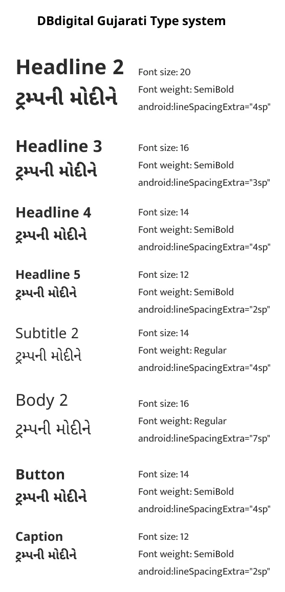
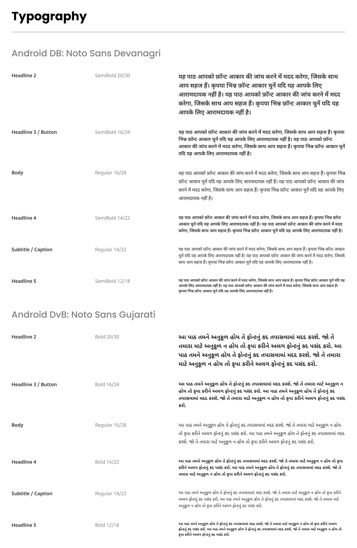
We design in Hindi first. Every screen starts there. For Divya Bhaskar, the Gujarati app, we only change the text, because the styles already exist. Text styles are grouped by language, Hindi, English and Gujarati. Hindi and Gujarati use the same names, sizes and line heights, so changing the language does not break the layout.
Gujarati in Bold
Hindi headlines are SemiBold. Gujarati headlines are Bold, at the same sizes. We chose this just by looking. The Gujarati font simply looks better in Bold. The old system had it at SemiBold.
One style for Android and iOS
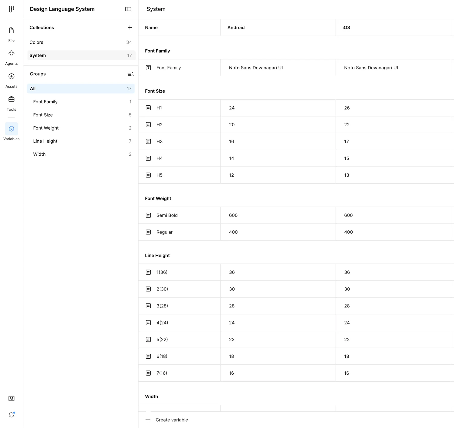
Text sizes have one value for Android and one for iOS. For example H2 is 20 on Android and 22 on iOS, and the style picks the right one by itself. Line heights are now the same on both platforms.
Icons, illustrations and brand
Read this part
The rest of the basics are Saurabh's work, and they follow the same idea. Each icon has one name and two styles, outline and solid, at 24 pixels. Icons with words in them have one version per app, like ई-पेपर for Dainik Bhaskar, ઈ-પેપર for Divya Bhaskar and E-Paper for Bhaskar English. Illustrations are drawn once and labelled per language. Small icons cover every news category, rashifal signs and IPL teams.
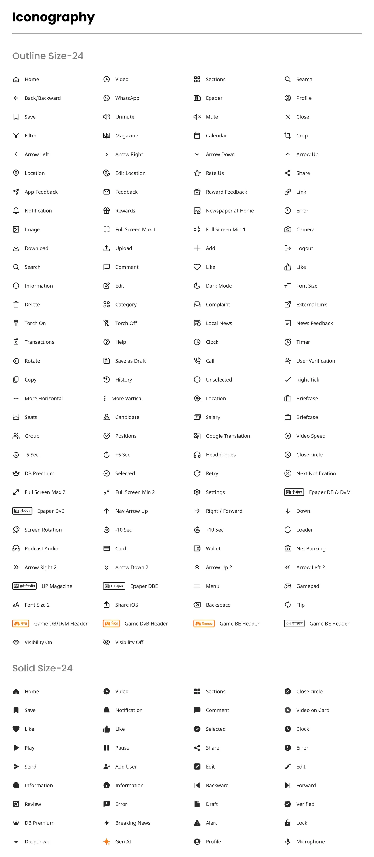
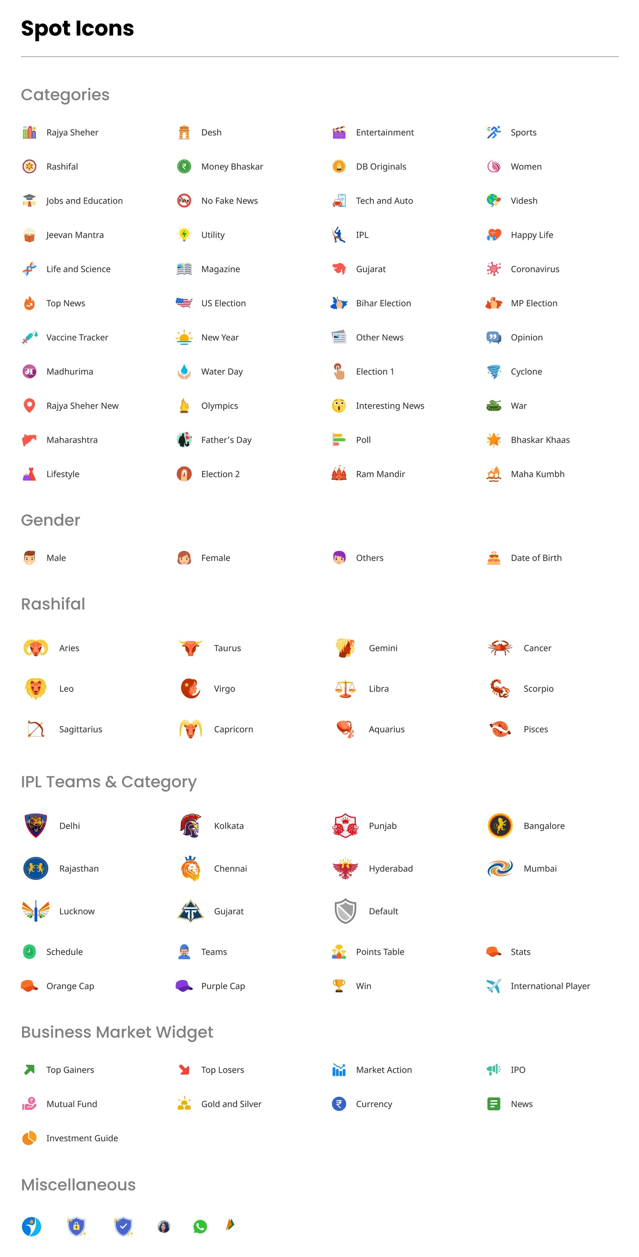
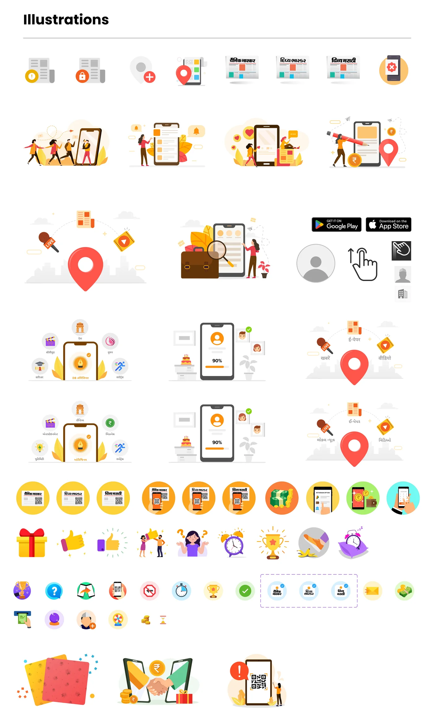
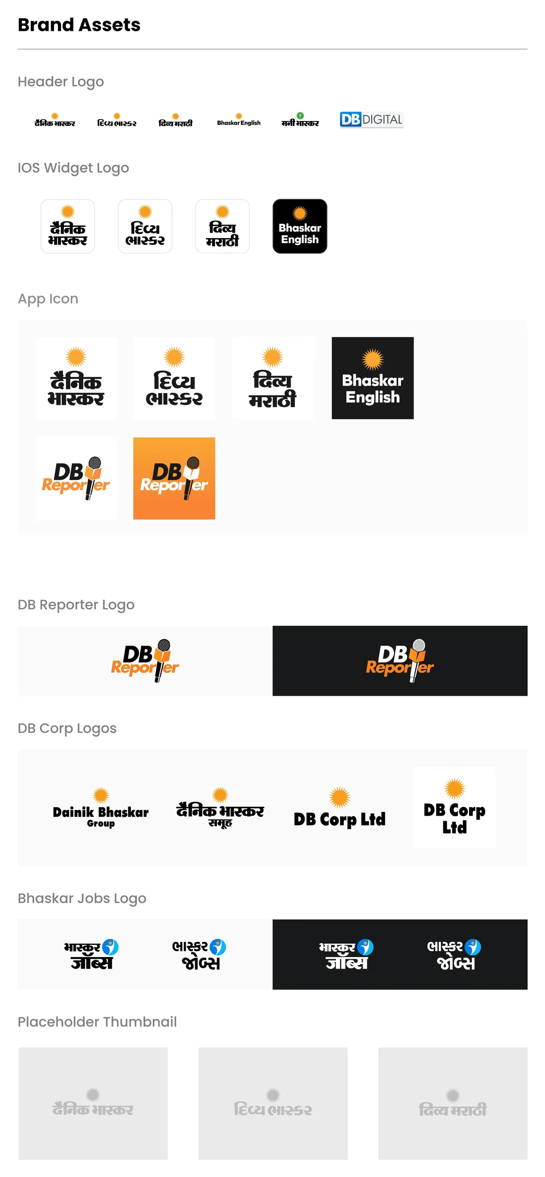
All four sheets made by Saurabh.
One card, ten layouts
Read this part
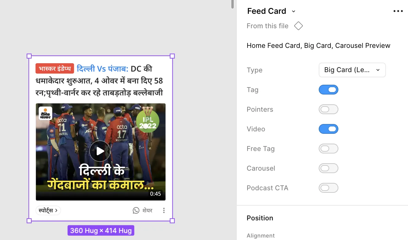
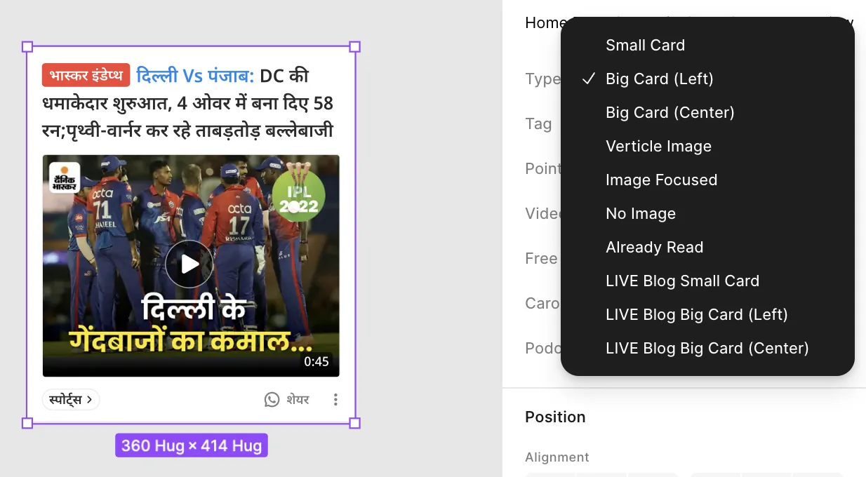
My part was the big components that screens are built from. The best example is the news card. A news feed has many kinds of cards. Small, big, with a big image, text only, already read, live updates. Each one could have been a separate component. I made it one. You pick the type, and the card changes its layout. There are ten types, from Small Card to three kinds of live update cards. Six simple on/off switches handle the rest. Tag, pointers, video, free tag, carousel and a podcast button.
So a designer just changes a setting. No need to break the card and draw it again.
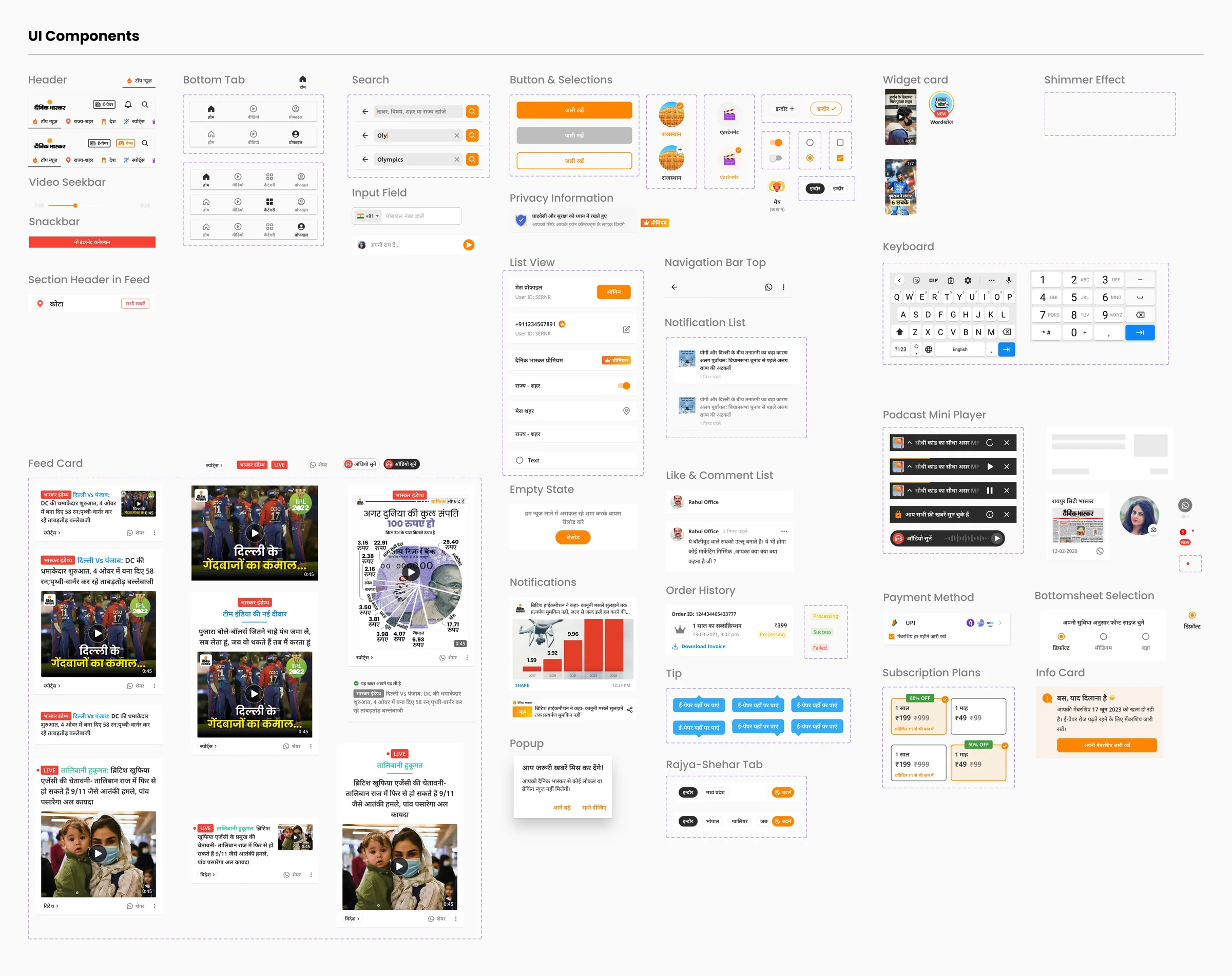
The subscription plans, payment and info card here came from the paywall work in case study 01
Nothing joins until it ships
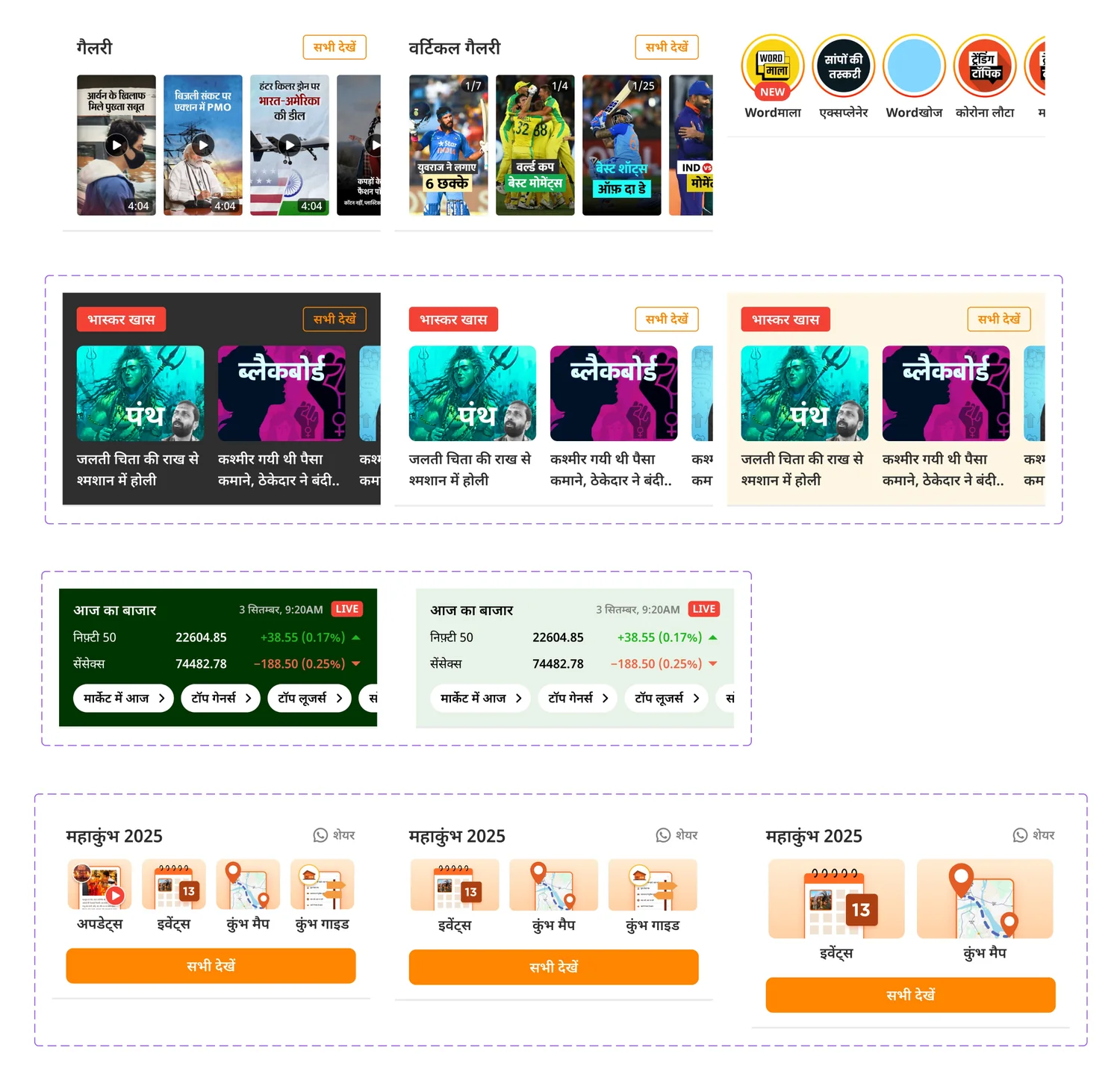
A component joins the library only after it ships in the app. Even then, we talk about whether it really needs to be in the system. So the library grows with the app, not ahead of it. Nothing in it is a guess. Everything in it has been on a real reader's phone. The widgets page shows what that looks like after a few years. Galleries, the Bhaskar Khaas carousel in three themes, the market band in dark and light, a Mahakumbh 2025 widget that works with 4, 3 or 2 items, and the story rings from case study 03
When only shipped things get in, the system stays small, and people trust it.
In every file
Read this part
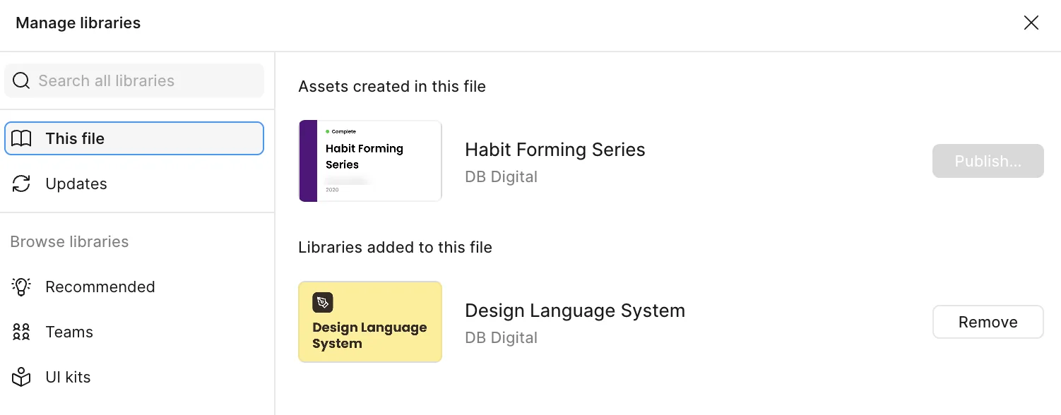
Every design file we have uses the library. This one is Habit Forming Series, a project from 2020, made before the new system existed. Today it uses the library too. Developers use the same names. When a designer writes Tertiary or H3, the developer reads the same name in code. I can't show usage numbers here, because our Figma plan does not have library analytics. So the proof is that the library is in every file, and that designers and developers now speak the same language.
Outcome
Saurabh built the basics. I built the components and widgets. We did the audit and made the rules together. I don't have numbers for time saved. I did not measure it, and I won't guess.
What I'd do differently
Keep the audit. The first list of what had shipped is lost. It should have stayed in the file, so people know why the system starts where it does.
Count by hand. Without analytics we have no usage data. When someone breaks a news card to change it, that means a type is missing. I would have tracked that for the main components.
Write down the reasons. Why Gujarati is Bold, why the orange changed. Choosing by eye is fine. But if nobody writes it down, someone asks the same question again later.