Notification permission onboarding
How we kept readers saying yes to notifications after Android 13 made it easy to say no.
Case study 05 • Dainik Bhaskar • 2023 – Sep 2026 • Android
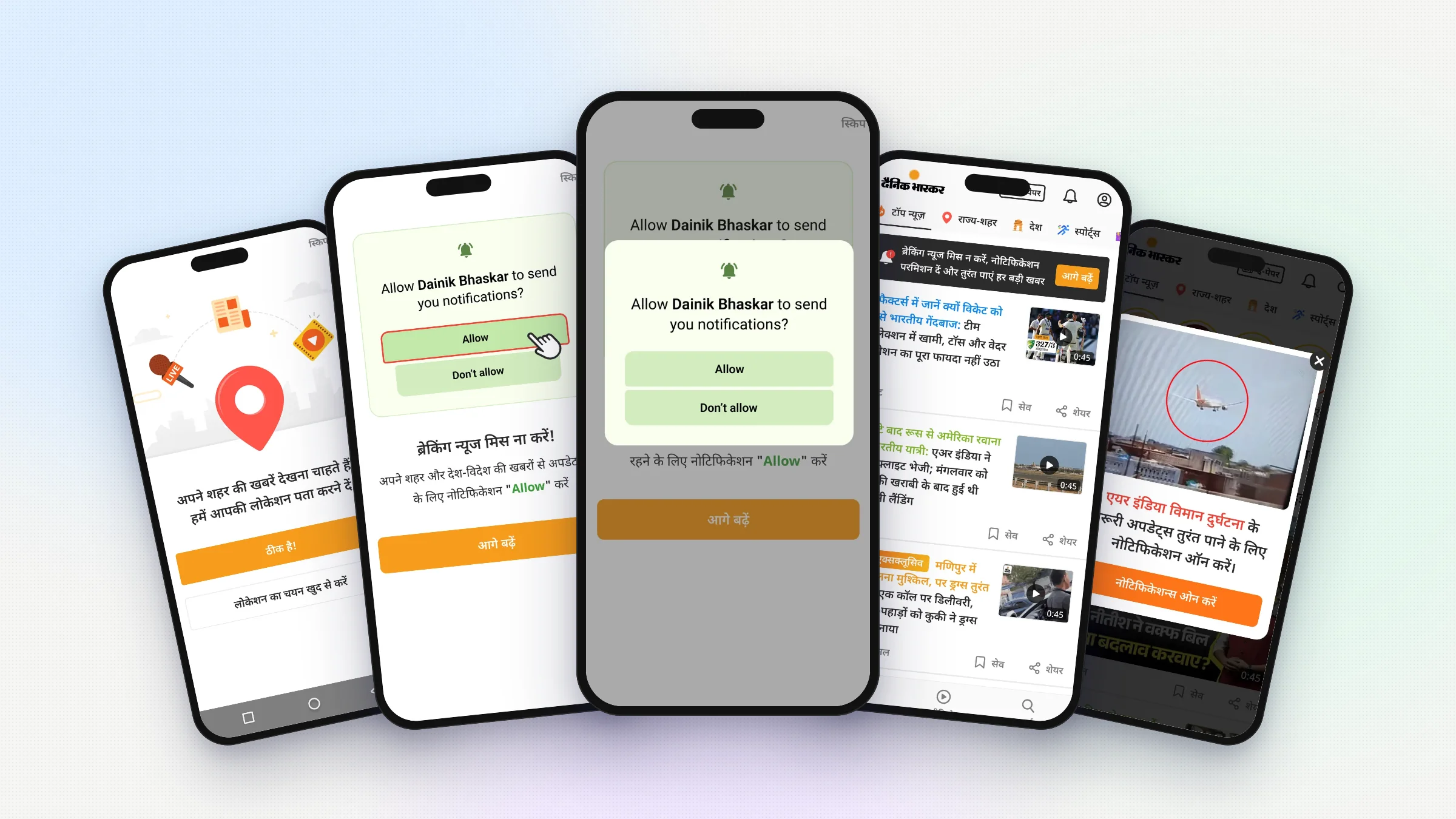
Overview Notification permission
Many Bhaskar readers open the app by tapping a notification. Android 13 made apps ask first. One tap on Don't allow and we lose that reader's alerts.
Details
- Product designer. Designed the screens and was part of both user tests.
- role
- Onboarding · Feed banner · User tests · News-time asks
- scope
- 2023 – Sep 2026
- timeline
- Android
- platform
My role Screens and user tests
I designed the onboarding screen and the feed banner. I sat in both user tests. Later I also suggested asking during big news.
Problem Android made apps ask
Onboarding was already long. It asked for location first. Adding one more ask had to feel simple.
Solution Show the popup first
Show readers the Android popup before it comes, so they know what to tap. Add a small banner in the feed for people who said no. Later, ask again when big news breaks.
Result 7 in 10 said yes
70% of new users said yes. Later, the feed banner and the asks during big news took it to 79%. In the April test, all 13 people tapped Allow.
Impact
Android made apps ask first
Many Dainik Bhaskar readers open the app from a notification. A news alert comes, they tap it, they read. For a news app, this is the main way in. Android 13 changed this. Apps now had to ask before sending notifications. Readers could say no with one tap. In 2023, this became my job to fix. One tap on Don't allow, and that reader stops getting our news alerts.
One more ask in a long onboarding
Onboarding was already long. Before seeing any news, the app asked for the reader's city. Local news is a big part of Bhaskar. First the splash screen. Then the location ask, the Android location popup, a wait while the city loads, a confirm screen, and then the feed. The first try was simple. The Android notification popup showed right after location, with nothing before it. It ran only for a short time and we never measured it.
Adding a second ask on top of the first had to feel simple and clear.
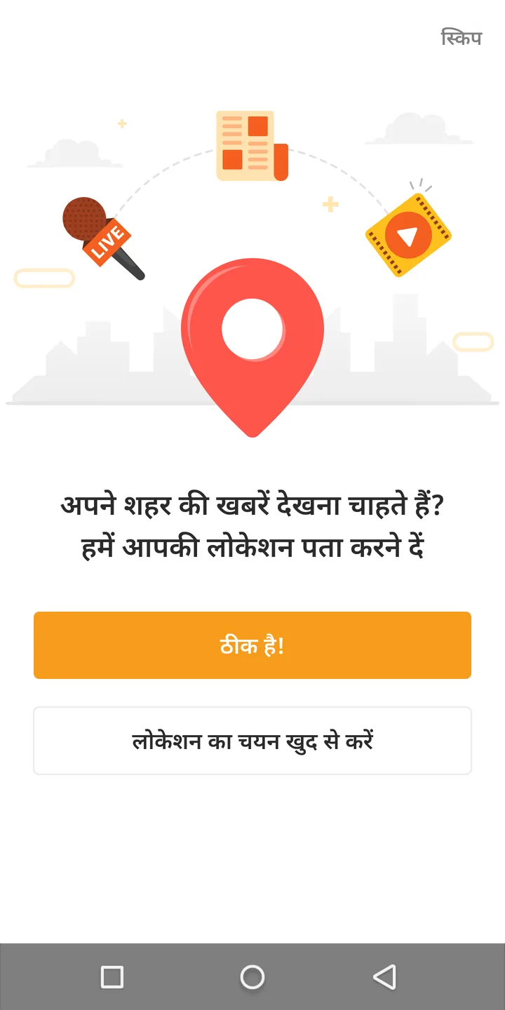
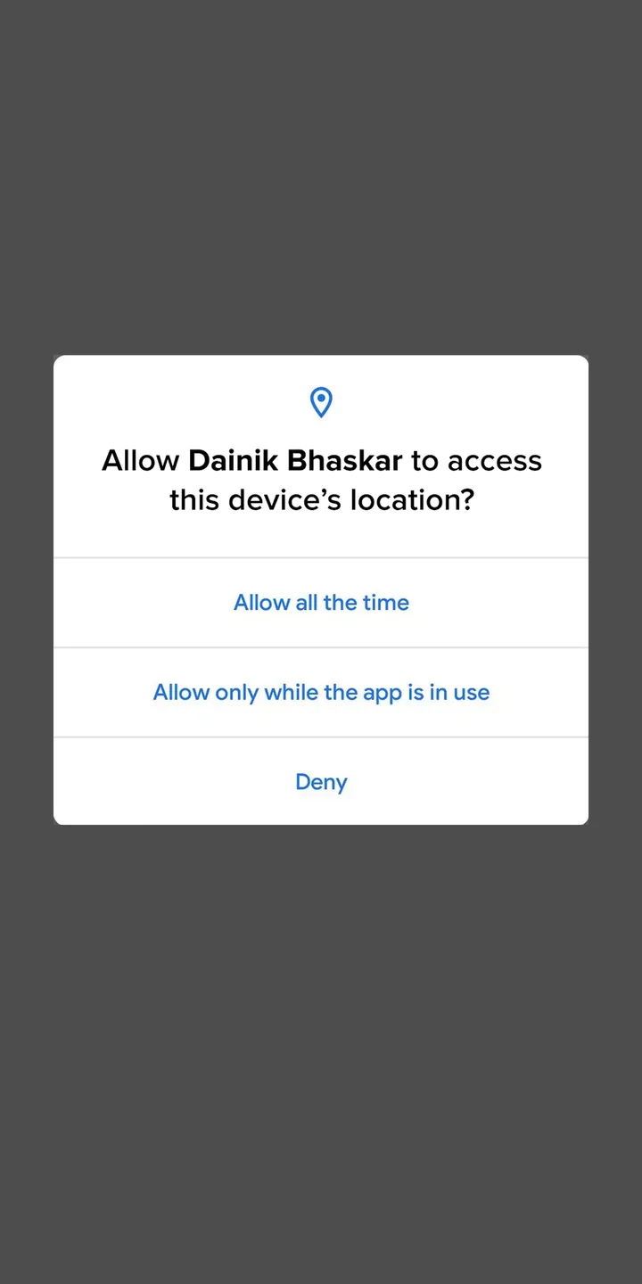
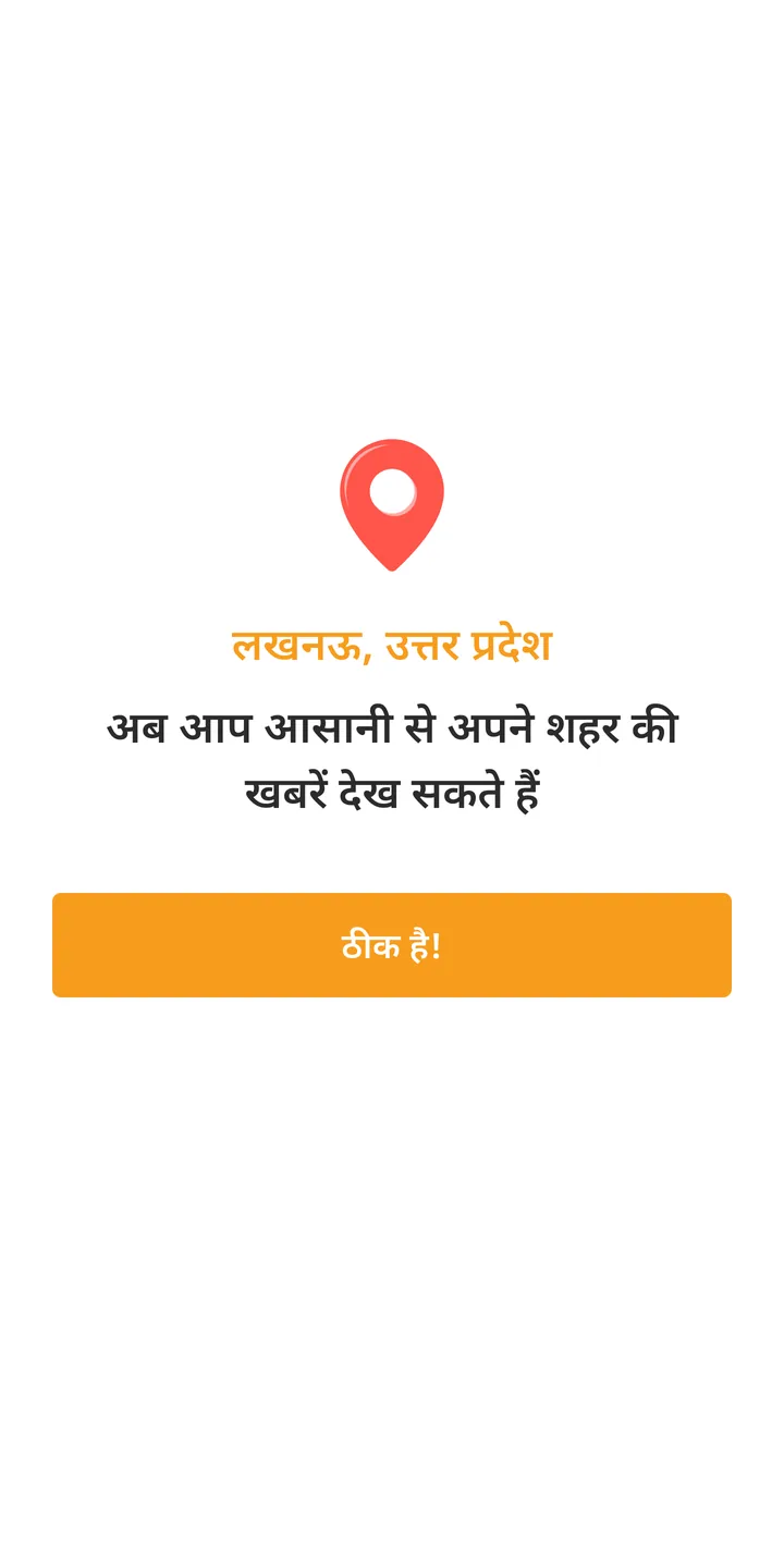
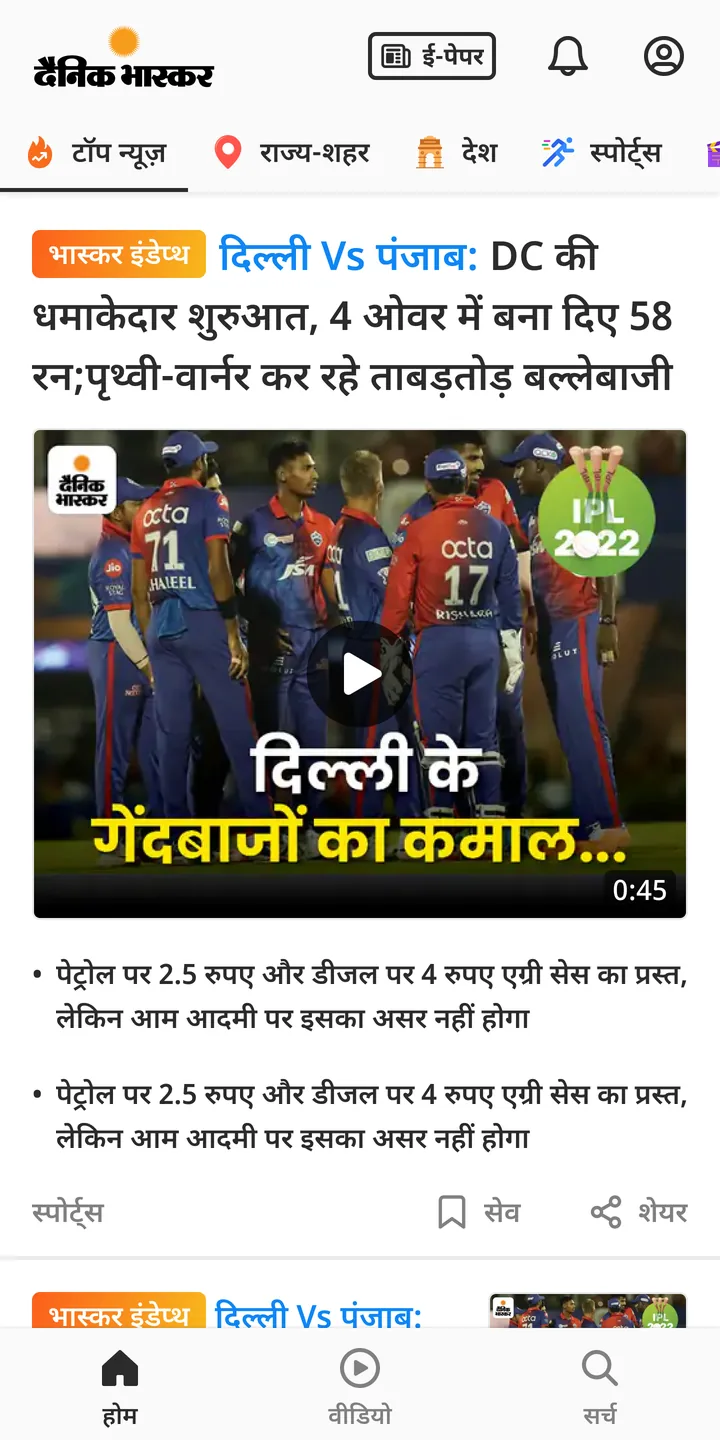
Onboarding before this work. The popup showed up between 5 and 6.
Show the popup first
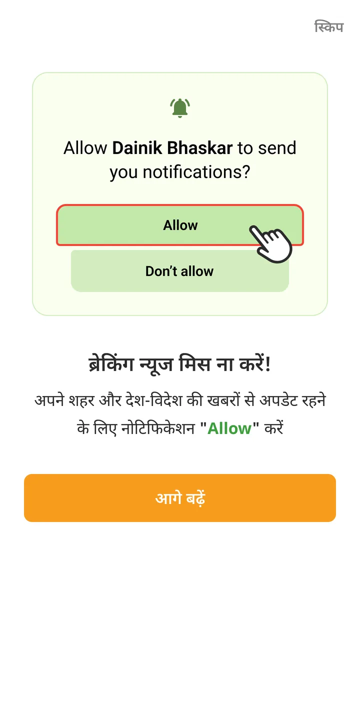
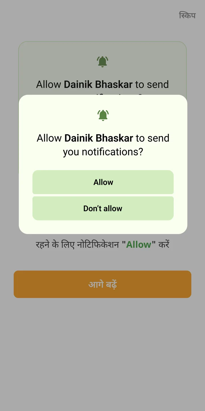
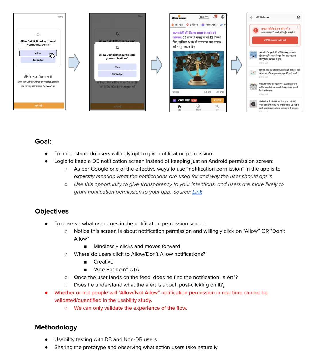
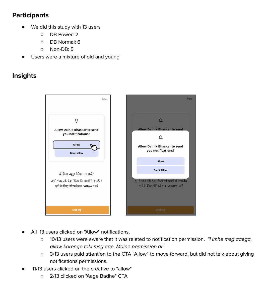
We added just one screen, right where the popup used to show. It shows a picture of the Android popup, with Allow highlighted and a hand pointing at it. Below it, one line. Don't miss breaking news, allow notifications to stay updated on your city and the world. Tapping आगे बढ़ें opens the real popup on top of the picture. So readers already know what to tap when Android asks. स्किप takes them to the feed without asking.
Why a screen before the popup
Google says apps should explain why they need notifications before asking. Our screen does that in one line.
One version for every phone
The picture shows the basic Android popup. On Samsung, Xiaomi, Vivo and Oppo phones the real popup looks a bit different. We still used one version for all.
Tested in April
I designed the flow and sat in the user tests. 13 people. 2 heavy Bhaskar readers, 6 regular readers and 5 who didn't use the app.
All 13 tapped Allow. 11 tapped Allow on the picture, before the real popup even came. 10 could say in their own words what they were agreeing to. One said, “Hmhe msg aaega, allow karenge taki msg aae.”
A test can't tell you what people will do on their own phone. The study said this too. The real number came after launch.
A second chance in the feed
Read this part
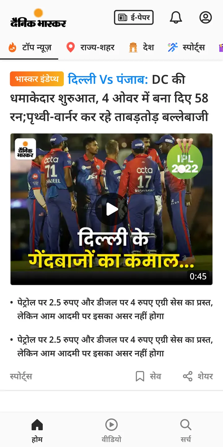
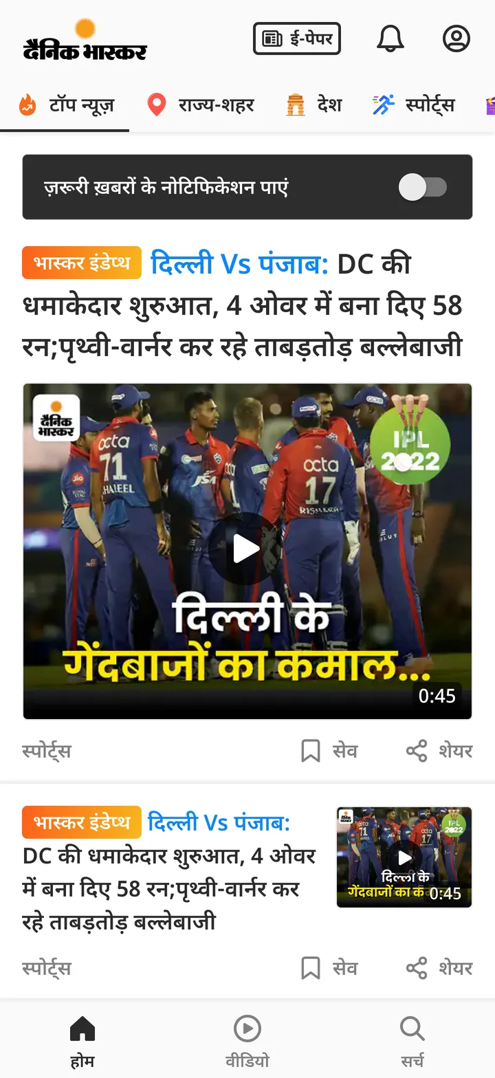
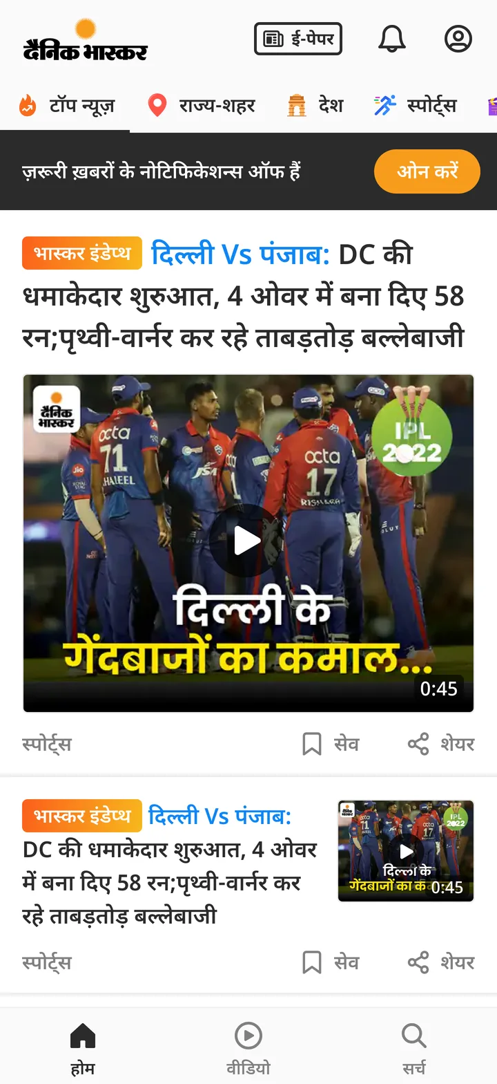
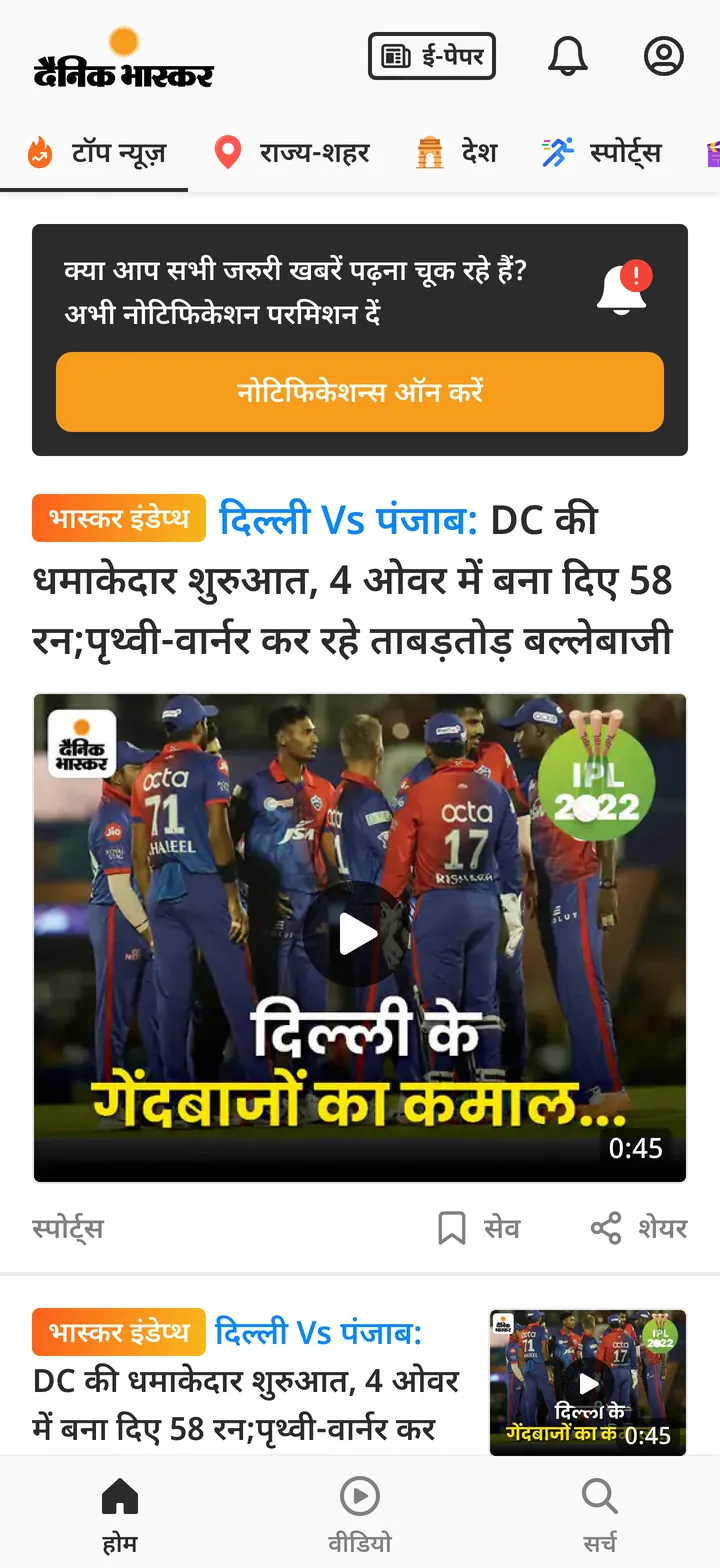
Onboarding only happens once. People who tapped Don't allow or स्किप, or turned notifications off later, needed another chance. So we made a banner at the top of the feed. It had to be easy to see, but not get in the way of the news.
Three rounds of tests in August
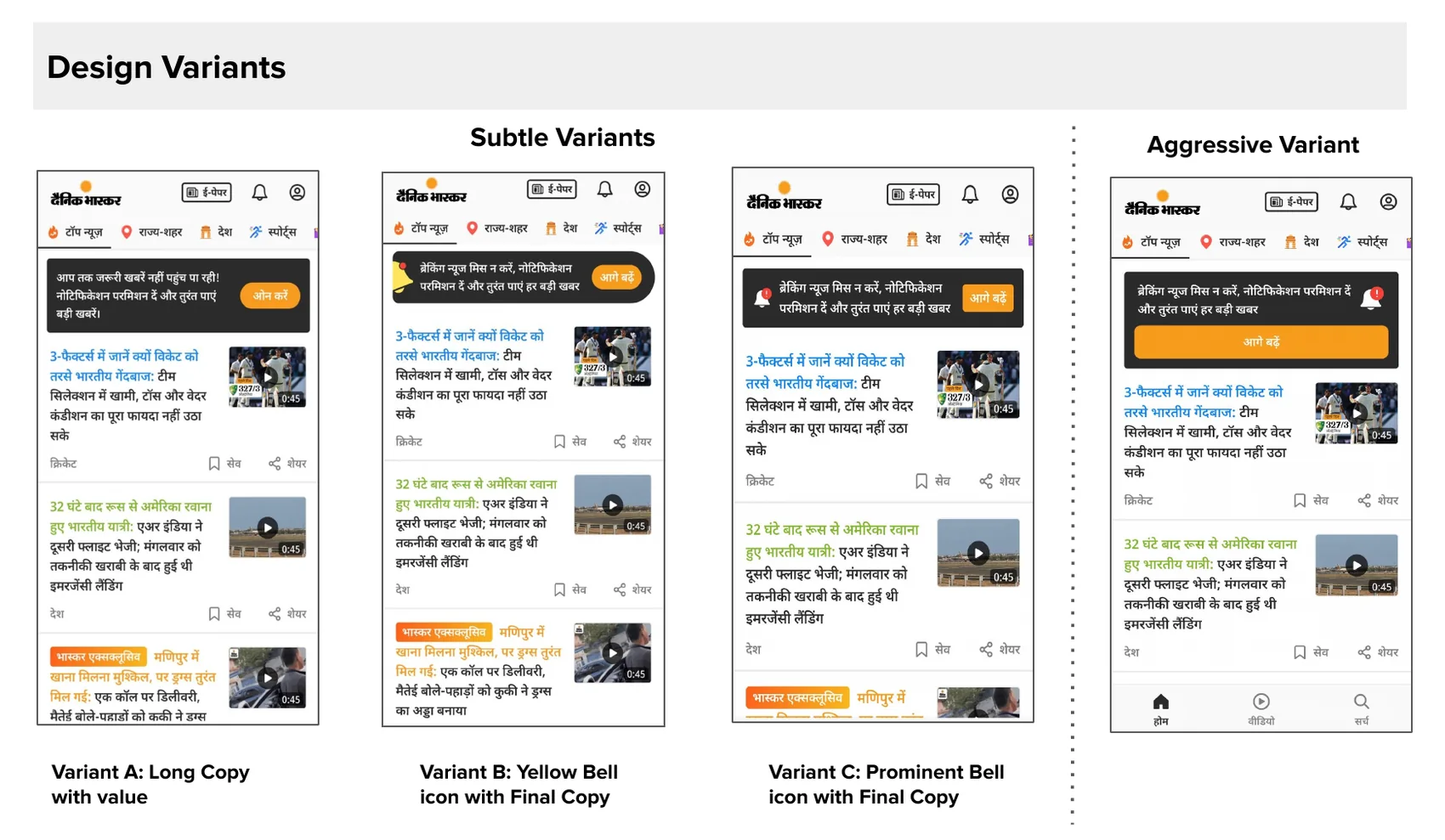
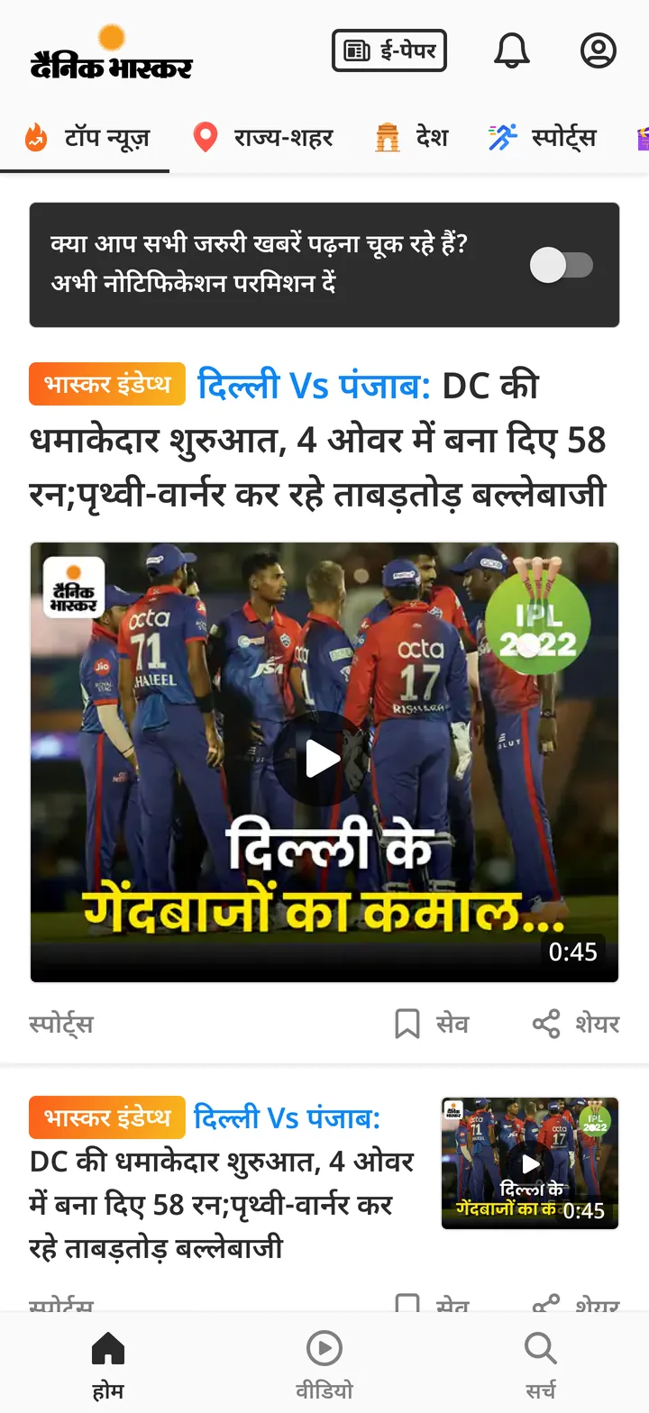
Round one tested a quiet banner against a loud one. Round two added a sticky bar. Round three tested the final words, with a bell icon on the quiet version. I designed the options and sat in the tests.
First ideas
Toggles, strips and a card with a big button, with different words.
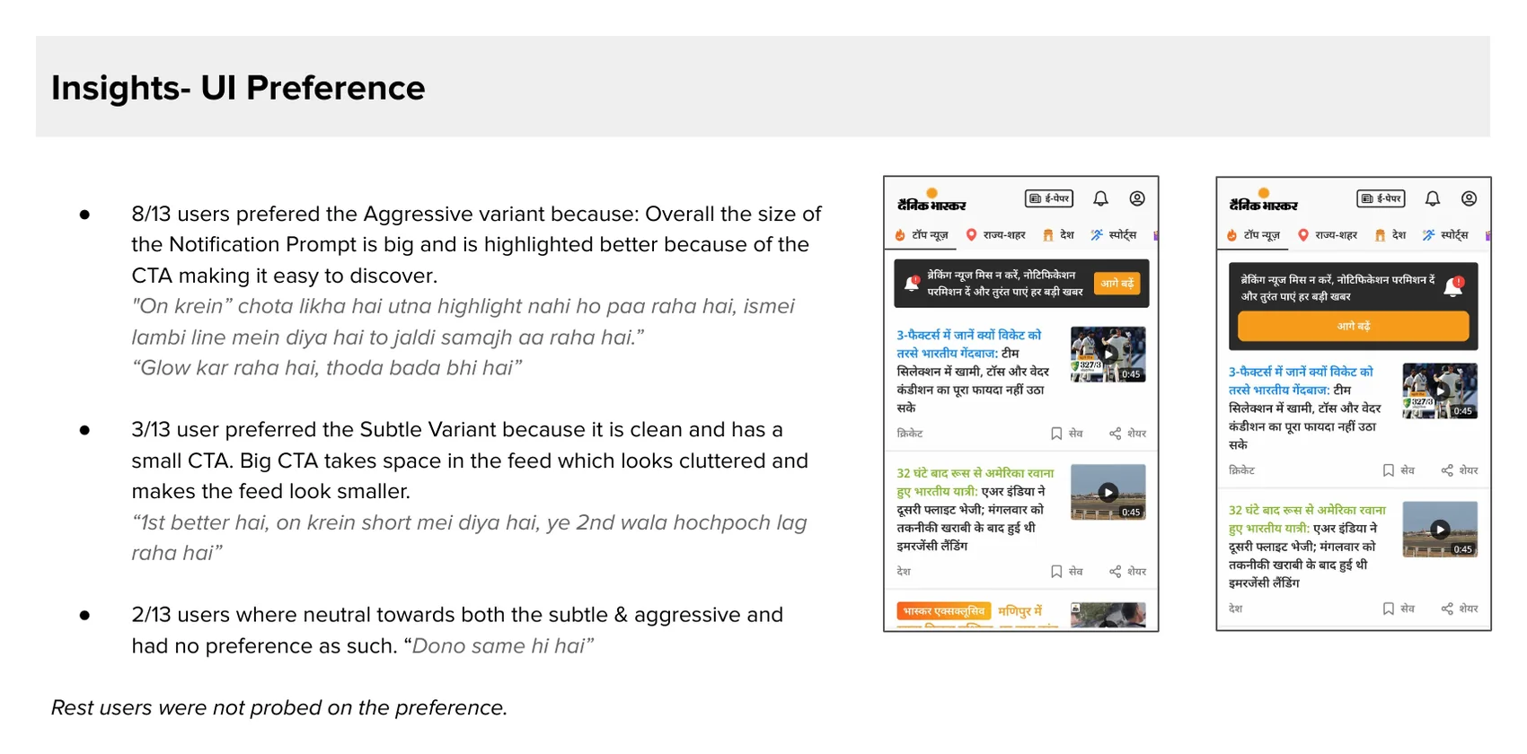
Most people liked the loud one
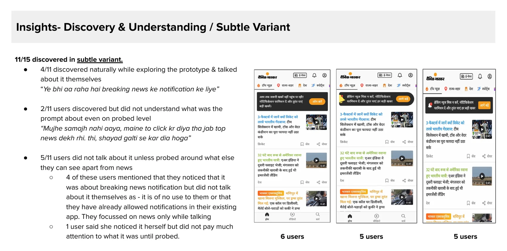
11 of 15 found the quiet banner. But only 4 found it on their own. 3 people who missed it saw the loud one right away. 8 of 13 liked the loud banner more. It was bigger and easier to see.
We still shipped the quiet one. The banner shows every time the app opens. If a reader misses it today, they can see it tomorrow. And a big card on a small phone, next to election and cricket widgets, would push the news down.
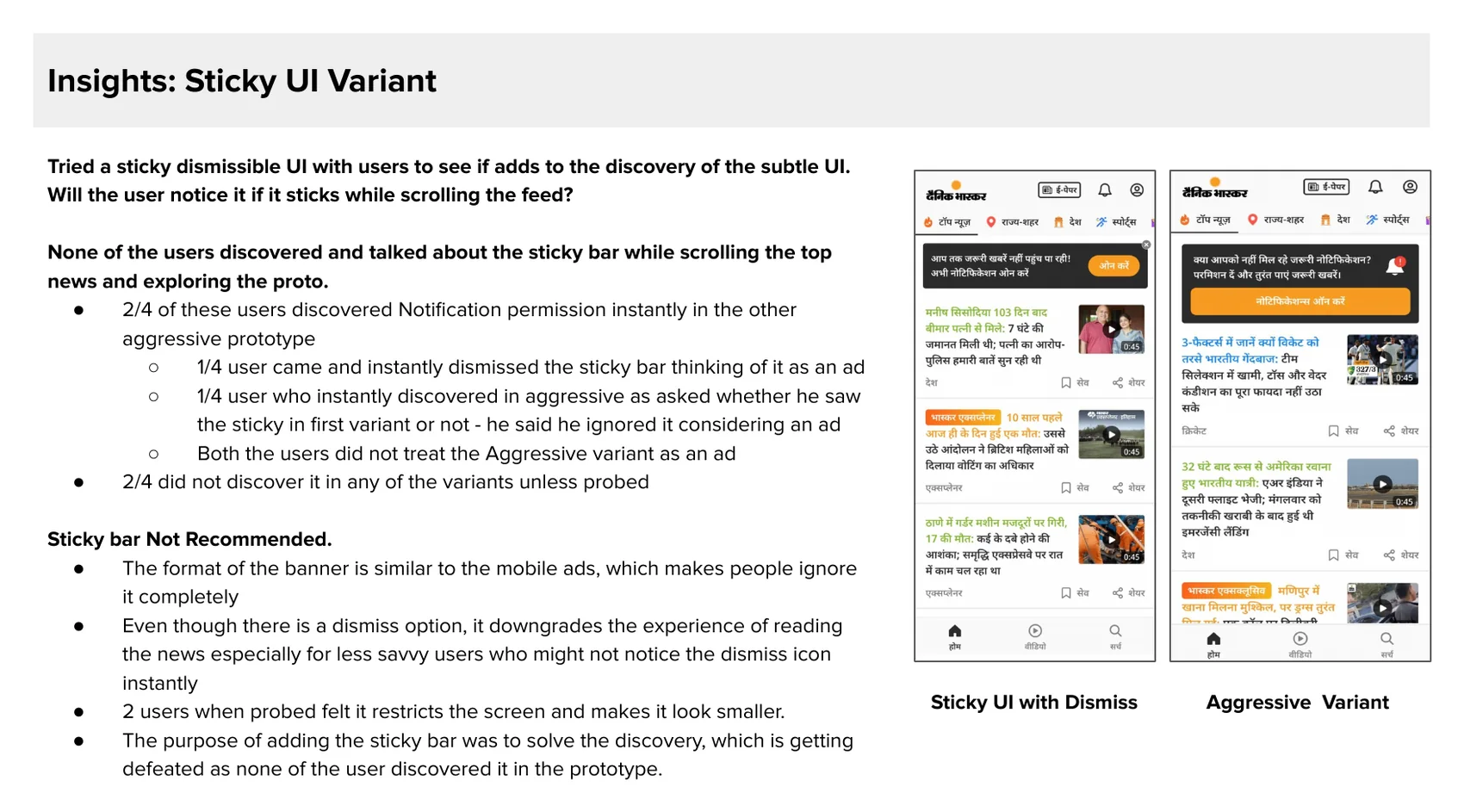
The sticky bar looked like an ad
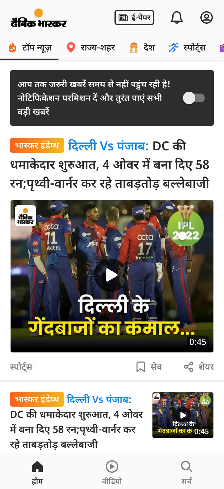
The sticky bar stayed on screen while you scroll, so more people would see it. But nobody noticed it. One reader closed it right away, thinking it was an ad. So we removed it. We also removed the close button, because it made the banner look like an ad too.
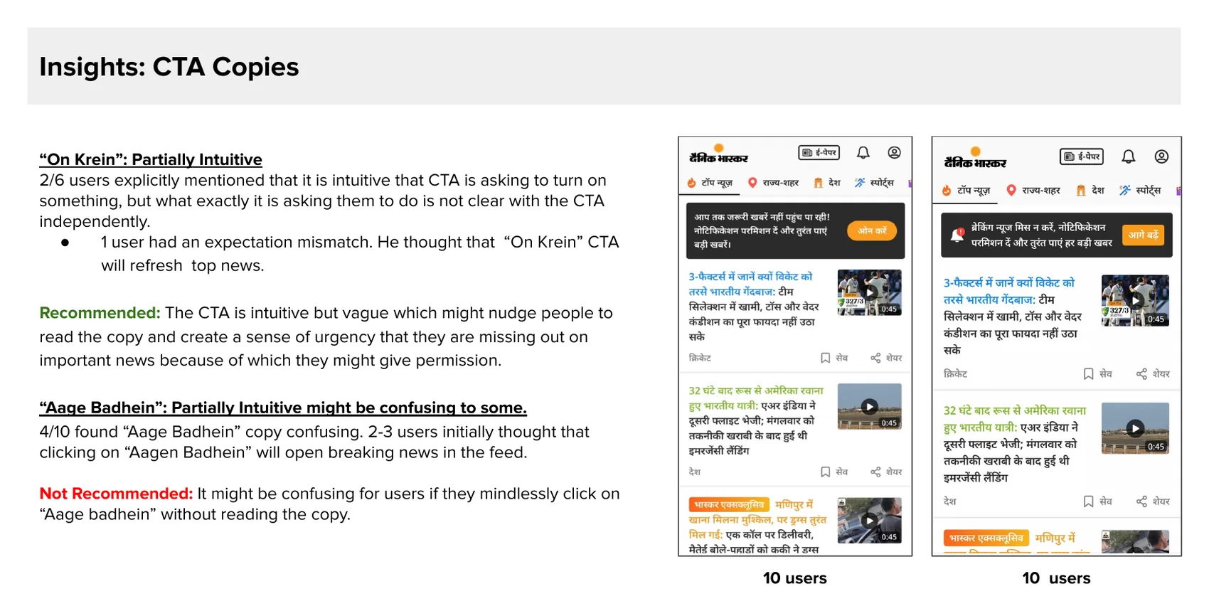
The button text we kept
4 of 10 people found आगे बढ़ें confusing. Some thought it would open breaking news. The study said to use ऑन करें or Allow. We tried both and saw no real difference. Readers see आगे बढ़ें all over the app, even on the screen before this. So we kept it. I show both here, what the study said and what we did.
Shipped
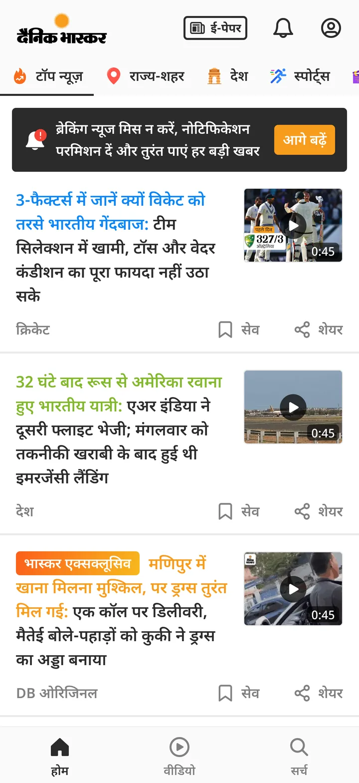
A dark strip above the first story. A bell with a red dot, one line of text, and आगे बढ़ें, which opens the Android popup. Only people who haven't allowed notifications see it. It added about 1 point to opt-in.
70%, then 79%
We measured 70% four months after launch. We don't have a before number, because the first popup ran only briefly and wasn't measured. So I can't say how much the screen helped. I can say 7 in 10 new readers said yes, even though Android made it easy to say no.
The extra 9 points
Later, opt-in went up to 79%. That's 9 more points, from two things. The feed banner added about 1 point. The asks during big news added the rest, about 8 points. Both only show to people who haven't allowed notifications. So these points came from people who first said no, skipped, or turned them off.
Ask during big news
Read this part
Onboarding and the banner ask everyone in the same way. Later I suggested a new idea. Ask about the story the reader is following right now. When big news breaks, readers want updates. That's the best time to ask, and we can name the story. Like, turn on notifications for updates on the Air India crash. These show as popups, set up for each story. They added about 8 points to opt-in, much more than the banner. Asking at the right moment worked better than asking all the time.
Being careful
Asking during a sad event needs care. The popup only offers updates on that story. It closes with one tap.
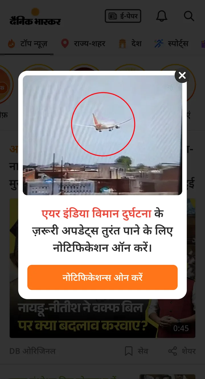
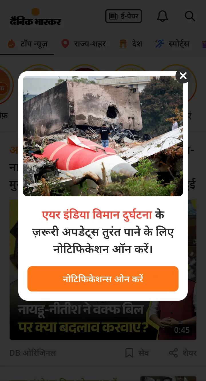
In places readers already tap
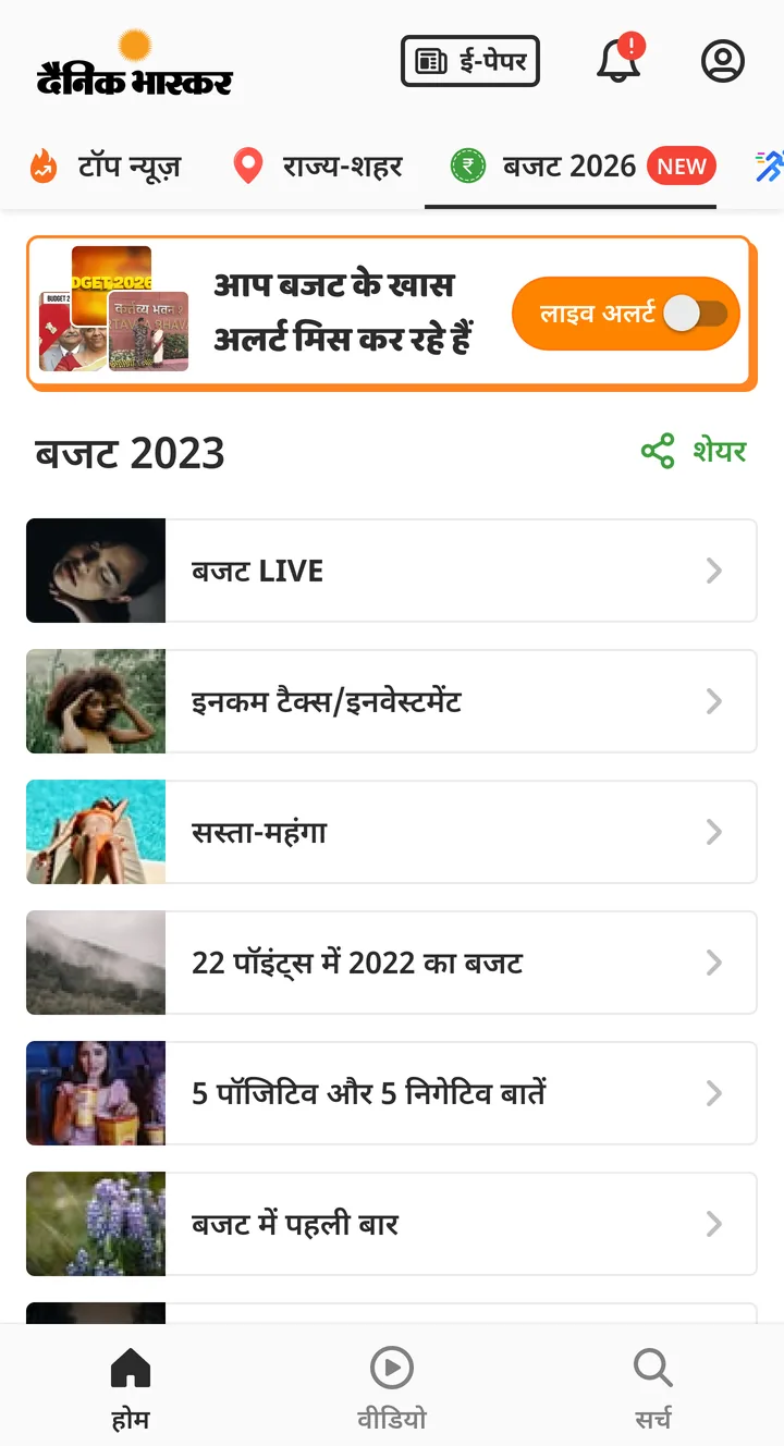
The widgets from case study 03 ask too. There's an अलर्ट पाएं ring with a ब्रेकिंग न्यूज़ badge in the story rings. And a card that looks like news in the feed, called ब्रेकिंग न्यूज मिस ना करें. For planned events, the ask sits with the event. The Budget 2026 tab has a live-alert toggle.
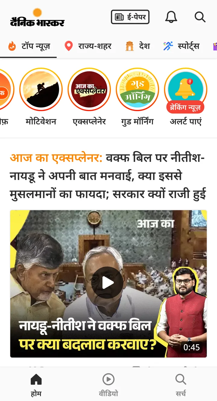
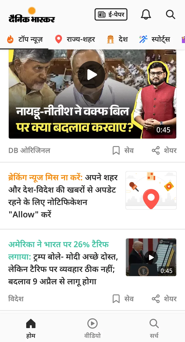
Tried, not shipped
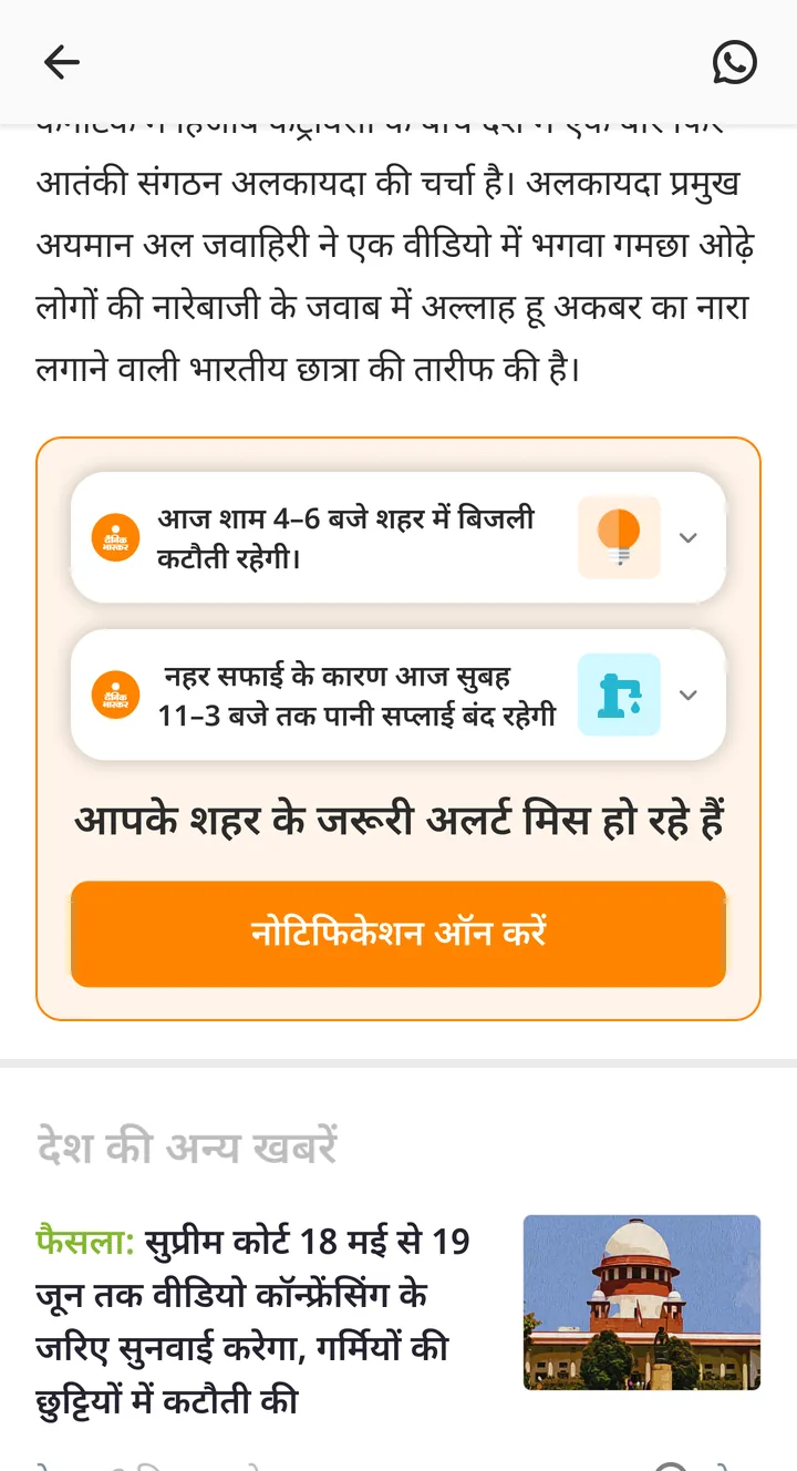
City alerts at the end of a story. Things like a power cut or a water shutdown, with आपके शहर के जरूरी अलर्ट मिस हो रहे हैं.
Outcome
I designed the onboarding screen and the feed banner, and sat in both user tests. I suggested the news-time asks. The ring and news card came from my discovery work.
What I'd do differently
Test against the plain popup. The 70% has nothing to compare to. A small group with the old popup would have shown how much the new screen really helped.
Match the popup to the phone. Everyone saw the basic Android popup. On phones where the real one looks different, the preview helps less.